Pixelated Lincoln

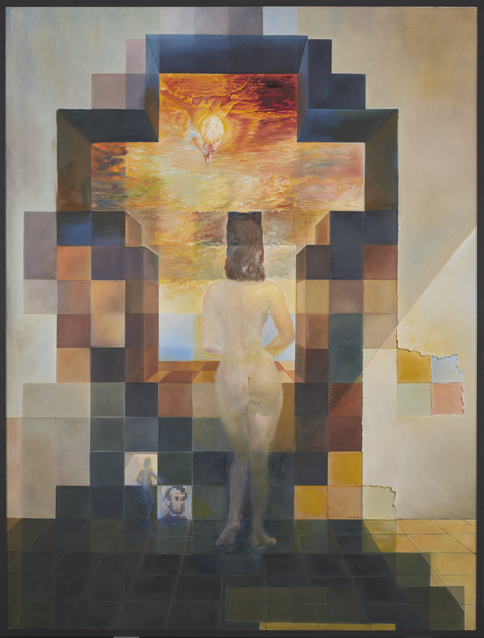
Gala Contemplating the Mediterranean Sea which at Twenty Meters Becomes the Portrait of Abraham Lincoln-Homage to Rothko (Second Version) by Salvador Dalí

Gala Contemplating the Mediterranean Sea which at Twenty Meters Becomes the Portrait of Abraham Lincoln-Homage to Rothko (Second Version) by Salvador Dalí
That title is a quote from a great profile over at The New York Times by Wil S. Hylton on one of my favorite artists of all time, Chuck Close. It’s titled, The Mysterious Metamorphosis of Chuck Close:
he has recently set about leaving much of his old life behind: filing for divorce from his wife, Leslie, after 43 years of marriage, disappearing for the winter to live virtually alone in a new apartment on Miami Beach and retreating from his summer friends to the crowded isolation of Long Beach.
His painting style has dramatically changed too:
It’s difficult to know how to describe that painting, or the series of new work it was part of, except to say that it was a radical departure from the last 20 years of his art. Gone were all the swoops and swirls that he typically paints into each square of the grid. In their place, he had filled each cell with just one or two predominant colors, creating a clunky digital effect like the graphics of a Commodore 64. The colors themselves were harsh and glaring, blinding pink and gleaming blue, while the face in the portrait — his face — was cleaved right down the middle, with one side of the canvas painted in different shades from the other. To the left, his skin was peach, his shirt deep red and the background mint green; to the right, his skin was pink, his shirt sapphire and the backdrop orange. There was a sea-green splotch hovering over his neck, with a long tail that poked into his nose, and one ear was radioactive yellow; the nose was honking blue.
The dude is getting old. Cut him some slack. The systems inside his body are shutting down, possibly including his brain. It’s called aging. To Close’s defense, “blinding pink and gleaming blue” sound like the colors he would see around him in Miami Beach.
This bit about Jeff Koons resonated with me:
In Long Beach, exile had the sound of summer, and I spent a few more days with Close, watching the tides roll out. We would sit at the long table on the middle floor, eating Indian takeout and discussing the commercial compromise made by artists who rely on assistants to make their work. “I look at my friend Jeff Koons, and I think, Why in God’s name does he want to do that?” Close said. “Why would he give up the fun part to become the C.E.O. of an art-manufacturing company?”
Seriously. Why would you give up the fun part? If I had to guess, I’d say Koons is more interested in being a businessman than being an artist.
The transformation in Close’s work reminds me of what happened to Willem De Kooning towards the end of his life. His works became more and more minimal to the point where they were barely recognizable as De Kooning paintings. There are allegations of De Kooning’s assistants taking away canvases when they considered them finished.
After reading the Close profile, Austin Kleon wondered how you tell the difference between symptoms of art-making and dementia. Great question. Sometimes it’s hard to tell.
I’ll say this: even if Close is in the early stages of Alzheimer’s or dementia, his work is still incredible. This isn’t a case where a once brilliant painter has forgotten his process and lost his craft and is finger painting (although Close could probably do a mean finger painting).
(Fifty-cent word from the Close profile: uroboric)
This constricted medium turned good artists into problem solvers. Good artists looked at the display like a mosaic artist, and not so good artists looked at it like a rock and chisel.
—from A Pixel Artist Renounces Pixel Art by Blake Reynolds
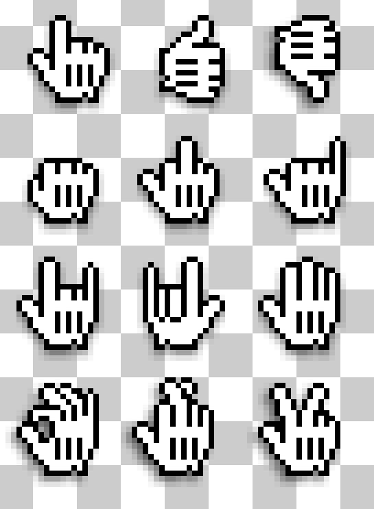
After the hugely successful Hand & Arrow Cursors post that went viral a few weeks ago thanks to swissmiss and Michael Surtees, I decided to follow up with a iconographic exercise with the OS X ‘Mickey Mouse glove’ hand cursor.

There’s 9 12 versions of the hand:
UPDATE: I’ve added a fourth row of additional icons.
I’ve gotten a few requests already for the *shocker version. I’d like to keep this post PG-rated. I think there’s enough reference material to make your own versions. 🙂
