Flash is Open and It Runs Fast

Flash_plug-in_versions.gif
Flash Co-Creator Jonathan Gay Responds to Steve Jobs
I’m hoping to get the iPhone vs Flash stuff out of my system so I can post thoughts on other topics, but I’m still too interested in the arguments. Call me a chick, but I like drama and gossip.
In the interview, Gay rehashes all the ‘open’ talk I’m already way to familiar with. I’m going to skip over commenting on that as well as all the “Apple-is-hurting-users-by-not-providing-Flash-on-the-iPhone” talk. Enough already.
I did find this nugget funny, where the interviewer asks Gay “how much would the Flash player need to evolve before it would meet Steve Job’s strict efficiency standards”:

It’s worth noting that Flash was developed on a 66 Mhz 486 which is probably one tenth the speed of an iPhone. So I don’t think there is a fundamental architectural issue. I think the Flash architecture with the binary file format is inherently higher performance than HTML for multimedia.

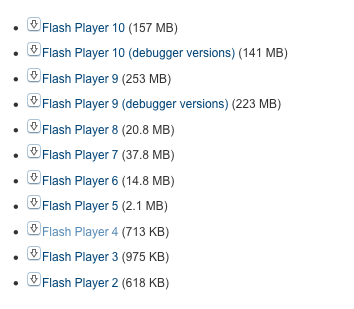
Gay is absolutely right. Flash was developed for those very limited specifications way back in the day. But if I recall the days when I used to design and develop in Flash 4, cerca 1999, the Flash plug-in was around 200K (Adobe has all the versions archived on their site). Granted, it also couldn’t dynamically load JPGs or any video. It also couldn’t load XML files. Or do PaperVision3D.
Looking into my Internet Plug-ins folder today, the Flash 10 plug-in is 13MB.
Times have changed. I’m not saying Flash can’t be refactored to run on a mobile device, but Adobe still has a lot of work ahead of them.

Categories:

Innovation, Technology

Tags:

iPad apps – expectations for content producers

MacNN: GQ records extremely low iPad magazine downloads
VP and publisher Pete Hunsinger doesn’t seem to get digital:

Hunsinger defends the iPad edition, claiming that it costs “nothing extra,” given that there are no printing or shipping costs. The iPad app is $2 less than the print edition, and GQ is also charging just $2 for back issues. The VP says he expects the iPad to eventually become a “major component” of circulation; one boost is anticipated with the June issue, which will feature Australian supermodel Miranda Kerr.

First off, I would argue that the iPad version should cost as much, if not more than the print version. From my experience, most people don’t understand the costs that go into building products/experiences/tools for the web. There’s an incorrect assumption that because this product isn’t physical and ‘real’, it must be cheaper to make.
The truth is that it should cost a lot of money to create an iPad version of GQ magazine if they truly exploit everything that makes experiences on the iPad great. This doesn’t mean you have to go overboard when using a new medium, but it does mean creating an appropriate experience.
And that’s what we’re talking about when talk about building for iPads and iPhones – experiences. I’ve read a number of stories in the press about the iPad being a device for passive consumption, but that’s a premature dismissal. If GQ is simply digitizing text and making image galleries that you can flick through, they’ve missed the point. That’s easy.
My second point is that the iPad is not and should never be ‘the savior’ of the print industry.
Every company is responsible for their own fate. Whether you’re Conde Nast trying to convert your print publications into digital experiences, or Adobe trying to make Flash relevant to mobile computing, blaming or praising Apple for your failure or success is to sell your company short.
Conde Nast is moving their properties onto an amazing platform. They’re responsible for creating an amazing experience.
Evolve or die.

Tags:

Windows Phone Wireframes 7

wp7_3_screenshots.jpg
So last week, Paul Thurrott posted ‘near-final’ screenshots of Windows Phone 7.
I have the same opinion now, as I did last month when I posted and reacted to Edward Tufte’s thoughts on the mobile interface design.
They’re still just wireframes.
Jack Moffett astutely observed, “There isn’t enough variation between what is tappable and what isn’t.”
Just to be clear, this isn’t me wanting or expecting the WP7 interface to be shiny and polished like iPhone interface. There’s many ways to design a GUI, and these just don’t look designed. At all.
It’s impossible to ignore what you’ve seen from your competition, but I’m hoping that the Windows Phone 7 team didn’t deliberately rage against the machine and decide to reject all implied dimensionality within the WP7 interface. If you want things to look clickable, you need to make them look, um, clickable. This doesn’t mean you need to use bevels, gradients, reflections and gloss. A lot can be achieved using just one of those effects.
A minimalist interface would be amazing, but WP7 isn’t minimalist, it’s empty.
Which brings me to my next point about WP7. In an interview with Steve Jobs back in the 80’s, he comments that “… they [Microsoft] don’t think of original ideas and they don’t bring much culture to their products …”
When first watched the interview, I understood what he said in theory, but it wasn’t until I saw the WP7 screens that I truly ‘got’ what Jobs was saying. The WP7 interface is completely uninspired and has a complete lack of culture.
Given WP7’s lack of real design, I was shocked at tweets from Khoi Vinh and AisleOne:
khoi_tweet_wp7.jpg
aisleone_tweet_wp7.jpg
I’m waiting for another company to give Apple some real competition to the iPhone. I love Apple products, but Apple needs competition and there’s so much more room to innovate with the mobile space.
Let’s not get excited over wireframes posing as finished designs.

Tags:

Garbage Kin

Gizmodo reviews Microsoft’s new mobile phones for hipsters:

It’s smart for a company to control its focus in designing a device, and that’s what Microsoft has done here. Messaging and social media are the Kin. But that doesn’t mean it shouldn’t come with a mapping application (there isn’t a native one, despite the presence of a GPS receiver.) It doesn’t mean that the browser shouldn’t have tabs, or a rendering engine that isn’t excruciatingly slow. It doesn’t mean that there should be no way to watch any web video of any kind, or that the phone should be arbitrarily tied to Microsoft’s Bing search service. It’s no excuse for excluding any kind of calendar.

Kids don’t do maps and browsers and shit like that, yo! They’re all up in all those social networks, hundreds of them! (read: Twitter and Facebook)
And regarding no calendar, I like this one from the comments:
“I can understand the lack of a calendar. Have you ever seen a hipster in a hurry? They don’t have appointments.”

Categories:

Image, Technology

Tags:

Android is best without Bumps

VentureBeat: Google acquires BumpTop: Will Android get a 3D facelift?:

What’s Google going to do with BumpTop? The search giant hasn’t said anything about the deal yet, either on the main Google blog or in response to VentureBeat’s email requesting comment. The most likely area seems to be its Android operating system for smartphones and (eventually) other devices, such as tablet computers. Some of these ideas and technologies might give the Android interface a leg up over Apple’s iPad and iPhone. Google is also developing the Chrome operating system for netbooks, but BumpTop seems less relevant there, since the Chrome OS is all about the web browser.

I reacted to BumpTop in ‘07 and ‘09 and now that Google has bought them, I’ll respond again.
First off, I still feel the same way now as I did in my last two posts on BumpTop. In short, I still feel they’ve taken the desktop metaphor too much in the direction of a real-life desktop as to render it useless. It suffers from not enough abstraction.
To err is human, and it’s the computer’s responsibility to reduce human err[or]s.
John Gruber made a great analogy:

Used to be that to drive a car, you, the driver, needed to operate a clutch pedal and gear shifter and manually change gears for the transmission as you accelerated and decelerated. Then came the automatic transmission. With an automatic, the transmission is entirely abstracted away. The clutch is gone. To go faster, you just press harder on the gas pedal.

and:

That’s where Apple is taking computing. A car with an automatic transmission still shifts gears; the driver just doesn’t need to know about it. A computer running iPhone OS still has a hierarchical file system; the user just never sees it.

In addition to a lack of abstraction, the desktop metaphor doesn’t have any relevancy in the mobile space. The desktop metaphor bridged the gap between the pre- and post-computers worlds when Xerox debuted their Star workstation in 1981. Apple would subsequently co-opt that idea and build on it with their operating system for the Lisa.
We still have folders, files and and trash icons in the mobile space but we’re entering a world where what you call the space where all these icons live matters less and less. The iPhone has “home screens” and the upcoming Windows Phone 7 and Palm webOS both use “tiles”.
Unless Google makes significant changes and simplications to BumpTop I see it’s implementation in Chrome OS and/or Android and a FAIL from the start.

Tags: