A photo filter is like a good screwdriver; a reliable, efficient, easy-to-use tool. But put in the wrong hands it’s potentially lethal.

Wells Baum on Instagram filters:

I stopped using Instagram filters almost two years ago. You don’t need them. The snap should be able to speak for itself, in its raw untouched nature.

But I do believe that some images still need a little pop. And that’s when you should use the VSCO app, Litely, or Snapseed, whichever apps enable you to adjust the strength of filters without making the photo look fake.
This is partially true. Instagram filters can be heavy-handed. I, like Baum, have not used them in a while. I exclusively retouch photos in the VSCOcam app on my iPhone. Like Instagram, it has preset filters. Unlike Instagram, it let’s you decide how much of a filter you want to use (on a 0-10 slider).
There are many philosophies on photography and many different industries in which photography is used, but there’s many professional photographers who don’t let their photographs leave the studio until they’ve been retouched. Annie Liebovitz used to work with one of the masters of retouching—Pascal Dangin—often referred to as the ‘Photo Whisperer’ (It looks as though Liebovitz now works with Alexander Verhave).
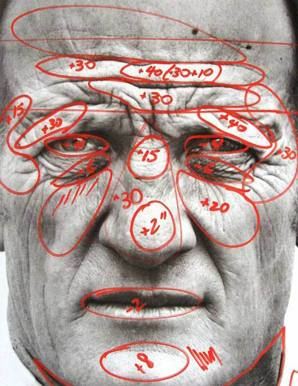
Even before the days of Photoshop, photographers like Richard Avedon were obsessive about tweaking their photos (through the old school process of burning-and-dodging).
Here’s one of his marked up photos:

The fact that #nofilter is one of the most popular hashtags on Instagram means shit to me and has no correlation to how good a photograph is (because most people are bad photographers).
Sometimes I get out of bed and I look fucking amazing, but more often than not, I need to brush my hair and put on a nice, clean, matching outfit. Photographs are no different. In the absence of the time and means to retouch my iPhone photos in Photoshop on my Powerbook, I use the VSCO app to tighten up my images.
Sure, sometimes the light is right, your timing is perfect and you don’t need to monkey with your shot but most photographs can be improved. The key to retouching photos is if someone looks at your photograph and their first thought is, “That’s a great photograph.” NOT, “Oh, he used the Mayfair filter.”
Photo filters bring to mind a quote a friend from design school told me:
“Helvetica is like a good screwdriver; a reliable, efficient, easy-to-use tool. But put in the wrong hands & it’s potentially lethal.”
—T. Geismar
You can find me here on Instagram.

Categories:

Photography

Tags:

Golden Repair

From Wikipedia:

Kintsugi (金継ぎ?) (Japanese: golden joinery) or Kintsukuroi (金繕い?) (Japanese: golden repair) is the Japanese art of fixing broken pottery with lacquer resin dusted or mixed with powdered gold, silver, or platinum a method similar to the maki-e technique. As a philosophy it speaks to breakage and repair becoming part of the history of an object, rather than something to disguise.

What an amazing philosophy.
via Colossal

Categories:

Philosophy

Tags:

Schooled

Matt Richtel, for The New York Times, on introducing coding into the school curriculum:

But the momentum for early coding comes with caveats, too. It is not clear that teaching basic computer science in grade school will beget future jobs or foster broader creativity and logical thinking, as some champions of the movement are projecting. And particularly for younger children, Dr. Soloway said, the activity is more like a video game — better than simulated gunplay, but not likely to impart actual programming skills.
Oh I see, we’re not sure if teaching computer science will beget jobs and foster creativity, but we’re fine cutting funding to the arts in public schools in the United States.
Having an understanding of computer science and coding in no way guarantees you a job, but if I had a choice, you’d be damn sure my kid would know how to code.
We’re beginning to label computers as our enemies more and more, as they continue to prove themselves more efficient and better at our jobs than us. I think the gospel of Vito Corleone makes the most sense: keep them closer.

Categories:

Education

Tags:

Bicycles For Our Minds?

Shaunacy Ferro at Co.Design:

The industrial designer of the future might just be a computer. The traditional design process can be a laborious one, full of iterations and tweaks to make a product just so. For years, design software maker Autodesk has been working on an alternative: a program that sorts through all the ways to make a product of specific measurements and then spits out the best option.
I’ve used computers since I was 4-years-old so saying this article frustrates me makes me sound hypocritical. I’m ok with that. But it does.
Our view of how good or bad things are in life is all about degree. It’s not nice to punch a random person in the face, but punching 40 people in the face randomly is worse. It might be enough to land you two minutes on the local evening news.
Similarly, having computers make our lives easier is great, until they start making our lives too easy and take over too many tasks. It’s too late to try and fight this; it’s only a matter of time before we end up like the fat, idle humans in Wall-E.
I made a poster series a few years ago inspired by the Steve Jobs quote, “The computer is like a bicycle for our minds.”
At some point the computers aren’t going to need our minds. They’ll be able to ride their own bikes.
[Also on Daily Exhaust: We Ain’t See Nothing Yet, Manpower Demand, We Are Redundant, I don’t see designers on there… yet.]

Categories:

Career

Tags:

“The Inventor”

From The Verge: The inventor of iMessage leaves Apple for a messaging startup
I hate that term, “inventor”. I hate it because it’s not accurate. I’ve talked about this before in regards to the “father(s)” of the iPod—Tony Fadell, Jony Ive, Steve Jobs or Jon Rubinstein. Take your pick.
If we dig into the article a bit (ok, if we read the first 2 sentences) we get more details:

Andrew Vyrros, the man who led development on iMessage and FaceTime while at Apple, has left the company for messaging startup Layer. The company announced the news yesterday, but Vyrros left Apple several months ago, sources tell The Verge, where he was also responsible for Apple’s push notification services, iTunes Genius, Game Center, and Back To My Mac.
So he’s a lead developer, or likely a director of development. This helps.
Now if we had been reading about the designer “in charge of” the design of iMessage leaving Apple, we would have likely seen a very similar headline as this one.
Design is almost always a collaborative process, so awarding a single person as an inventor of a product is inaccurate.

Categories:

Technology

Tags:

Monkeys With Guns

At The Guardian, Trevor Timm points out technology law will soon be reshaped by people who don’t use email:

This is not the first time justices have opened themselves up to mockery for their uninitiated take on tech issues. Just last week, in the copyright case against Aereo, the justices’ verbal reach seemed to exceed their grasp, as they inadvertently invented phrases like “Netflick” and “iDrop”, among others. Before that, many ripped Justice Roberts for seemingly not knowing the difference between a pager and email. And then there was the time when a group of them tried to comprehend text messages, or when the justices and counsel before them agreed that “any computer group of people” could write most software “sitting around the coffee shop … over the weekend.” (Hey, at least Ginsburg reads Slate.)
The first time I remember being scared how little the government knew about technology was back in 2006 when John Stewart skewered the late senator Ted Stevens when he described the Internet as a series of tubes.
You shouldn’t be allowed to make judgements on cases involving technologies you don’t understand.
These justices are like monkeys with guns. They may not know how things work, but they’re still dangerous.

Categories:

Law

Tags:

PayPal Logo

Armin Vit on the new PayPal logo by fuseproject:

The new logo is a really good evolution that unquestionably modernizes the previous logo. The double-P monogram has a nice rhythm to it and the two “P”s assemble together warmly — they are spooning. The typography, a modified Futura italic (or, actually, oblique), is a perfectly acceptable solution that reads more cleanly than the previous whateveritwas. The brighter blue hues help the logo compete better against the livelier identities of other payment gateways like Square.
I disagree with Vit. The new logo is shitty. My beef is specifically with the dark blue shape formed from the overlapping “P”s. It’s muddy and too close in value to the blues around it. I’m fine with the letterforms comprising the logo mark and the word mark (you know there’s a difference between a word mark and a logo mark, right?).
Call me old school, but I think a logo should activate the space in and around it. Let me dig into my Graphic Design 101 bag….. gestalt! Yeah, this thing has no gestalt, there’s no dance between negative and positive space. If you’re looking at a logo you should have an active role in deconstructing and understanding it.
Why am I wasting this critique on PayPal of all companies? As Vit notes in his post, this is the company that hasn’t updated its logged-in dashboard view in 12 years.
Update: Happy I’m not the only one who isn’t impressed with the new logo

Categories:

Identity

Tags: