Microsoft: Self-Saboteur

Microsoft, you’re killing me. You’ve just announced what looks like a killer new tablet that you’re hyping as “the tablet that can replace your laptop.” It looks like a big improvement over the Surface 2 in just about every possible way, from the display quality to the super-thin build. But for some reason, you are still insisting on selling the keyboard cover separately for $130 a pop. To use an old science fiction cliché, this does not compute.

This bothers me for no other reason than because it seems like an assault on basic logic. You are selling a tablet that is, by your own admission, meant to be a laptop replacement. You compared it to the MacBook Air repeatedly during your presentation. And yet you’re still telling customers that having a keyboard is optional for something that’s supposed to be a laptop replacement… why?
—Brad Reed, BGR
If Microsoft opened a car dealership, they’d be selling the cars without wheels.
If Microsoft were a clothing retailer, they’d be selling shirts without buttons, and pants without zippers.
I have more, should I go on?
Seriously, Microsoft, what the fuck is wrong with you?
Tags:

Flat Design Isn’t the Problem

Gabby Manotoc on the new Netflix logo and the rise of the flat design trend:

This flat design is in trend with many logo redesigns. Its approach is an attempt on minimalism. The Helvetica-esque typeface disregards the personality of Netflix. The company doesn’t need to be a wayfinding system; its users want it to be fun. Cinema is a form of entertainment that contains boundless levels of energy. The old logotype was reminiscent of the old Blockbuster signs–which was incredibly appropriate considering the service the company provides. The new approach is not only sterile, but it appears to have no rhyme or reason behind it.
I find it interested that at the same time as we’re seeing a surge in flat visual treatments on everything—logos, mobile user interfaces, web sites—we’re also seeing a surge in copying the old, naive type treatments from 100+ years ago. Talented designers like Jon Contino, who imprefectly draw their work out by hand, are more popular than ever (a Contino logo pairs well with a ring made from a coin from Etsy).
It’s also important to note that the fact that the new Netflix logo is flat isn’t the problem. The problem with the Netflix logo is that it isn’t better than the original. It’s not telling a story.
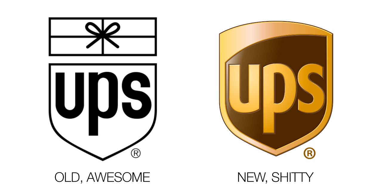
The same goes for the not-flat UPS logo:

The question we need to ask ourselves isn’t whether a logo is flat or not, but whether it’s good or it’s shit.

Categories:

Identity

Tags:

Always


—Stan Rizzo, Mad Men, S7E6

Categories:

Words

Tags:

Instagram & Art

The social media platform is not only launching the career of under-the-radar artists, it is providing the world with an entirely new way to access art. Where artists once had to first get support of the art world elite–critics, galleries and big name collectors, which would eventually lead to museum shows–before reaching the monied masses, today artists use Instagram as their own virtual art gallery, playing both dealer and curator while their fans become critics and collectors, witnessing the creative process in real time.
Vogue

Categories:

Art, Business

Tags:

Smart Schools

From Steve Lohr at The New York Times:

Gov. Andrew M. Cuomo of New York last month appointed a three-person commission to offer thoughts on the use of technology in schools.

The group, the governor’s office said in a statement, will be “charged with advising the state on how to best invest” the $2 billion the governor plans to raise in a “Smart Schools” bond issue in the fall.

Eric E. Schmidt, executive chairman of Google, is one of the three, but his appointment raised some eyebrows. Mr. Schmidt’s company has a commercial interest in seeing more Chromebook computers, which run Google’s Chrome web software, and the company’s productivity applications, Google Apps, being used in schools.
That’s bullshit.
(I’d feel the same way if Tim Cook was on the commission, only to a much lesser degree because I prefer Apple products to comparable Google ones)

Categories:

Education

Tags:

You Better Have Something Amazing On Your Wrist

From BGR:

Motorola executive Mark Randall is saying what a lot of other gadget watchers are thinking: The smartwatches we’ve seen released so far are nothing to get excited about. In fact, in an interview with Trusted Reviews, Randall goes so far as to say that every smartwatch that’s been released to date has been “pretty crappy.”

“People just don’t want to wear them,” Randall said of today’s current smartwatches. “We look at the [Moto] 360 and we look at what everyone has done in that space. To be honest we think they are all pretty crappy.”
Smack talk from the company who gave us the RAZR.
Mark Randall best have something off the chain to sell.

Categories:

Product

Tags:

Anti-Commenting

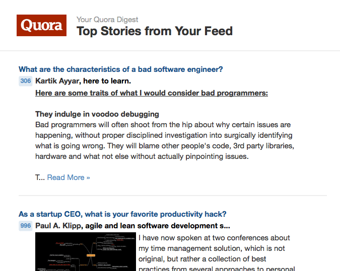
Outside of the blogs of technology and design people I follow daily, Quora is one of the most thoughtful places I’ve found on the Web. It’s one of the few places I’ve found where the comments are honest without being snarky or mean-spirited.
I think of the answers to Quora questions as the Bizarro version of Youtube and tech blog comments—they’re not filled with anonymous vitriol.
And it’s not only the quality of the answers I appreciate on Quora but the diversity of topics too.

Categories:

Community

Tags: