You Are Not A Storyteller

Stefan Sagmeister is an incredible designer, and I agree with what he says in the video below to an extent.
I think many designers mistake articulation with storytelling. They’re not the same. Designers and art directors and creative directors need to be able to sell ideas to clients. Doing this involves articulating in words what they and their team made with typography, shape, color and motion.
Articulation of ideas is a integral skill all designers should learn.
But it’s not storytelling.
I think the equation is: All stories are articulations, but not all articulations are stories.

Categories:

Technology

Tags:

Amazon Fireless Phone

Walt Mossberg gets right to the point in his review of Amazon’s Fire Phone:

But I consider the Amazon Fire phone no more than an interesting first step. In my tests, I found its big new features less useful than I expected, and sometimes outright frustrating. And, arriving seven years after the debut of the first modern smartphone, Amazon’s new entry lacks some key functions both Apple and Samsung include.
But over at the NYTimes.com, Farhad Manjoo is more bullshitty:
Amazon’s focus on the Fire Phone’s flashier side is unfortunate, because when I dug beneath the gimmicks, I found something better than 3-D heroics. The Fire Phone is uncommonly friendly and easy to use. As a bare-bones smartphone, it should prove especially attractive to people who find themselves overwhelmed by today’s crop of do-it-all superphones. When you forget about its whiz-bang marketing, the Fire begins to stand out as something much more interesting: a phone for the rest of us.
Uncommonly friendly? How so? And what is a “do-it-all superphone”? Is he referring to Android phones? iPhones? Without specific comparisons, none of this means much.
Later on, Manjoo on the “carousel” feature:
But what the Fire Phone lacks in aesthetics and breadth of capabilities, it makes up for in ease of use. Consider the phone’s main app-launching interface, the “carousel,” which should be familiar to people who’ve used Amazon’s Kindle Fire tablets. The interface constantly sorts your apps according to how recently you’ve used them. This let me navigate my phone very efficiently, often saving me from getting lost in a sea of apps — a common occurrence on most other phones.
Call me crazy, but I do this thing where I put all my essential apps I use on a daily basis on my first home screen. On my second screen, I have lesser-used apps organized in folders by function: Look, Listen, Read, Socialize, Buy, Pay, Travel, Create and Play. If you’re getting lost in a sea of apps on your phone or tablet, maybe you’re the problem, not your device, Mister Manjoo.
All in all, I get the impression the Amazon Fire Phone is not a great phone.
Categories:

Technology

Tags:

Tip of the Day: How to Kern

Yesterday I gave away my kerning secret on Twitter and it seemed to resonant with a few people so I thought I’d share it here.
(if you had a proper graphic design education, this isn’t a secret)
How to kern a word:
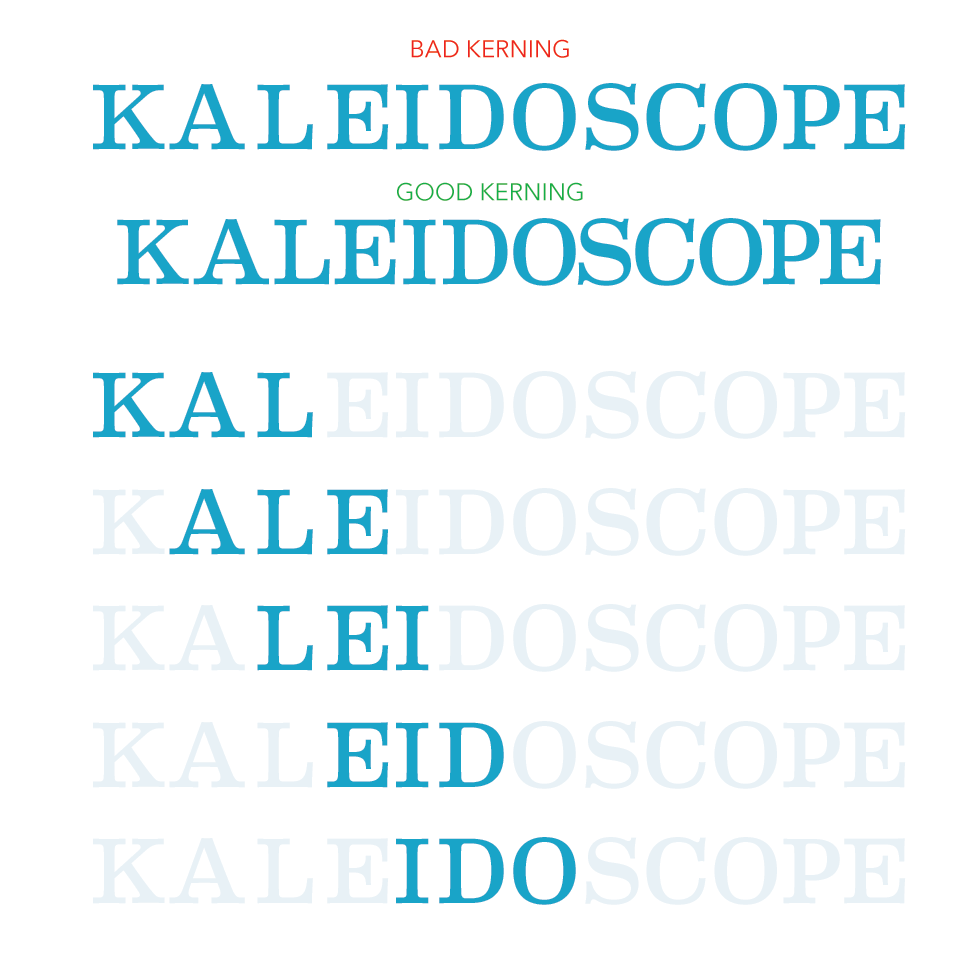
1) From the beginning of the word, look at the first three letters; cover the remaining letters if needed (as you become a kerning Jedi, you won’t need the blinders)
2) Do these first three letters look evenly spaced from each other? If not, expand or contract the spacing between the letter (s) in question
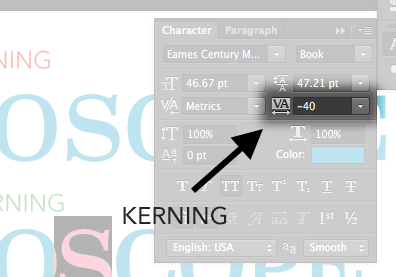
The controls in Photoshop, Illustrator and InDesign are very similar:

3) Now move to the next letter to the right and the 2 letters following it. Repeat Step 2.
4) Continue this process until you finish kerning the word
Bonus tip: Round letters like ‘O’ and ‘B’ need the letters next to them more tightly kerned on the side(s) with round edges. This is to compensate for the illusion that letters with rounded edges are farther away than letters with flat/perpendicular edges.

Categories:

Typography

Tags:

Mo’ Data, Mo’ Problems

Om Malik on Big Data:

Facebook’s emotion-driven-engagement experiments are tiny glimpse of what really awaits us: a data-driven and alogrithmic future, where machines make decisions on our behalf, nudging us into making decisions. As I pointed out in my recent FastCompany magazine column, the new machine age is already underway, unseen by us. “It is not really just a human world,” said Sean Gourley, cofounder and CTO of Quid who points out that our connected world is producing so much data that it is beyond human cognitive abilities and machines are going to be part of making sense of it all. So the real question is what will we do and what should we — the technology industry and we the people do? From my perspective, we need to start with the raw material of this algorithmic future: data. Whether it is a billions of photos that carry a payload of emotions, relationships and location data, or status updates announcing the arrival of a new one or those searches for discount Prada shoes or a look-up about a medical condition — there is someone somewhere vacuuming our data droppings and turning them into fodder for their money machine.
And:
Automation of our society is going to cause displacement, no different than mechanization of our society in the past. There were no protections then, but hopefully a century later we should be smarter about dealing with pending change. People look at Uber and the issues around it as specific to a single company. It is not true — drones, driverless cars, dynamic pricing of vital services, privatization of vital civic services are all part of the change driven by automation, and computer driven efficiencies. Just as computers made corporations efficient — euphemism for employed fewer people and made more money — our society is getting more “efficient,” thanks to the machines.
We live in a post now, ask questions later world.

Categories:

Community

Tags:

Soft News

From BGR this morning:

One of the main features Windows 9 is expected to offer users is the return of the Start menu, which Windows users are anxiously waiting for, and Myce has obtained new screenshots showing it. Initially expected to arrive in Windows 8 Update 2 that’s said to launch on August 12, the Start menu is now said to only be ready next year, when Windows 9 “Threshold” is released.
So this is where we’ve gotten to with Microsoft rumors. Outside of the massive layoffs, the only exciting product leaks involve a nearly 19-year-old software feature—the Start Menu.
Contrast this to Apple, where everyone is expecting a new wearable device this fall, and competitors have been scrambling to launch their own versions (regardless of how half-baked they all are), a new, bigger (thinner?) iPhone is expected and everyone was blown away at the number of new software announcements at WWDC 2014 for both OS X Mavericks and iOS 8.
Maybe next decade, Microsoft.

Categories:

Product

Tags:

Weekly Exhaust Ep. 9: El Gato Duerme Sobre el Mono

This week Michael and Bryan discuss creative habits, inspiration, dreaming in black & white, phone etiquette in cinemas, recording vertical phone videos, the simulated universe, Grand Theft Auto & super hero movies. They also want to remind you Rocky lost in the first movie. The episode opens with the exhaust from a 1971 Chevelle SS 454.
Weekly Exhaust, Episode 9

Categories:

Podcast

Tags:

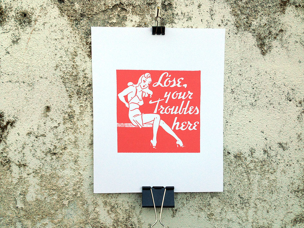
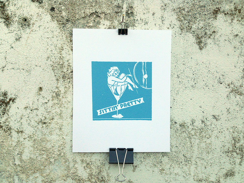
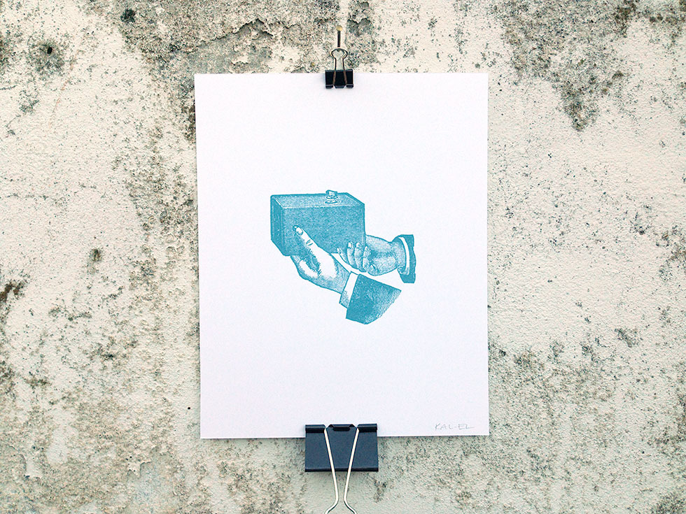
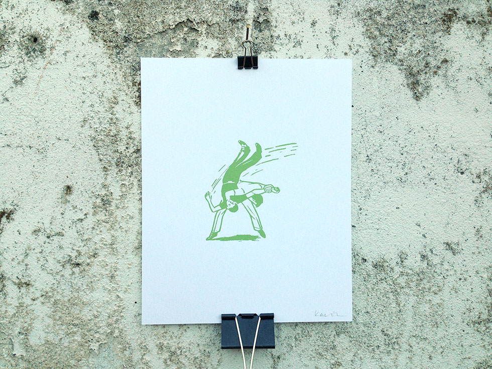
Scratching My Kitsch Itch

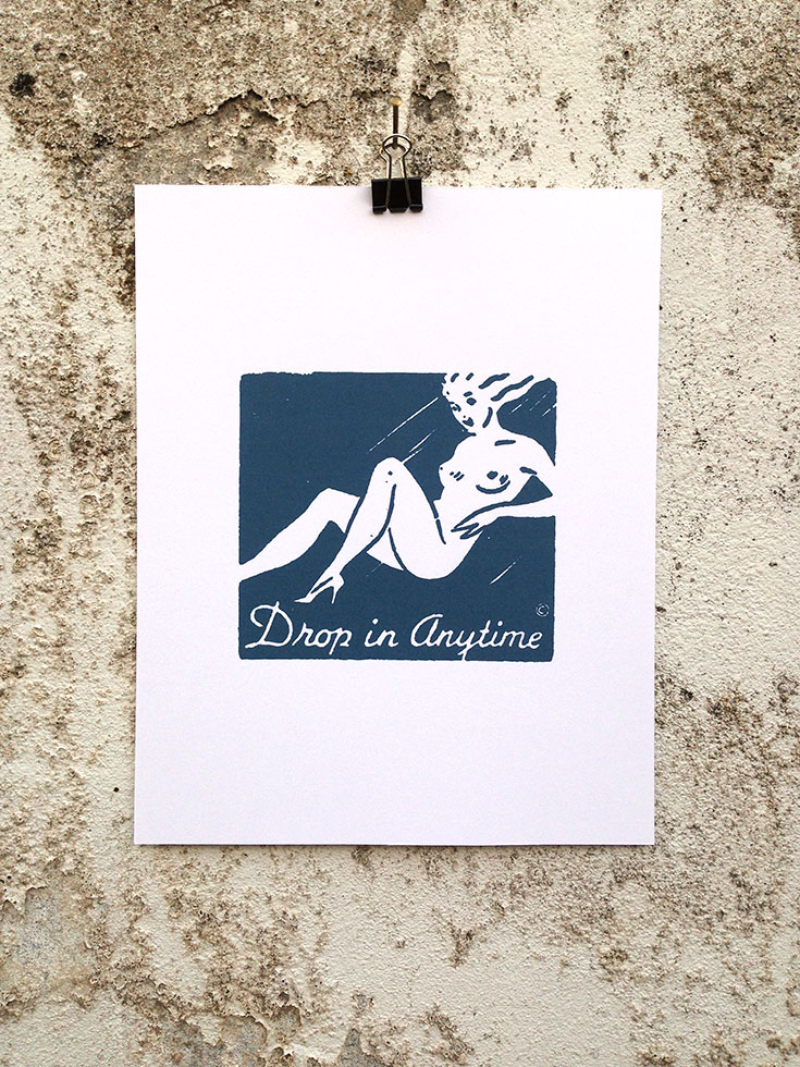
There’s new digital prints up at The Combustion Chamber.
I have an addiction to old, kitschy illustrations I find on matchbooks and in tiny ads in the backs of old magazines from the late 19th and early 20th centuries.
Making these prints is part of my therapy.


Categories:

Art

Tags:

Agreed

Now, there is the matter of the mob mentality who, yesterday, got all riled up about two things: 1) The new icon looks like the logo of Automation Anywhere and have claimed it was ripped off, and 2) the new icon looks like every sexual reproductive organ in the male and female anatomy. To the first claim: had you ever heard of Automation Anywhere before yesterday? Right, didn’t think so. To claim that DesignStudio or Airbnb copied or stole the logo is idiotic. It simply points to the fact that neither logo is highly original in its shape and that it’s possible that out of the millions of companies out there designing logos for themselves to arrive at similar solutions. To the second claim that the logo looks like testicles, a vagina, a butt, a penis, and an asshole — all already dutifully illustrated in this Tumblr (NSFW) — seriously, how old are y’all, 13? Grow up. It’s a fucking “A”.
—Armin Vit on the new Airbnb logo

Categories:

Branding

Tags:

Airbnb

Airbnb has new branding by DesignStudio.
It’s fun, fresh and really dig it.
Former NYTimes.com design director, Khoi Vihn disagrees:

I can’t pretend to know what went into designing the Bélo, but the end result is surprisingly tone deaf. This seems like a case of a still young startup that wants to assign meaning to its stratospherically successful brand so badly that it has quickly gotten in over its head. The story that Airbnb tells in order to contextualize its new identity seems similarly hamfisted and overly self-important to the point of satire. Airbnb is successfully disrupting the tremendous and staid lodging industry, but it’s hard to imagine this particular combination of pomposity and message mismanagement from say Holiday Inn.
Khoi wouldn’t have to “pretend to know what went into the design” because DesignStudio documented the process behind their work. I particularly like how the logo forms an “A” from two b’s facing in each other. It also looks like an upside-down heart.
Opinions are like assholes. Everybody has one (I do, Khoi does).
If Airbnb had crowdsourced a shitty logo over the weekend, they’d be getting chastised for putting to little effort into their branding. For Khoi, they’ve done too much. You’re damned if you do, and you’re damned if you don’t.
Personally, I live by the gospel according to Andy Warhol: “Don’t think about making art, just get it done. Let everyone else decide if it’s good or bad, whether they love it or hate it. While they are deciding, make even more art.”
The same goes for design.

Categories:

Branding

Tags: