The Grip Is Being Loosened

I’ve fallen behind on some links. This one is from last month, from Electronista:

Time Warner Cable is “hard at work at a cloud-based [TV] guide experience,’ but willing to allow third parties to create interfaces for it, says president and COO Rob Marcus. The executive revealed the information at an investor conference in New York earlier today. The catch, Marcus elaborates, is that Time Warner isn’t willing to forsake the “customer relationship,” meaning that it wants people to know TV is being delivered through TWC instead of a device maker or any other company.

The television door is getting pried open. It’s only a matter of time. Comcast? Time Warner? You’re interfaces suck really, really bad. I don’t think Apple should be the only one allowed to try and fix things. I’d love to see multiple solutions.

Because it’s clear fixing the Human Experience of cable television is not a high priority to cable television companies.

Categories:

Human Experience

Tags:

iOS 6 – Updates to Updates

Yesterday I posted a nitpick from iOS 6, so here’s something I like.

Now when you update apps in the App Store, iOS no longer yanks you out of the app to the Home screen. The App Store also no longer requires iTunes password authentication for free apps, just the paid ones.

Two minor updates adding up to a lot when you apply them across the dozens of apps on my iPhone (and iPad).

iOS6_updates.png

Categories:

Human Experience

Tags:

iOS 6 – Scrubbers & Sliders

It’s been a few weeks since I upgraded my iPhone 4 from iOS 5 to iOS 6.

Overall, things are good. There’s been some welcome improvements, some steps backward and little nitpicks here and there. I’ll start with one of the nitpicks.

In the music application, Apple has updated the styling on the track duration scrubber and the volume slider. Both elements share the same visual style, as they did in iOS 5, but for some reason it bothers me this time around. Now, the both read as differently scaled volume sliders to my eyes.

Perhaps this is because both of them are larger and have a more pronounced, brushed-aluminum style (I really hope Apple eases off the skeuomorphs in future OS versions).

iOS_Music_Player_Beck.png

I wonder if something like this doesn’t make more sense:

iOS_Music_Player_Beck_fixed.png

While both controls slide, they perform different functions and thus should have different visual stylings.

Categories:

Human Experience

Tags:

“MapQuest It”

There was a time I can remember when the common term for mapping a route on the computer was to “MapQuest it.”

I’m talking about the mid 1990’s until a few years after Google Maps came out in 2005. At some point after Google Maps had been around the ‘switch’ happened, and everyone started to gradually migrate over from MapQuest. Google Maps started out as the Student, and had become the Master.

Now, here we are in September of 2012 and Apple has ditched Google Maps for it’s own solution. The problem is, for some people in some parts of the world, this “solution” isn’t a solution at all.

In response to the backlash to the new Maps application in iOS, Apple’s CEO, Tim Cook, has issued an apology and has recommended we look to some third-party applications for help as they fix their maps. One of the services Cook recommends? MapQuest (via The Loop).

I find that so surreal.

Is that the Backstreet Boys I hear on the radio?

Categories:

Human Experience

Tags:

MySpace

Back in March 2007 I shut down my MySpace account. It was the end of a social media era for me and a lot of other people too. A year earlier I had joined Facebook and it was clear Facebook had a much better understanding and social media than MySpace did.

As everyone has seen, MySpace is back and they posted a beautiful demo video of it. And as far as I know, it is just that, a demo. Justin Timberlake owns a controlling share of the company (hence his strong presence in the demo video) and he seems intent on bringing it back to glory.

It brings to mind the current state of Windows 8. Despite it’s fresh Human Experience in mobile computing and non-skeuomorphized GUI, Microsoft is having a bitch of a time getting traction in the market. At the end of the day, Windows 8 isn’t ‘changing the game’. At the end of the day, they have a fullscreen, multi-touch display smartphone with cellular functions, video/music playback, mapping and texting. Just like everyone else.

Will a fresh, new interface be enough to convince people to go (back) over to MySpace? Are they changing the game?

I wouldn’t be doing my job as a multimedia designer if I didn’t at least test drive it.

Categories:

Human Experience

Tags:

I Changed My Mind

I decided to go ahead and install iOS 6, despite my decision a few days ago to wait (Who the hell am I kidding? I’m a huge geek and I’ve been using computers since I was 4 years old).
The reason? The more I read about mapping technology and listened to podcasts where people were discussed it, the more I realized I wouldn’t be helping the situation if I just sat out of the game.
As many people reminded me, some technologies, including mapping, can only get better when people are allowed to use it. Break it. Point out flaws in it. Mapping is one of those technologies. Google has been doing maps for 7 years (that’s 2 years before the iPhone launched). They’ve had a big head start in collecting data, improving it, adding amazing features like StreetView I’ve come to rely on. But they didn’t launch with StreetView, or transit directions or the high(er) fidelity satellite images they have today.
Now, for better or for worse, Apple has decided to build their own mapping service (At this point all we know is Apple had a 5 year licensing contract with Google for their Maps data and they didn’t renew the contract). It might not be as bare bones as Google Maps was in 2005, but it needs a lot of work.
I discovered the link in Apple’s Maps app you need to click on to ‘Report a Problem’. It’s too subtle in my opinion:
iOS_Maps_Report_A_Problem.jpg
So far, from the few routes I’ve plotting between places here in Los Angeles, nothing looks wrong, but I’ll be keeping my eyes peeled.

Categories:

Human Experience

Tags:

Maps

Yes, Apple’s Achilles’ Heel is services. Anyone who remembers what MobileMe was (or wasn’t) knows this.
The MobileMe debacle is where you can find one of my favorite Steve Jobs quotes:

“Can anyone tell me what MobileMe is supposed to do?” Having received a satisfactory answer, he continues, “So why the fuck doesn’t it do that?”

It looked like MobileMe was behind them with the revamped, North-Carlina-server-farm-driven iCloud service, but now we’re seeing Apple struggle with maps.
This is why I’m not an early adopter with new hardware and gadgets (online services is different, there’s no risk). Looking at the situation, I’ll be keeping my iPhone 4 on iOS 5 at least until the new year. Maybe things won’t be such a mess by then.

Categories:

Human Experience

Tags:

Crappy Maps on iOS?

I’ve been hearing a lot of good things about the new iPhone and iOS 6. I was originally planning on upgrading my iPhone 4 in a month or two, but I don’t like what Anil Dash is saying about Maps:

The classic criticism that thoughtless Apple haters use against the company is that it makes products that are pretty but dumb. Usually those criticisms are by people who don’t understand the value of a comprehensible Human Experience, frustrated by the reality that many people will eagerly trade the open-ended technologies of competitors for the simple and satisfying experience that Apple provides.

But this time, they’re right: Apple’s made a new product that actually is pretty but dumb. Worse, they’ve used their platform dominance to privilege their own app over a competitor’s offering, even though it’s a worse experience for users. This is the new Maps in iOS 6.

I use maps a lot. I used them a lot living in Manhattan and I use them a lot living in LA. Apple needs to step it up real quick on this.
I definitely won’t be upgrading my current iPhone to iOS 6. I don’t feel like being a guinea pig on this.

Categories:

Human Experience

Tags:

Time Flies

I was digging through the Daily Exhaust archives and came across the entry in 2008 where I retired my Palm Treo 650 after getting the original iPhone.
As I mention in the post, the syncing kept me loyal to Palm. The fact that my 2008 Treo 650 identity, contacts and applications originated on a 1999 Palm Vx is kind of incredible.
Also from 2008 is my first wish for the iPhone:

I want a program that will cache my RSS feeds so I can read them offline.

Yes, people, there was day before Instapaper existed (It was one of the first apps in the App Store in July 2008).
I also think my response to “what is the iPhone’s killer app?” still holds up well:

One answer is that the iPhone itself is the killer application. The way Google Maps integrates with Contacts which integrates with Calendar which integrates with Mail which integrates with Photos and Camera.

The fact that I can get an email from my friend Bryan, click on his name, get taken to his contact page, select his mobile number to call him, and while I’m on the phone with him, click on his address to find out where his apartment is, and then go back to his contact page to get the URL to his site so I can read his most recent entry.

That’s the killer app for me. All of it. Together.

Or:

The other way I could answer the question is – the App Store is the killer app.

To reference my first answer above, the iPhone has solved integrated communications. Every other app is just along for the ride and will be inherently derivative, only able to tap into the various Core Services (email, browser, maps, media playback) and since the App Store is the gatekeeper to all the apps, it’s the most popular application, by design.

Now that I think about it, ‘The App Store’ is a very appropriate name, since what you’re getting with most of the apps is just that – an appetizer.

The iPhone is the whole meal.

Categories:

Human Experience

Tags:

Long In The Tooth

Further evidence that iTunes is getting long in the tooth:
stopped_updating.jpg
The above alert window is confusing because I listen to multiple podcasts on my iPhone via the new-ish Podcasts application Apple dropped earlier this year and iTunes should know this and mark the ones I have listened to as ‘played’.

Categories:

Human Experience

Tags:

Improving…

The latest update (3.2) to the iOS Kindle app is out, and it is steadily improving on the iPad, although in incremental steps. The most significant change iPad users will see is the introduction of changeable margins, mirroring a feature already present for Android users. Users can now select between three different options, illustrated below:
kindle8_bl.jpg
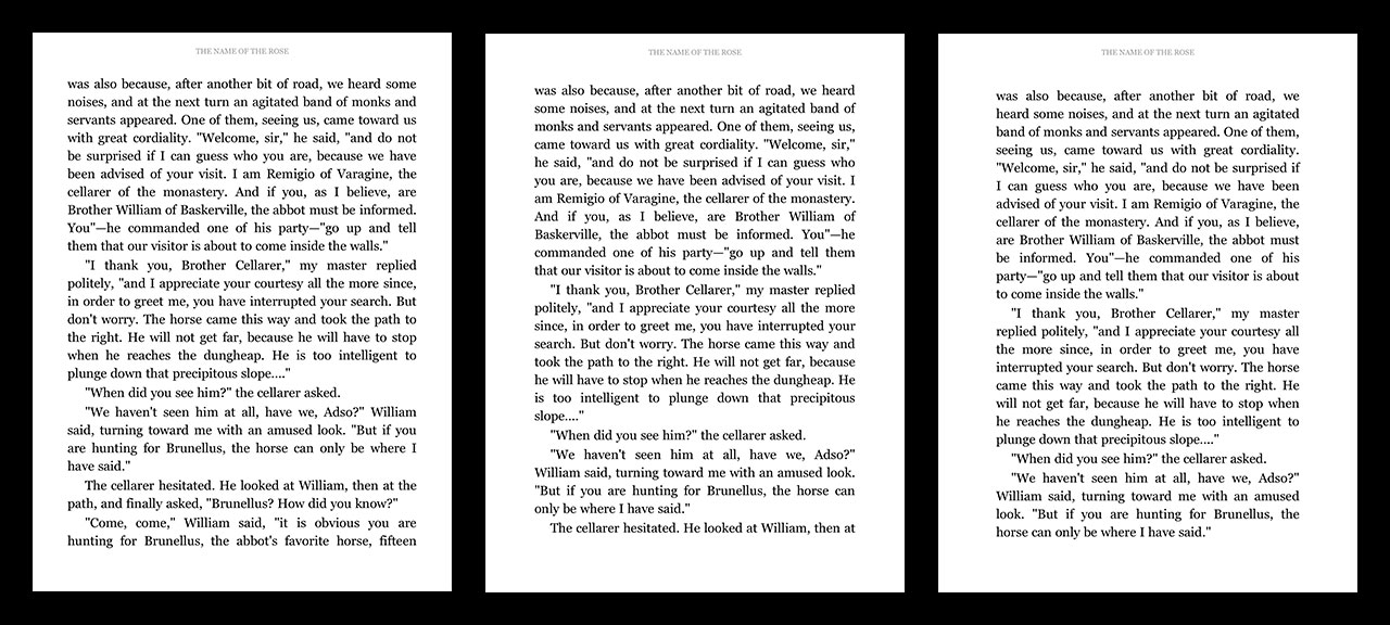
The first option, on the left, is close to the margins in the regressed update I covered in June, but there is a more comfortable amount of white space above and below the text. It’s a little crowded, but much easier on the eye than the blocky mess from the end of spring, which caused howls of protest on the app’s store page.
The best readability comes with the other two options. The second option is identical in width to the July update, with the text moved up slightly, while the third has left and right margins identical to that which was banished in the June update, with the leading opened up some. All in all, these three represent fine options for a user to choose from. In the future, it would be nice to see the app incorporate different fonts. The iBooks app, Apple’s answer to Kindle, lets a user choose from seven different fonts, while Stanza, the now unsupported reader app that Amazon owns, lets the user choose from all the system fonts that were available at the time of its final update in 2011. Once again, it boggles the mind that Amazon has a readily available reader app that is better designed and continues to draw nothing from it, that a user can see, at least.
Another feature from Stanza that I love is the ability to change the brightness of the screen with a finger swipe, rather than having to go into the options menu. It’s great for maintaining flow while reading. Curiously, the new Kindle update touts improved brightness controls, but what they seem to have done is lock the brightness with the iPad. That is, if a user changes the brightness controls within the Kindle app, it changes the brightness across the entire iPad, not just within the app. This is very odd.
Still, Kindle version 3.2 for the iPad is keeping pace with reader apps in general, as they go through the long process of becoming viable alternatives to printed books. Presentation is key. As soon as all reader apps figure this out, users will benefit greatly.

Categories:

Human Experience

Tags:

Still Not Baked

Back in June I thought Windows 8 looked half-baked.
Tim Edwards just reviewed it for PCGamesN (via DF):

The email app is horrendous. It is the worst email client I have ever used. It’s a full-screen Metro abomination that hides or is missing basic and vital functionality (search, column sorting, filtering). It’s full-screen, but only shows a small sample of your messages – so the screen real-estate is massively wasted. If you have multiple email accounts, there’s no combined inbox view. It’s slow to check and sync your email – unless you force a manual refresh. And the first time you use it, you will struggle to find the ‘send email’ button. Pro-tip – it’s the (+) in the top right.

Yep. Still not baked.

Categories:

Human Experience

Tags: