sit or start

For the last few months my team and I at Roundarch have been working with Bloomberg Sports on Decision Maker for iPad.We’re happy to announce it’s now live and available for purchase from Apple’s App Store.
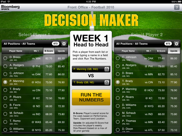
Decision Maker is an application that lets you analyze any two NFL players using custom algorithms that determine who the optimal choice is.The player with the higher B-Score is the better bet that week. B-Score, the ‘Bloomberg’ Score, is based on factors that include his Performance, Opponent Matchup, Team Support and Game Conditions for that week.
BB_NFL_configure.jpg
We tackled the project holistically, from concept and Human Experience flow down to the user interface design, iconography and branding. One of the goals throughout the project was balancing simplicity and complexity. It had to be simple enough for novice fantasy players but also provide the complexity and details advanced fantasy players look for.
We encounter this simplicity as soon as the application loads – select a player from column 1 and one from column 2 (or use the auto-complete fields in the middle) and click ‘Run The Numbers’. Alternatively, you can refine your search from All NFL to just a position or team through the settings button at the top of each table.
Once we Run The Numbers, we’re taken to a head-to-head view of the results of our player comparison. Once again, we’re start out in the top half of the interface with the most essential information – do I sit this player or do I start this player?
BB_NFL_summary.jpg
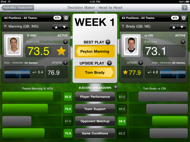
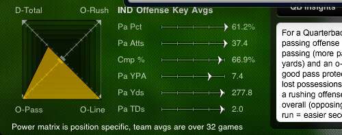
As we move down to the lower half of the screen, we can view the details that make up the scores. Even for those who might not initially want to see or understand the data presented below, the interface is designed to encourage users to drill down and explore the various factors. Everything is tap-friendly and provides more context and information – from the risk/reward chart overlay to info tool tips, to radar chart tips.
BB_NFL_detail_radar_chart.jpg
BB_NFL_detail_weather.jpg
A big thank you to everyone from Roundarch and Bloomberg Sports who made this application a reality.
iTunes App Store: Decision Maker – Football 2010 for iPad

Categories:

Uncategorized

Tags:

emerging adulthood?

The NYTimes asks, What Is It About 20-Somethings?

It’s happening all over, in all sorts of families, not just young people moving back home but also young people taking longer to reach adulthood overall. It’s a development that predates the current economic doldrums, and no one knows yet what the impact will be — on the prospects of the young men and women; on the parents on whom so many of them depend; on society, built on the expectation of an orderly progression in which kids finish school, grow up, start careers, make a family and eventually retire to live on pensions supported by the next crop of kids who finish school, grow up, start careers, make a family and on and on. The traditional cycle seems to have gone off course, as young people remain un­tethered to romantic partners or to permanent homes, going back to school for lack of better options, traveling, avoiding commitments, competing ferociously for unpaid internships or temporary (and often grueling) Teach for America jobs, forestalling the beginning of adult life.

Categories:

Uncategorized

Tags:

They want Google to tell them what they should be doing next.

William Gibson, in an op-ed piece for the NYTimes:

Science fiction never imagined Google, but it certainly imagined computers that would advise us what to do. HAL 9000, in “2001: A Space Odyssey,” will forever come to mind, his advice, we assume, imminently reliable — before his malfunction. But HAL was a discrete entity, a genie in a bottle, something we imagined owning or being assigned. Google is a distributed entity, a two-way membrane, a game-changing tool on the order of the equally handy flint hand ax, with which we chop our way through the very densest thickets of information. Google is all of those things, and a very large and powerful corporation to boot.

Categories:

Uncategorized

Tags:

Vision In Motion

Design has many connotations. It is the organization of materials and processes in the most productive, economic way, in a harmonious balance of all elements necessary for a certain function. It is not a matter of façade, of mere external appearance; rather it is the essence of products and institutions, penetrating and comprehensive. Designing is a complex and intricate task. It is integration of technological, social and economic requirements, biological necessities, and the psychophysical effects of materials, shape, color, volume, and space: thinking in relationships.

–Lázló Maholy-Nagy, Vision In Motion, 1947 (via Daily Icon)

Categories:

Uncategorized

Tags:

helping out those feeble electric currents

audion_triode_tube_1906.png
Nick Carr has posted a chunk of his new book, The Shallows: What the Internet Is Doing to Our Brains:

De Forest couldn’t have known it at the time, but he had inaugurated the age of electronics. Electric currents are, simply put, streams of electrons, and the Audion was the first device that allowed the intensity of those streams to be controlled with precision. As the twentieth century progressed, triode tubes came to form the technological heart of the modern communications, entertainment, and media industries. They could be found in radio transmitters and receivers, in hi-fi sets, in public address systems, in guitar amps. Arrays of tubes also served as the processing units and data storage systems in many early digital computers. The first mainframes often had tens of thousands of them. When, around 1950, vacuum tubes began to be replaced by smaller, cheaper, and more reliable solid-state transistors, the popularity of electronic appliances exploded. In the miniaturized form of the triode transistor, Lee de Forest’s invention became the workhorse of our information age.

Categories:

Uncategorized

Tags:

data visualizations – appearing to be useful

Sometimes that’s all they’re doing.
Case-in-point: Stephan Thiel’s B.A. thesis at the University of Applied Sciences Potsdam. He attempts to understand Shakespeare through visualizations:
understanding_shakespeare_romeo_and_juliet.gif
I ran this by my brother Mark, because he’s long been a huge fan of Shakespeare. This was his take (via email):

Shakespeare’s not very difficult. Probably the hardest part of reading Shakespeare is the learning curve: there are a lot of words in his plays that have fallen [into] disuse…so you have to learn a bunch of new vocab. Once you have those down it becomes much more manageable. Also, some of the plots can get convoluted, though that’s where a lot of the comedy (and deceit in the tragedies) comes from. i.e. “She’s disguised as a guy, but this other guy doesn’t realize it and he’s talking to her like she’s a he, etc…”
I can’t imagine how these visualizations are of any use.

I agree with my brother. I feel that Thiel’s thesis is very high-level and doesn’t help me understand Shakespeare any better.
It brings to mind one of the many great data visualizations from the New York Times, The State of the Union in Words: A Look at the 34,000 State of the Union Words Delivered of George W. Bush.
nytimes_state_of_the_union_address.gif
What we get with the NYTimes graphic is context. We can tell what the focus was for different years, repeated themes and we also can click on a specific word and get the exact place where it was used in the speech.
I should make it clear that I find the quality of Thiel’s thesis top notch – from data mining to final printed output. It’s beautiful. All he needs now is more context, more questions answered. So he did all this work – what is his conclusion? His insight?
Other than pattern recognition, I walk away from his thesis not knowing any more about Shakespeare than I did coming in.
The preface to The Picture of Dorian Gray comes to mind:
We can forgive a man for making a useful thing as long as he does not admire it. The only excuse for making a useless thing is that one admires it intensely.

Categories:

Uncategorized

Tags:

disruption in publishing

Seth Godin decides he’s no longer going to publish books the traditional route:

The thing is–now I know who my readers are. Adding layers or faux scarcity doesn’t help me or you. As the medium changes, publishers are on the defensive…. I honestly can’t think of a single traditional book publisher who has led the development of a successful marketplace/marketing innovation in the last decade. The question asked by the corporate suits always seems to be, “how is this change in the marketplace going to hurt our core business?” To be succinct: I’m not sure that I serve my audience (you) by worrying about how a new approach is going to help or hurt Barnes & Noble.

Categories:

Uncategorized

Tags:

asymmetries, disruption and innovation

Wow, how much to I love this article, The Innovator’s Battle Plan:

Asymmetries allow disruptive attackers to enter a market, grow without incumbent interference, and mitigate the incumbent’s response when it is finally motivated to counterattack. The result of asymmetric battles often is the seemingly sudden end of a great firm. From the incumbent’s perspective, every action it takes is rational. But the outcome is devastating. Disruption is the strategy that creates and capitalizes on asymmetries of motivation and skills.

Found via one of my new favorite websites, Asymco (I can see where that name came from now):

Categories:

Uncategorized

Tags:

Design in the Age of Multi-Touch Reproduction

PSFK asks, Is The Touchscreen Killing Or Reinventing Design?
Good friggin’ question. Actually, it’s a decent question, but a bit general. A better question would be, Is The Touchscreen Killing or Reinventing Industrial Design?
Right now and for the foreseeable future, the answer is yes, the touchscreen is killing industrial design. We’re replacing real clocks, calculators, compasses and keyboards with virtual ones on screens. Not only are we killing industrial design, but we’re also killing the enjoyment of touching physical objects. Pressing real buttons, typing on real keys. We’re replacing physical feedback from physical products with haptic, aural and visual feedback from virtual devices. Real buttons that make click-sounds and spring back from real springs are now WAV files of click-sounds and animations of up, hover, press and release states.
We’re living in the age of skeuomorphs:

A skeuomorph is a derivative object which retains ornamental design cues to a structure that was necessary in the original. Skeuomorphs may be deliberately employed to make the new look comfortably old and familiar, such as copper cladding on zinc pennies or computer printed postage with circular town name and cancellation lines.

I grabbed this word from Adam Greenfield’s blast on Apple (via Daring Fireball) and their overindulgence in this area:

The iPhone and iPad, as I argued on the launch of the original in 2007, are history’s first full-fledged everyware devices — post-PC interface devices of enormous power and grace — and here somebody in Apple’s UX shop has saddled them with the most awful and mawkish and flat-out tacky visual cues. You can credibly accuse Cupertino of any number of sins over the course of the last thirty years, but tackiness has not ordinarily numbered among them.

While the loss of analogue devices can be sad and their digital replacements can be lacking in responsiveness, I don’t think the retro TV shell by frog creative director Jonas Damon is anything more than cute decoration. While Apple creates digital skeuomorphs, Damon makes analogue skeuomorphs.
tv_3.jpg
The Wii steering wheel is example of transcending a skeuomorph and providing actual, functional value to a non-analogue device. In the absence of the wheel, the Wii controller doesn’t lend itself well to driving:
wii_steering_wheel.jpg
We’ll reach a point in the future where digital devices will be able to give us physical feedback – be it tactile, aural or olfactory, but we’re not there yet. We’ll continue to see skeuomorphic crutches for out digital devices and these crutches aren’t always bad.
iOS_vs_Windows_Phone_7.jpg
While Greenfield can argue Apple has the skeuomorphic dial up to 11, I much prefer this to the complete lack of substance in the Windows Phone 7 user interface. With that said, I do agree Apple can go heavy on the GUI sauce (see my post on The Goddamn Page-Turn).

Categories:

Uncategorized

Tags:

What’s the point of Twitter?

I hear this a lot, both by people in and outside the web industry.
Over at frog design’s design mind blog, they recently hit the 100,00 follower mark and explain what this milestone means. Here are a few points that stood out to me:

If there’s one truth to this milestone, it’s that a social network doesn’t exist on its own. Unless you’re a pop star with an audience already in place like LeBron James, who opened a Twitter account and got 650,000 followers in seven weeks, I believe it’s impossible to attract such a following without also having an ecosystem of complimentary initiatives in place, namely a rich and always-fresh supply of content to share, a community of actual people that you actually talk to (not just Twitter accounts), and a dedicated person or team to care for and feed the social media conversation

Why people follow them, and the responsibilty that goes with 100,000 followers:

There is a reason people continue to follow us on Twitter, just as there is a reason conferences want our magazine at their events or indeed, why people want to continue to do business with us. They trust us. If anything, reaching the 100,000 follower mark on Twitter is a reminder of the responsibility we have to be thoughtful curators of relevant news, trends, and debates, even when those debates involve our competitors.

Regarding ROI (return on investment):

Now that frog has reached 100,000 followers, we are officially considered an “influencer” by analyst firm Forrester, which means we can augment conversations on the Social Web, instantly broadcast content to a wide, relevant audience, and use that reach as an asset in our relationships with clients and conferences.

The the most negative comments I hear people make about Twitter always focus on the mundane, trivial and adolescent tweets. That’s easy, and yes, there’s plenty of dumb shit out in the Twitosphere.
But there’s also the people and companies I follow. Twitter streams I find thought-provoking, hilarious and insightful, like frogdesign, kanyewest and mullerbrockmann.

Categories:

Uncategorized

Tags: