Some People Prefer Analog

I have a client that has never seen the website I designed for her.
I launched the site 6 years ago.
Correction – She saw it once when I burned her a CD-ROM of it so she could view it on her laptop.
She doesn’t have Internet at her business or home but understands (now more than ever) the value of an informative web prescence. Over the years she has invested money in CitySearch and has become fanatical about her keywords and description. Street traffic in her neighborhood in Manhattan has dropped significantly over the years, being replaced by digital street traffic on Google.
This past weekend I shot some new images for her website.
Along with the image updates, she also wanted to review all the pages so she can edit the copy.
She asked that I send her printouts via postal mail.
Wow.
It’s so archane, but I actually got a little excited folding up the printouts, sealing them in their envelope and dropping them in the mail.
It was a combination of feeling like I was getting punk’d and being involved in some weird art experiment.

Categories:

Advertising, Technology

Tags:

SilverLoad

I installed the Silverlight plug-in on my computer at work. I knew that Microsoft had created an inferior, derivative product to Adobe Flash, but I went with the thinking of the Godfather – keep your friends close and your enemies closer.
Well, I’ve seen it and interacted with it, and the company I work for is doing their best to make lemonade of the lemon that is Silverlight.
Silverlight isn’t worthy of being an enemy.
Or competitor.
It’s third-rate. Bush league. Meh.
I’ve been using Flash for 9 years, and over those 9 years Macromedia …and then Adobe, have continued to make more and more improvements to it. You’re telling me that I should consider a new program that is in many respects equivalent to Flash 3?
Some developers out there will correct me and point out all the integration points that can be made with Silverlight. My reply to this imaginary combative developer is that presentation is essential. You have to look good.
If you look good and sound good – you’re in a good position.
If you work well too? You’re set.
Microsoft sees looking good and working well as two separate entities, when they should realize this equation:

working well + looking good = great design

Categories:

Technology

Tags:

Distillation

So the second project I’ve assigned to my interactive design class at Rutgers Newark is to design a widget (like the ones on your iPhone and Dashboard).
The strategy behind the widget is to create something that would help them with their day-to-day college schedules. It’s a widget and not a website, so they have to focus on one or two (maximum) functions. Widgets are all about distallation, both visually and informationally.
The widget could delivery information specific to the student, or it could be something all the students of Rutgers could use.
The students should not limit themselves to what they think is possible. They should start out like this:
Wouldn’t it be great if there was a widget that let me see…. [insert functionality]
It’s going to be a really fun project. I wish I had time to build a widget too. 🙂

Categories:

Education, Technology

Tags:

Soft!

Yes. This is what you get when a Microsoft eats a Yahoo!
Soft!
So Microsoft is offering $44.6 billion for Yahoo! Great, good for them.
This whole deal is soft.
I mean, this whole deal is Soft!
If Microsoft has proven anything with its many acquisitions, it’s that money can’t buy you market dominance (licensing your product can, which is why they are where they are today).
Daring Fireball has a great little breakdown of things.

Categories:

Art, Image, Technology

Tags:

RAW RAW

I don’t many people who dig her, but M.I.A. rocks. She’s weird, innovative and extremely talented, drawing on tons of musical references and genres.

Categories:

Music

Tags:

Know the Ledge

Educators have a lot of power.
I somewhat understood this when I started teaching at Rutgers University in the fall semester of 2007, but I didn’t have that Eureka! moment until I started this spring semester for 2008.
The class I’m tag-team teaching along with Professor Brenda McManus is Interactive Design. The first project is get into teams of 2 and audit a website (from a pre-selected list we created). They have to break down the site through the scope, strategy, skeleton, and surface (based on James Jesse Garrett’s Elements of Human Experience) and then make a presentation to the class on their research.
I told the students they have many options on how they can present – Powerpoint, JPGs, PDFs – whatever form they feel most comfortable with and which is most appropriate.
While keeping things open to the class I strongly recommended they all open GMail accounts. I explained that using their Google accounts allowed them to not only collaborate with each other remotely (remember how crazy college schedules can be), but it also had Google Presentation – an alternative to Microsoft Powerpoint. I told them that this was how Brenda and I collaborated when we were developing class assignments.
It was at this moment that not only realized the power of a good educator – but also how collaborative paradigms are completely changing AND how I could effectively sway students away from Microsoft products and services. I feel the need to move the students away from Microsoft products, not because I don’t like Microsoft – but because Microsoft does not make well-designed software and products. Google Docs is a better alternative.
Prior to that moment I took things like Google Docs and Basecamp and all the other web-based applications for granted.
Prior to that moment I was talking the talk, but not walking much walk.
I guess I didn’t know the ledge.

Categories:

Education, Technology

Tags:

Flickr with a Purpose

So I’m a little late this this, but FFFFound is hot. Very hot. I think of it as Flickr with a purpose, or Flickr with a brain or something. Dalematic told me, “It’s better than going to the bookstore …almost.” What is great about the site is the simplicity. It’s easy to start browsing just the images that speak to you.

Categories:

Art, Image

Tags:

My First iPhone Wish

Ok, I’ve got my first “wish-I-had-this-on-my-iPhone” item. No, cut-and-paste is not on the list, surprisingly.

I want a program that will cache my RSS feeds so I can read them offline.

Like when I’m in the subway or don’t have a WiFi or mobile signal.

Categories:

Mobility, Technology

Tags:

 / 

Those Were the Days

Remember back in the day when you were using Netscape 4.47 – if you resized your browser window it would wipe out all your CSS to Times Roman?
…so you had to include a Javascript to refresh the page when the window was resized?
Yeah. Those days sucked.

Categories:

Technology

Tags:

Talent

So we just hired a great interactive art director at Schematic. His name is Victor Brunetti, and he’s the kind of person you need in today’s digital design world. He knows design and he knows code – and then he knows how to cook em into amazing experiences.
I hold hybrid designers like this in high regard. Probably because I’m one as well. 🙂
We’re like the mixed-marital artists of web design.
We’re dangerous.
*also check out Victor’s blog. I just found a killer link to Nitro Group on there. Damn!

Categories:

Uncategorized

Tags:

Combustible Webclips

So I’ve retired my Treo 650 (I will write a separate entry on that topic) and replaced it with an iPhone. As I suspected, the iPhone is an incredible device and I’m already changing the way I work and organize myself.
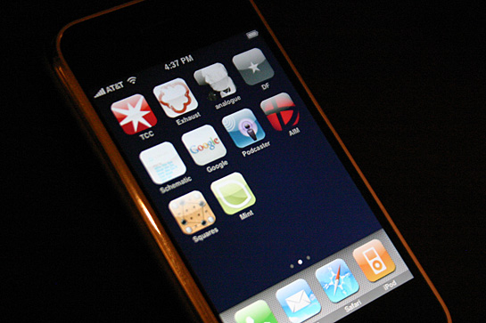
One of the great features is the ability to make ‘webclip’ icons for your home screen. In essence, they’re just bookmarks to websites, but like favicons, its another way to customize your site – or entend your branding/identity. The way you implement a webclip is similar as well – just drop a 60×60 pixel PNG file on the root level of your public server folder and name it ‘apple-touch-icon.png’.
iphone_tcc.jpg
More on iPhone webclip customization at AisleOne and cameron i/o (via Shaun Inman)

Categories:

Uncategorized

Tags:

Exercise In Futility

Edward Tufte has contributed a lot to visual communications, but I’ve put him in the category with people like Hillman Curtis – people who’s ideas and non-design work are more important than their visual contributions. His books are intelligent, beautiful and well constructed – christ the guy has his own printing press.
…but
…with that said – Tutfe needs to shut up with his critique on the iPhone.
In a video on his website, Tufte shows how smart the iPhone interface is.
WOW! Really?! It’s innovative? Apple has simplified things? They’ve eliminated scrollbars? Get out of town!!! Thanks Eddie, I would have never figured that out for myself.
Let me get in a Ferrari and show you why its an amazing car.
Thank you Captain Obvious.
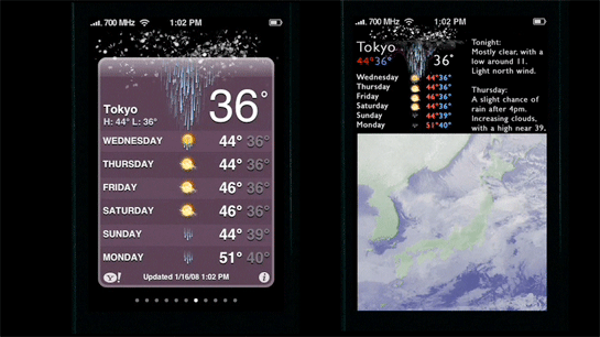
And then to my second point, on which I agree with Jon Gruber – his critique of the weather widget is completely misguided. What’s funny is he gives a side-by-side comparison of the Apple weather widget next to his ‘improvement’ which is hardly legible. It makes me wonder if Tutfe designed his screen interface on his printing press. What size slugs did you use? Was the type set in picas instead of pixels or ems?
iPhone screen side-by-side with Tutfe's crappy improvement
This reminds me of an article in Wired magazine where they asked a handful of artists and designers how they would redesign the Google homepage. This, like Tufte’s iPhone widget ‘improvement’, was an exercise in futility. None of the redesigns hit anything resembling a target. They were self-indulgent interpretations by artists egos that didn’t take into account brand consistency or relevance to the public at large.
On a related note, Tutfe needs to lay off the Gill Sans, it’s not the best screen font, and Eric Gill was a sicko according to this post by Jason Kottke.

Categories:

Uncategorized

Tags: