I’m Not You
—Glad I’m Not You, The Morning News (quoting Avenue Q)
—Glad I’m Not You, The Morning News (quoting Avenue Q)
Laredo Lloyd on Tim Duncan:
Shaq won three titles with Kobe, one without him, was All-NBA 1st Team eight times, and was the most dominant presence in the game. Kobe, of course, won those three rings with Shaq, two without him, was All-NBA 1st Team 11 times, and was the best post-MJ wing in the game. Ultimately, the greater basketball universe just kind of collectively shrugged and agreed Kobe was the one, and the “best players of their era” cannon was then complete: Bird and Magic, then M.J., then Kobe (and now LeBron).
Alas, we were wrong. Kobe wasn’t the one. And neither was Shaq. It was Tim Duncan.
It was always Tim Duncan.
I find this piece interesting, and I barely follow sports (although I used know a hell of a lot more about basketball in the 90s when I was in high school).
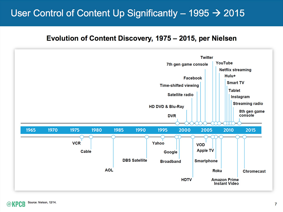
Mary Meeker’s Internet Trends 2015 Report is out.
If you’ve never seen her report, I encourage you to do so. You might see a lot of statistics you either already know or consider obvious, but it’s an extensive and extremely thorough look at the state of the Internet.
Here’s just a few slides that stood out to me.
The evolution of content discovery:
I know a lot of old farts who don’t let their phones leave their sides:
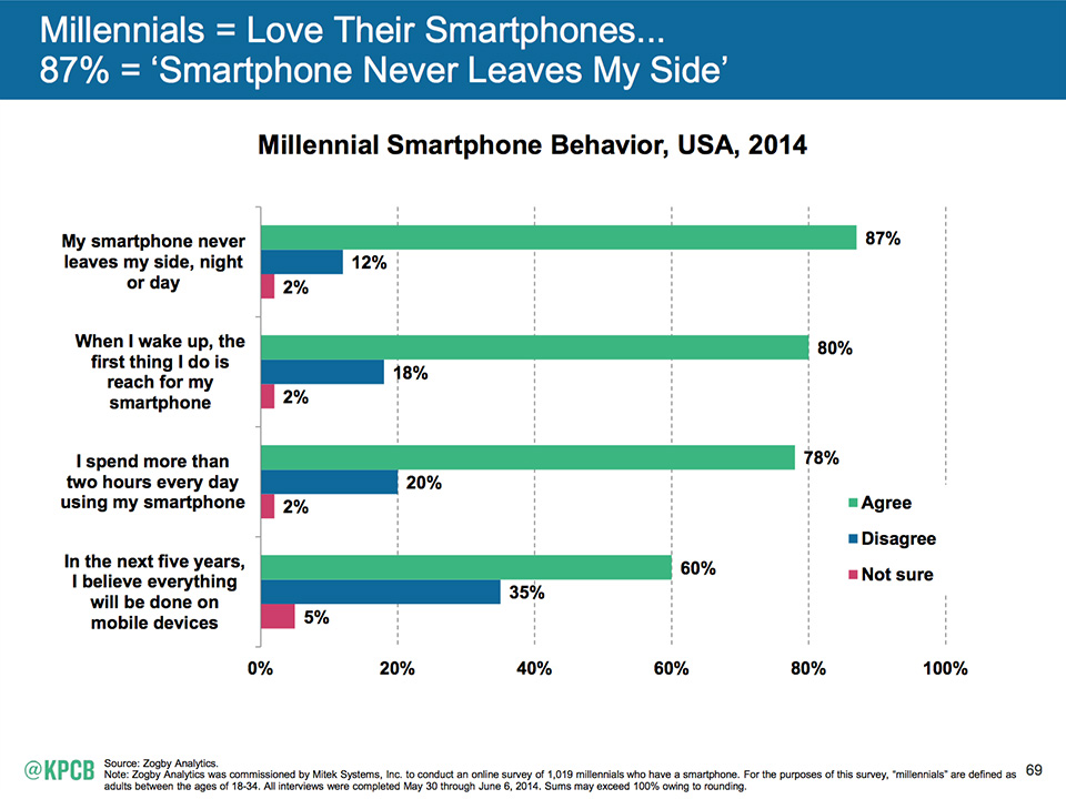
…AND CAN WE STOP CALLING THEM PHONES?!
I will never forget the first time I realized we were ripping people off. It’s the one and only time in my life that my older brother, a very gentle person by nature, swore at me. A pretty young woman, maybe twenty-three at the oldest, with one baby in her arm and another in a stroller, had been waiting about an hour, and I drew her number. When she came to the counter I was already sick to my stomach. She wanted to sell her diamond engagement ring and her gold wedding band. I had been taught the trick of how to buy gold. I could have weighed her ring on a gram scale and offered her that price immediately, but I knew you always bid on the biggest item first, because then the smaller offers for cheaper items feel less important, like small change.
—Clancy Martin, We Buy Broken Gold
On Episode 36 of Weekly Exhaust Michael and Bryan discuss discuss the GWB, the Indy 500, NASCAR, F1, Big Sur, Mad Men, cable tv, high school reunions, blogging, and crappy expensive Internet in the U.S.

Over at the AIGA, Liz Stinson on an experience by Errol Morris and Michael Bierut to determine if a font can make us believe something is true:
The toothsome paperback provides an intriguing look into an intuitive but little understood truth: typefaces can have an emotional and psychological impact on us. To appreciators of typography (and Kanye West) this probably sounds like a pretty obvious statement. Of course typography has an impact on our judgement; we’re just not always conscious of its effects. And why shouldn’t it? Typography is but one of countless environmental factors that influence our perception of truth or falsity. Morris, for his part, recently said during an interview: “It’s absurd to think that we would be nudged by one typeface over another, into believing something to be true. Something disturbing about it, I’d go so far to say.”
We judge people by their the tattoos on their bodies, the clothes they wear, and the cars they drive why not the fonts they use?
Well I’ll be damned.
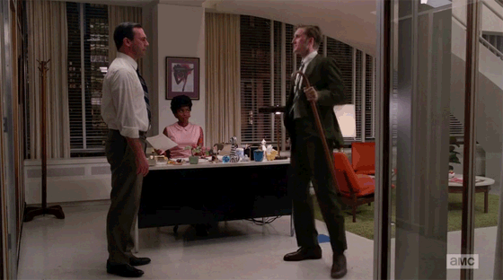
Ken Cosgrove got a story published in The Atlantic:
The south side of the tree, Fitz had once explained, gets the most direct light from the sun. The heat, day after day, would warm and soften the sap, making it more pliant, more easily yielding to our desires—as if, I thought with a chuckle, it had availed itself of Secor laxatives. Fitz held the compass in an outstretched arm, eyes narrowed toward the hovering needle. It shook like a Relax-a-cizor. He moved slowly around the narrow perimeter of the tree trunk, circling, slowly, until, with the strength of Right Guard deodorant and the confidence of Richard Nixon—
“Here,” he said.
He had found the spot for the tap. He drilled; he hammered the spile. The trunk shook with each impact. I imagined the sap—soon, the sap—slow and sweet, its trickle as voluptuous as a siren wearing both a red dress and an even redder shade of Belle Jolie lipstick.
What about the t-shirt itself? Surely we can at least agree on that, you plead. Absolutely. A t-shirt is a t-shirt is a t-shirt… except when it’s not. A t-shirt is not just a t-shirt when you care about, say, how long it will last or whether it boasts your favorite sports team’s logo or your rival’s, or, in fact, whether it has a genuine copy of your team’s logo as opposed to a shoddy ripoff. You might care where and how the shirt was made. In America? By people being fairly compensated and well-treated? It might matter a lot to you if the t-shirt profits are going to a mega-corporation or a mom-and-pop shop. All of these attributes—and many more—are integral parts of what it is exactly that you are purchasing.
—Nathan Peretic, Better Than Cheap
Great points throughout Nathan’s post. I especially like, “there is no cheaper version of the same thing.” Amen.
via Dinosaur’s Pen
Interesting new approach to harnessing the wind:
Farms dotted with the gigantic spinning blades of wind turbines have become a standard sight on long-distance road trips, but what if there was another way to capture energy from the wind? A startup out of Spain is working on that very idea. The company’s called Vortex Bladeless, and its turbines look like stalks of asparagus poking out of the ground.
Instead of using the wind to rotate a blade, the company’s pillars shake back and forth from the vortices created by the movement of air around the structure. Engineers look to avoid these forces when designing buildings and other structures, but the Vortex turbine takes advantage of this phenomenon to oscillate in the wind. Typically, a structure can only be optimized to oscillate at the specific frequencies caused by a certain wind speed, but Vortex says it is using magnets to adjust the turbine on the fly to get the most from whatever the wind speeds happen to be. Once the structure starts vibrating, an alternator in the base of the device then converts the mechanical movement into electricity.
The solution to the problem lies within the problem itself.
The story behind the first Photoshopped image*.

*According to Adobe, you’re not supposed to use “Photoshop” as a verb.
I don’t give a shit. They should be happy they’ve become part of popular culture and nomenclature. You google things on the Web and you photoshop images. End of discussion.
Centered type. Likely set in Futura Bold. A logo with two long forms crossing each other like an “X”, usually with four distinct icons in each of the four quadrants. An emphasis on authencity and materials in the rich, photographic backdrop of the website.
We’ve all seen this vernacular in graphic design over the last 5 years. It’s become very popular, even when the characteristics described above don’t match the product or service being pimped on the website.
This doesn’t mean this approach is wrong or contradicts the product or service, it’s just a popular trend.
Take the website for Maine Quarterly.
It’s a gorgeous and well-built website describing and showing different facets of Maine. If there’s any website (or US state) that has a good reason to adopt an identity comprised of old type, wood, iron, forests and hand tools it’s Maine.
Nice work.
Despite a $20 million Kickstarter campaign, Pebble is in trouble?
The company, which recently raised $20 million in a wildly successful Kickstarter, currently has 150 employees and is still hiring. Even with the crowdfunding infusion – which amounts to about $18 million after fees – the company is shopping for VC money in order to maintain growth and turned to a bank loan “in order to stay afloat.”
These start-ups that need continual injections of money sound more like junkies than legitimate companies.
“I promise man, this is the last time I’m going to ask you for money… I’m cool, I’m cool. Vegas cleaned me out, but I’m a new man now.”