I thought I would miss Live Tiles but I don’t

Eric Shupps used a Windows Phone (he actually used a phone that ran the operating system, Windows Phone, so he used a Windows Phone phone but that sounds totally fucking stupid so I’m not using it outside of these parentheses) for 2 years then he switched back to an iPhone.
Here are his findings.
It’s great to hear a review from someone who has actually used two operating systems before he both praises and talks shit about them both.
His conclusion? He’s sticking with his iPhone, but both platforms have their problems (Microsoft’s has more problems) and he’s a self-admitted “Microsoft guy”.

Categories:

Human Experience

Tags:

Having A Fitts

I’ve been bruising up Android real nice lately, pointing out the things Google still isn’t getting right with the operating system, but today I have to turn my attention to Apple.
Yesterday, iClarified posted pictures of the iOS 7 beta release, which Apple just seeded to developers.
Here’s a before-and-after:
iOS7_beta3.png
Why have Apple’s UI designers gotten into the bad habit of making the sizes of hit areas on buttons smaller?
This is the same problem we have with the iOS 7 music app I wrote about in November.
I’ll repeat myself for the millionth time: when you make hit areas on user interfaces smaller, they’re harder to click/tap on. I didn’t conceive of this. Paul Fitts did. This is excusable if you’re cramped for space, but the places where Apple is choosing to be stingy with screen real estate just doesn’t make sense.
There’s plenty of room for nice, big beautiful buttons. Use it.
This is a beta release, so let’s hope Apple reverts to the current button style.

Categories:

Human Experience

Tags:

Android UI Design Improvements

Based on some of the feedback I’ve received on my mini-rant about the poor state and Android UI & UX design, there is definitely a contingency of people out there who feel everything is great in Android land.
Luckily, there’s also people who acknowledge the work that needs to be done to improve Android’s design.
These headlines caught my eye today:
BGR: Leaked photos may reveal Samsung’s gorgeous new Android interface
To be clear, the screenshots in the link above are interesting looking, but the font choice is far from great. It resembles Gill Sans, a typeface known for it’s problems, not the least of which is how bad it looks in title case (it should only be used in all caps).
And this one, also from BGR:
BGR: Is Android’s iPhone finally here?
As well as these tweets:
tweet_BobB.gif
Tweet_AngelC.gif
If you’re wondering, yes, I do have thoughts on problems with iOS 7 I plan on publishing as well.
There’s no interface on the planet that’s above criticism.

Categories:

Human Experience

Tags:

Sexier ≠ Better Designed

At BGR, Zach Epstein says Android is about to get a whole lot sexier because Google acquired Bitspin:

Bitspin consists of a small team of application developers based in Zurich, Switzerland that is fresh out of college. Timely is the only Android app the group has released at this point. While Google hasn’t shared any plans for its Bitspin acquisition, it’s possible that the team will help design user interfaces and user experiences for the companies various Android apps, or even help tweak various areas of the core Android interface itself.
For the sake of all the Android users in the world, I can only hope Bitspin takes a crack at reworking the UI of Android. Sexier would be a big improvement for Android, even though ‘sexier’ does not mean ‘better designed’ (design is how it works).
I’m not holding my breath though, because it’s not like Bitspin is going to solve the fragmentation problem and fragmentation is one of the main monkey wrenches in the Android design problem.

Categories:

Human Experience

Tags:

Like a phoenix rising from the ashes, webOS lives.

From the bits I’ve seen of LG’s new smart TV plans, I’m loving how they’re repurposing webOS. It’s rare to see refreshing interfaces on tvs (and set top boxes).
I also agree with Dieter Bohn’s assessment:

Earlier I called webOS on smart TVs “a smaller ambition for a bigger screen” and after seeing how webOS works now, that assessment still stands. LG hasn’t solved any of the truly thorny problems in the living room. But executing well on a smaller ambition is still to be commended
I was rooting for webOS back when HP was using it on their Pre phones, and I’m still a fan.

Categories:

Human Experience

Tags:

I’m 6 Months Ahead of My Time

Jillian Edelstein at The Guardian writes about how photographing events stops us living them (via MG Siegler).
No shit, I wrote about this back in June of this year:

In the 1990’s photo, the audience has a one-to-one connection with the musicians on stage. It’s direct, focused and visceral. It’s how I experienced every concert in high school and college.

In the 2010’s photo, the connection is no longer one-to-one between the audience and the performers. A middleman has been inserted between the two sides. What this means is the priority is to capture a great version of what’s happening, not to experience the performance. I know this because I’m guilty of pulling out my iPhone and recording bits at concerts in recent years. It’s a tempting and easy thing to do, but I’ve quickly found myself feeling like a cameraman doing a job and not a guy at a concert enjoying a great band with my friends, beer in hand.
I’m either ahead of my time or everyone else is behind the times.

Categories:

Human Experience

Tags:

Samsung Software Sucks

Phillip Greenspun is not a fan of Samsung’s software (via BGR):

Having switched from an iPhone 4S to a Samsung Note 3, I am amazed almost every day at some of the user interface decisions made by Samsung. (Apple fans: please don’t post comments about how it wasn’t smart to switch; I needed the Note for a work project.) Today I installed an operating system upgrade and was hopeful that some of the most glaring problems had been fixed. Sadly, they hadn’t…
As BGR notes, we’re talking about Samsung. The company that put together a 132-page document to show their engineers how to copy the iPhone UI pixel-for-pixel.
On a related note, my father has a Samsung 3D Smart TV. The “Smart” denotes it can connect to Internet services like Facebook, YouTube and Netflix. I try using the on-screen menus and it’s god-awful. Transitions and animations are choppy, the visual design is cheesy—overall it’s a very bad experience (the actual picture quality of the TV is great).

Categories:

Human Experience

Tags:

I Can Answer That

Co.Design: Why Did Apple Just Pay $360 Million For Microsoft’s Sloppy Seconds?
Because Apple can probably do a much better job at implementing the technology than Microsoft has thus far:

There is another way to use Kinect, too: with your hands. Simply raise a hand up to the screen, hover over any tile, and push forward to select an app. Close your fist to grab the screen, and you can drag it to scroll much the same way you’d swipe across a touchscreen. In Internet Explorer, you can even “punch” the screen with your fist or pull it away to zoom. Unfortunately, it’s even more finicky than the voice commands: sometimes I couldn’t get it to recognize my hands, and often I selected something I didn’t mean to.
Call me crazy.

Categories:

Human Experience

Tags:

Music Player App in iOS 7: Form Over Function

I have problems using the music player app in iOS 7. The specific problem is when I (try to) click on the Next button to advance the track. Sometimes I hit the Next button and sometimes I hit the volume scrubber, turning the volume up full blast. This hurts my ears and it’s annoying. This is an example of where Apple is ignoring Fitts’ Law. First off, what the hell is Fitts’ Law? Shame on you for not knowing:

Fitts’ law is a model of human movement primarily used in human-computer interaction and ergonomics that predicts that the time required to rapidly move to a target area is a function of the distance to the target and the size of the target. Fitts’s law is used to model the act of pointing, either by physically touching an object with a hand or finger, or virtually, by pointing to an object on a computer monitor using a pointing device. It was proposed by Paul Fitts in 1954.

Let’s look back at the controls for the music player app in iOS 6:

music_player_controls_iOS6.png Back in iOS 6, the music player controls were big, and easy to tap on with your fingers. Seen and used in the context of Fitts’ Law, the button targets were large and the button targets were close to each other.

Now, the controls are harder to use:

music_player_controls_iOS7.png

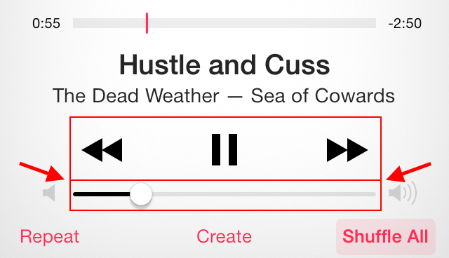
If you don’t use the music player in iOS 7 much, the image above might look fine, but try using it. Now, when I try to advance to the next track, I have to look closely at where I’m tapping. More often than not, I tap too close to the volume scrubber and the volume jumps up to 8 or 9.

In Apple’s iOS Human Interface Guidelines, they advise giving, “tappable controls a hit target of about 44 x 44 points.” In IOS 7, the volume scrubber is only around 22 points high, well below Apple’s recommended hit target size.

An easy fix would be to hide the time lapse scrubber as it was in iOS 6 and making it viewable when you tap on the album artwork. This way, the Previous/Play/Pause/Next controls could move up and away from the volume scrubber and the volume scrubber could be given bigger hit area like it had in iOS 6.

Try this: In a straight line from the Play/Pause button to the Next button, make a series of tiny taps and watch the volume scrubber jump around. What’s going on?!

Categories:

Human Experience

Tags: