Siri Nitpick – Launching Timer
If I tell Siri to “Launch Timer” she opens the Clock App, but doesn’t jump to the Timer tab.
If I tell Siri to “Launch Timer” she opens the Clock App, but doesn’t jump to the Timer tab.
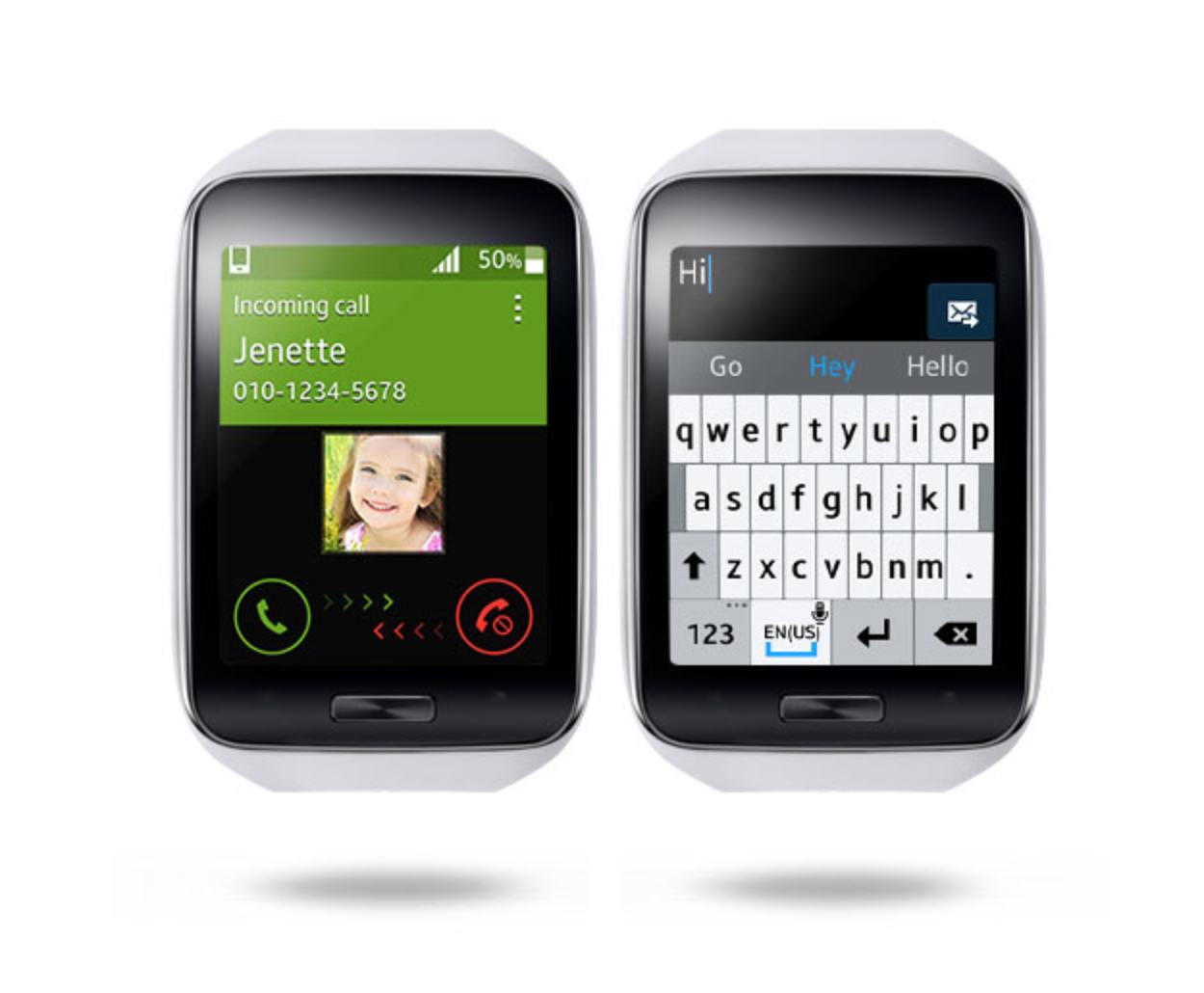
If it isn’t clear from that official product shot, that is a smartwatch.
I feel like John Stewart making fun of the news.
Poking fun of Samsung is too easy.
Image taken from Samsung.com
Infield top-aligned form labels are quickest to scan.
Eli Schiff has an interesting multi-part series on the “Fall of the Designer”.
Here’s a bit from Part 3, Conformist Responsive Design and the shift away from shiny, roundy, textural UI elements and towards ‘flat’ design:
Similar to web design, application design is becoming homogenized. Where before, apps like Tapbots’ Tweetbot were worlds unto themselves, with robotic sounds and futuristic cartoon aesthetics, today the only remnant of that past is robotic sound effects, devoid of any rationale as to why they sound the way they do.
Paul Haddad of Tapbots seemed to laud the shift, explaining in 2013 that he and his team “talked about making the Mac version a little bit more…plain” too. This hesitation might have invited our skepticism about their approval of flat design. But in the following years, Tapbots announced proudly their newly flattened Tweetbot 2.0 for OS X.
Tapbots is not alone in castrating Calcbot and their Twitter client Tweetbot. The Iconfactory’s Twitteriffic and Twitter’s proprietary iOS app in earlier days all attracted dedicated followings based on expressive designs which each exposed unique feature sets. But with their new flat interfaces, they struggle to differentiate their brands. Even with custom glyphs, animation and functionality, at a 10 foot view, it is difficult to tell one of these flat UIs from the next.
Did these developers suddenly have an epiphany and conclude that their former designs were ugly and overwrought? Or was it instead an imposed, though convenient, ideological shift by operating system designers?
I respect the time and thought Schiff has put into this series on design, and I think the answer to this last question is simple: fashion. UI design, like clothing, goes through different different phases and trends. Thats’ really it.
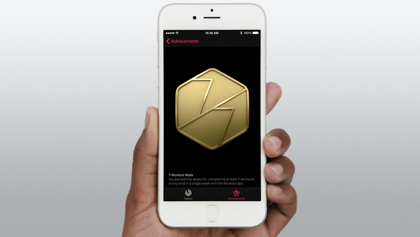
If you’re afraid skeuomorphism is gone forever, fret not. All you need to do is look at the achievement badges in the new Apple Watch exercise app:
There are gaudy ways of using depth and shading in UI design and there are tasteful ways of using depth and shading just like there tasteful and gaudy ways of using chrome and paint on a car.
I think what we’re seeing, as Schiff has pointed out is not so much flat design as lazy, flat design.
Steven Levy on the problem with his ever-increasing notifications:
But it’s hard to do this right when every single app wants to send you notifications. Even given that the system will limit itself to notices worthy of instant notice – and The Melvin Renaming is evidence to the contrary – there are just too many notifications elbowing their way into what should be a narrow passage labeled, “Stuff I absolutely need to see.”
This decreases the value of all notifications. If you want an example of another realm, consider the situation of “alarm fatigue” in hospitals, as recently exposed in a book by Dr. Robert Wachter, excerpted here on Backchannel recently. Of the 350,000 drug prescriptions a month that Wachter’s hospital issues, pharmacists get alerts on nearly half of those. In the hospital’s five Intensive Care Units, bedside cardiac units alerts go off 187 times – per patient, per day. That’s 381,560 a month. If you weren’t inured, you’d go crazy. But what about the really serious ones?
We aren’t at that level of desperation yet with online notifications. But the Age of Notifications is about to face its biggest mess yet, as alerts move from phone screens to watch faces. Notifications are just about the entire point of a smart watch – you’re not going to be reading books, watching movies or doing spreadsheets on them. And a tilt of the wrist is the perfect delivery system for those little blips.
I say these are his ever-increasing notifications because I don’t have this problem. Because I turn off most notifications on my iPhone. The only time my phone vibrates is when I receive a phone call. You know, that old-timey medium were you hear a voice and you talk into your device and they can hear you.
I understand I’m an outlier in how I handle my notifications, but I still don’t have any sympathy for these self-made “victims” of notifications. I am in charge of my device, my device is not in charge of me. As George Carlin said, I have this real moron thing I do, it’s called thinking. When I install a new app, and that app asks permission to send me notifications, I think for a minute if really makes sense for Flappy Bird or Instagram to send me notifications. The answer is usually no.
I have some advice for anyone who feels their device is running and ruining his or her life:
Now those hours you’d normally be wasting following the lives of other people? Use a small fraction of that time in the settings area of your iPhone or Android phone. Familiarize yourself with how notifications are handled and turn off the unimportant ones.
I’m normally a big fan of Steven Levy, but shame on him for writing that piece.
Great insight by Basecamp founder Jason Fried on how Instagram and Twitter feel different:
Every scroll through Instagram puts someone’s good day in front of me. A vacation picture, something new they got that they love, pictures of nature, pictures of people they love, places they’ve been, and stuff they want to cheer about. It’s just flat out harder to be negative when sharing a picture. This isn’t a small thing – it’s a very big deal. I feel good when I browse Instagram. That’s the feel that matters.
So now I have a choice… When I have a few minutes to kill, and my phone is in front of me, I almost always reach for Instagram. I never regret it. I come away feeling the same or better. When I occasionally reach for Twitter, I discover someone’s pissed about something. I often come away feeling worse, feeling anxious, or just generally not feeling great about the world. Twitter actually gives me a negative impression of my friends. I know it’s not Twitter doing it, but it’s happening on Twitter. that’s how Twitter feels to me.
I’m on Twitter every day and it’s definitely a place to show off how witty, topical or pissed off you are.
Instagram is just where i like to post pictures of cars I find.
At The Verge, Vlad Savov on the Samsung Galaxy S6 Edge:
I am not, however, convinced that the S6 Edge is the future. Despite my best intentions and great excitement, I have not been able to shake the initial impression that the Edge is ergonomically busted. In my time using the handset, I’ve consistently pressed on-screen buttons with my holding hand — because the metal sides are so thin they are almost nonexistent — and found myself growing anxious about holding it just the right way. Yes, it’s very much like the iPhone 4 Antennagate debacle, though unlike that hardware issue, there’s a software fix that Samsung could perform to rectify things: just make the side screens insensitive to touch input when the display is on.
The Galaxy S6 Edge also doesn’t play too nicely with Google’s Material Design. Samsung has my eternal appreciation for following Google’s lead in moving to a cleaner, more minimalist interface, but Material Design emphasizes flatness and geometric regularity, which the Edge’s warping side screens disturb. They create a sort of vignette effect on white pages and are a hindrance rather than a help when editing photos.
HAHAHAHAHAHAHAHA.
Once you have two groups of people, each advocating for its own position and reinforcing its own beliefs, people seem to start turning off parts of their brains. Things get emotional. Assumptions turn into unquestioned facts. At this point, people are no longer looking for solutions, or for common ground. They’re fighting an adversary.
Tribalism based on superficial, insignificant criteria — the computers or phones we use, the sports teams we like, the clothes we wear, the car brands we drive — is pretty common human behavior, and we fall into it easily.
But if you take a step back, you’ll notice that the whole discussion between these two groups is now based on a fallacious assumption. People have replaced the actual question they’re trying to answer — «how should this UI look and work?» — with a different, misguided question: «which of these two options should we pick?1″
This is a false dichotomy.
I’ll be bringing this thinking to my next critique.
Kevin C. Tofel on the nut Apple has to crack with their Watch:
The Apple Watch offers most – but not all – of the features I have with my Sony and arguably, has a more elegant interface. Apple’s big advantage here is complete control of both the hardware and software experience; particularly with how well the watch integrates with a connected iPhone. At its core, however, it does most of the same things your phone already can do; just like an Android Wear watch or a Pebble. The watch brings a convenience factor though. Presumably, you can spend less time on your phone because certain glanceable information is available on your wrist.
There’s one commonality with all of these devices however and has to do with the challenge of bringing simplicity and value to the wrist without adding complexity. If an activity takes too long to do on a watch, for example, or requires too much engagement, you’re likely better off just pulling out your phone for a better, faster interaction.
I’m really interested to see how Apple Watch changes the dynamic between me and my iPhone.
Apple has posted their Human Interface Guidelines (HIG) for Apple Watch:
Personal. Because Apple Watch is designed to be worn, its UI is attuned to the wearer’s presence. A raise of the wrist shows the time and new alerts. Digital Touch–particularly its Heartbeat and Sketch features–enables new types of personal communication. An accelerometer and a heart rate sensor provide personalized information about the wearer’s activity from day to day. No other Apple device has ever been so connected to the wearer. Be mindful of this connection as you design apps for Apple Watch.
Just as the iPad marked the beginning of the “Post-PC Era”, the Apple Watch is marking the beginning of the “Post-Smartphone” or “Smartphone+1” Era.
The smartphone might still be the star of the mobile computing show, but it now has to share the stage with the tablet and the watch. Wearing a watch that’s tethered to your phone changes the relationship of how you interact with both of these devices.
Digital designers, UI designers, UX designers, web designers–I don’t give a fuck what you call yourselves–you best familiarize yourselves with the Apple Watch HIG.
It doesn’t matter if you hate the Apple Watch, or love the Apple Watch or never plan to wear one. Not making an effort to understand wearables will put you at a severe disadvantage as a designer.
Robert Downey Jr. delivered a real bionic arm to a 7-year-old boy.
This is one of the coolest things that could ever happen to a kid.
Even at 37-years-old, you best believe I’d be getting an Iron Man prosthetic if I lost part of my arm.
via The Verge
Mark Manson doesn’t give a fuck:
In life, our fucks must be spent on something. There really is no such thing as not giving a fuck. The question is simply how we each choose to allot our fucks. You only get a limited number of fucks to give over your lifetime, so you must spend them with care. As my father used to say, “Fucks don’t grow on trees, Mark.” OK, he never actually said that. But fuck it, pretend like he did. The point is that fucks have to be earned and then invested wisely. Fucks are cultivated like a beautiful fucking garden, where if you fuck shit up and the fucks get fucked, then you’ve fucking fucked your fucks all the fuck up.
I haven’t read something that has resonated so much with me in a long time.
Manson is absolutely right. As I get older, I give less and less of a fuck about the shit that doesn’t matter in life. With maturity has come the ability to distinguish between things that are worth my time and those that are not.
I’ve had far from a rough life, but certain events have changed my perspective on how to give fucks. Being at my mother’s bedside while she died of cancer in 2013 stands out most prominently in my brain. That made me realize how little time we have on this little planet.
I best give out fucks wisely with the time I have left.