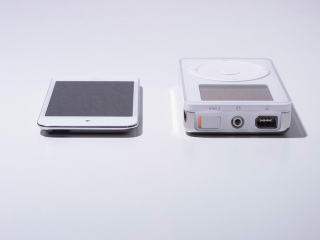
Ten Years
via Flickr via Shawn Blanc
via Flickr via Shawn Blanc
via nfgraphics.com via The Next Web
via paidContent
hat tip Public School

(via @TeslaMotors)
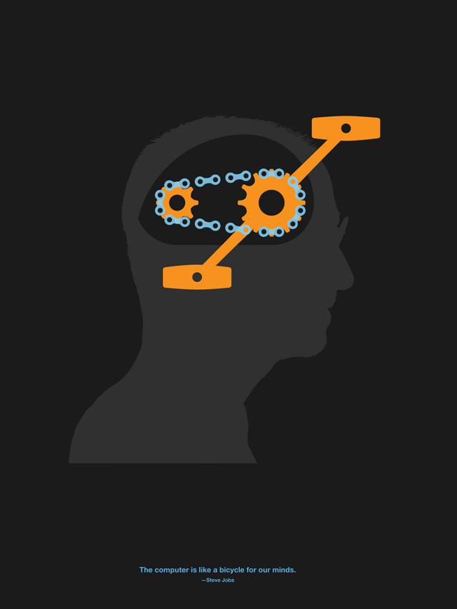
This morning I launched a Kickstarter project, Bicycles For The Mind. It’s a poster series inspired by Steve Jobs’ belief that “the computer is like a bicycle for our minds.”
I’ve spent a lot of time on the poster as well as putting together everything on Kickstarter. Go check it out.
I have a handful of amazing screen printers I plan to pick from if the project gets funding. I really want these posters to look amazing.
If you dig it, donate. No matter what tier you choose, you’ll get something in return for your support.

Philip Elmer-DeWitt for Fortune.com on how many Kindle Fire tablets are being returned based on Amazon reviews:
There were 3,678 write-ups in all, nearly half of them (47%) glowing five-star reviews that basically said the same thing (Typical headline: “Outstanding value at $199”).
What interested us, however, were the 491 (13.3%) one-star reviews. They are relevant because the number of Kindle Fires being returned to the store is likely to be an undisclosed material factor in Amazon’s results this quarter
Amazon got the media ecosystem aspect right with the Fire, but as I mentioned in my brief review, everything else was a big letdown for me. But I’m also someone used to the smooth, well-thought out user interface found on iOS.
Which leads me to speculate if many of the negative reviews of the Fire are from iPad owners who have higher expectations than from people who are buying their first tablets.
Wow, you can actually own photographs taken by Stanley Kubrick (via Daring Fireball).
Fine, they might not be gelatin silver prints, but they’re museum-quality and limited edition.

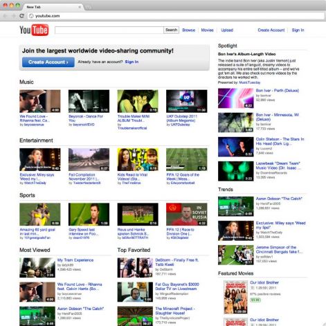
The old YouTube
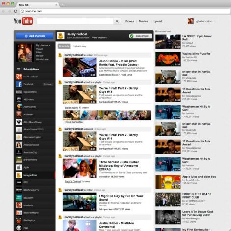
The new YouTube
YouTube launched it’s new design for all users on Thursday afternoon. The reviews are in, and the majority of sites commenting on the changes have chosen to focus entirely on the new features, ignoring the new look and feel. I don’t know how I feel about this. Design is an important part of my life, yet I understand that it’s a peripheral concern for most people. It’s a function over form nation we live in, which makes sense, considering good design is something that has to be learned to be appreciated. That doesn’t mean it’s right.
When I checked out the new design on YouTube, what struck me first was not the increased number of features or Google’s attempts at increasing social networking presence and integrating channels. Rather, it was the numerous little ways the design could be tweaked to make it vastly better. A margin here, a font there, another margin over there, a color here. I’m a developer, not a designer, but even I could recognize the litany of freshman design mistakes the folks over at YouTube made. I could run through a complete list of the issues I found, but instead I’m going to focus on one area of website design that doesn’t get as much consideration as it should, and is also where I feel the new YouTube site is lacking. Specifically, background color.
Before writing this, I did a search on Google for “background color is important.” Most of the links on the first page had to do with CSS, that is, real background colors, not the idea that choosing the right color is important. One link had the promising headline, “Importance of Colors in Web Site Design.” From 2008, the article focuses on the various moods a color could put the user in, and what color choices say about the company that deploys them. It’s some real hippie shit. Besides recommending that designers stick to web-safe colors (HA!), one of the highlights reads, “red : Red is the most emotionally vivid color and may cause a [sic] faster breathing. It symbolizes energy, action, confidence and passion.”
Changing the wording of the search query doesn’t improve things, either. Clearly, background color is something that has gotten short shrift when it comes to design theory.
On YouTube, the change in background color, from white to a very light grey, struck me as bizarre. The old design was never all that good, either, but it was immediately recognizable. YouTube had a look. A cluttered, unwieldy look (worse now), but one a user had burned into their brain. After seeing the new design, I realized that a big part of that was due to the stark white of the background. As important as the little tv screen in the logo, the white of the background had come to be a part of YouTube’s brand.
It’s odd to think that a background color on a web page could be considered within a brand’s color palette, but think about it just a little bit and it begins to make total sense. In print, the majority of the time designers work with, and readers are exposed to, white paper. It becomes something we expect, something we ignore, something we take for granted. On the web, however, a background color can be changed without going through the expense of using a special paper stock or even covering the page with ink. It’s as simple as changing a few characters in the style sheet. As such, there’s a lot more variety out there on the web when it comes to the surface upon which the content lives.
YouTube’s white, then, was just as important to the site’s look and feel as is ESPN’s red to grey gradient, or facebook’s blue header, or Daring Fireball’s dark grey, etc. Change any of those, and the sites would feel a little alien. In some cases drastically different, even without rearranging all the pieces on the screen.
“It is simply a tool.”
—David Hockney

Of course Don uses an iPhone.
via Mail Online via TheNextWeb