zzz
zzz
Responsive Exhaust
Over the last few days I’ve been updating the pages of this site to be responsive. Whether you’re viewing it on a laptop, tablet or smartphone, the text and images should adjust in scale for optimal reading.
The starting point for the design was taken from 37Signals recently redesigned company blog(embrace the remix). I feel the same way the guys at 37Signals do in regards to priorities with Daily Exhaust. I want the reading experience to be great and I’ve always had problems with sidebar columns on sites. Sidebars are usually good for the first 600-700 pixels down the page, but after that, all you have is a big, empty gap next to posts. It’s always driven me nuts.
It’s been a while since I’ve messed with HTML and CSS so it’s taking me some time to understand exactly how all the code works, but I’m getting there. The layout will continue to evolve over the next month. At this point I’ve only been able to tackle the landing page and individual entry pages. There’s still a lot of work to be done.
So if you’re reading this from the RSS feed, I invite you to check it out in a browser.
Ah, Technology…
It’s a good day to be a New Yorker. A beta version of MTA Subway Time hit the app store today. For years, the MTA has been slowly, oh ever so slowly, installing countdown clocks in stations to let riders know when the next train is arriving. It’s not a perfect system, but nothing about this city’s subways is. With today’s app release, the info collected and displayed on the clocks is now available on iphones. But, there’s a catch. The countdown clocks have yet to be installed on all the subway lines, so Subway Time only has data for 7 lines. (Conspicuously absent is data for the L train, which was the first line to have the countdown clocks. Apparently, the clocks on the L use a more advanced technology, and that is what is keeping it from…hell, who knows. It’s the most advanced, so it was implemented first? Whatever, the MTA said it’s coming to the app in 6 to 12 months.)
Open the app, and this is what a user sees:
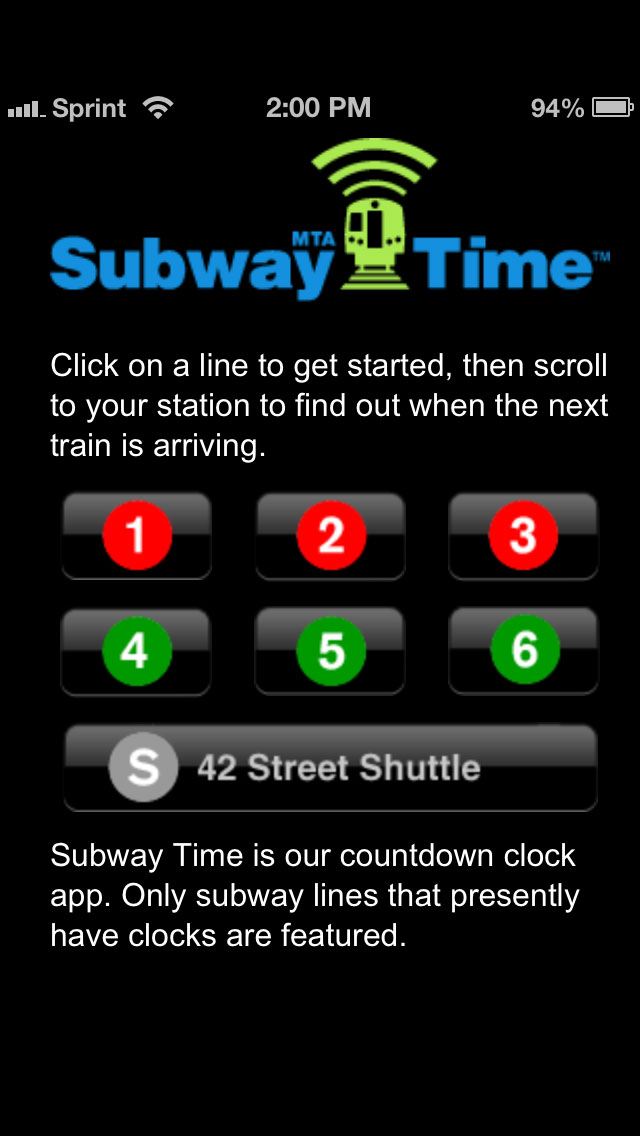
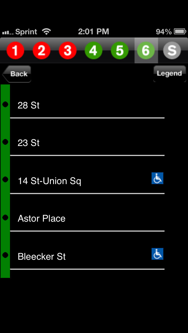
The interface is ugly, and it’s not optimized for retina screens. But I’m willing to let that slide. Does it work? Yes, it does. A user selects a line and a screen appears showing all the station stops on that line:
Choose a stop, and the data from the clocks is displayed:
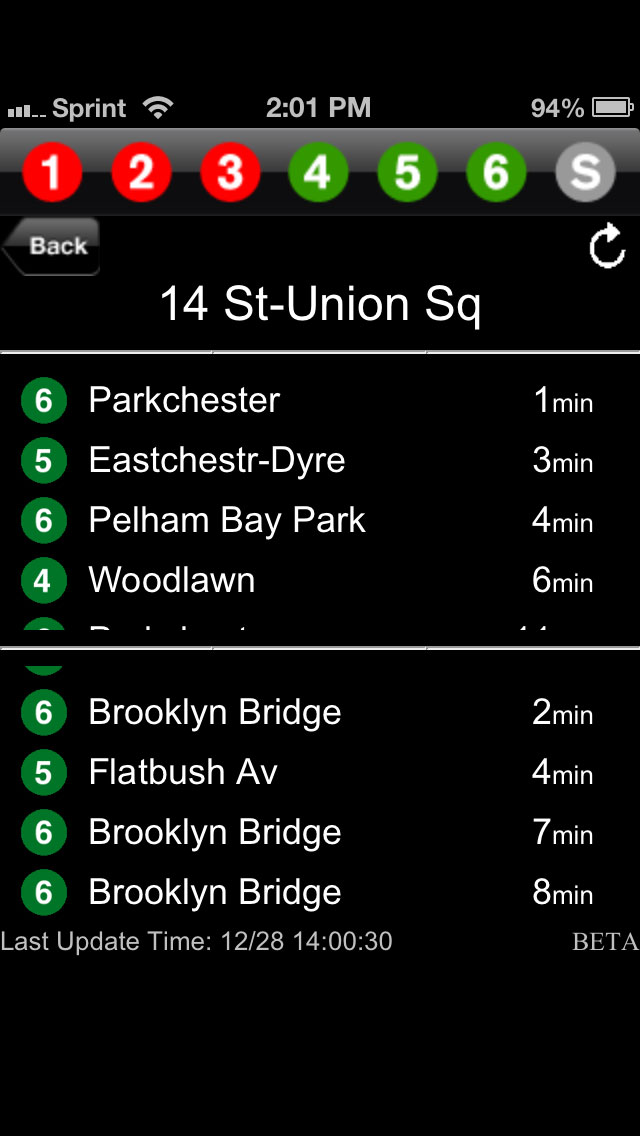
It’s not bad, and does what it’s supposed to do. Besides the ugly design, though, the interface does have its issues. The information isn’t organized all that well. A user gets the name of the line and the destination, but it could use a header pointing out if it’s an uptown train or a downtown train, if it’s Bronx-bound, Brooklyn-bound, etc., and if it’s an express or a local. Also, the image above results from clicking on the 14th St. Union Square station, which has multiple lines stopping on a single platform, so a user gets the info for the 4, 5, and 6, even if they only tapped on, say, info for the 6 train. This is a good start, but the MTA has a lot of work to do to make this a tip-top app. And, there’s a lot of this nonsense:

Loading screens and poor transitions. That shouldn’t be a hard fix, but this is brought to you by the same people that can’t prevent subway cars from smelling like feces.
Vibrations
Taken from The Combustion Chamber
Know The Rules, Then Break Them
TheNextWeb: Google Finds Its Design Voice On iOS:
The string of well designed, if not exactly perfect, app updates continued. In no particular order, YouTube, Chrome, Google Search, YouTube Capture and of course, Google Maps all displayed a much surer design hand on Apple’s platform. They obeyed the right conventions for things like the back button and the bottom-oriented navigation bar, but they maintained a sense of what Google has been about from the beginning.
Because Apple established strong human interface guidelines*, Google knows where to break them to make apps that feel both at home on iOS and ‘Google-y’. Once you know the guidelines, you can break them.
When you have no design guidelines you have no foil act against. This is why it’s taken Android’s UI design so long to evolve. While far from perfect, Apple App Store Rules and Human Interface Guidelines have made developers a ton of money and created thousands of well-designed mobile applications. Android can be as open as the ocean but restrictions can be a good thing too.
*Notice how Apple refers to them as guidelines, not rules. You get in trouble for breaking rules, whereas guidelines are just, guidelines.
And seriously, if you haven’t read through the HIG yet, do it. You’ll see there’s a method to Apple’s madness. It’s not all bevels and drop shadows.
Privacy Is Overrated
America, home of the free[ly monitored]:
The federal government will continue to access Americans’ emails without a warrant, after the U.S. Senate dropped a key amendment to legislation now headed to the White House for approval.
What bullshit.
Tools + Showcase
So Adobe bought Behance. It will be interesting to see how this acquisition goes.
It tastes a little bit like Comcast’s acquisition of NBCU, where the pipeline bought the content. In the case of Adobe, they make the content creation tools and now they’re buying the showcase holding the creations made with their tools.
I don’t have any positive or negative feels on the deal other than that (yet).
I signed up with Behance a few months ago and posted my updated portfolio after 6 years of procrastination (this was the last major update …in Flash). So far I really like the Behance Network.
I hope Adobe doesn’t mess it up.
Notifications
Speaking of Notification Center in iOS, Alex Saretzky has some interesting ideas. The point isn’t if they’re perfect. The point is to at least start thinking about how Notification Center can be improved. And it can be.
You can’t know if an idea is good or shitty until you execute it, so points to Saretzky for walking the talk.
via The Loop
Something Interesting

via FUCKING HOMEPAGE via thisisnthappiness
Keeping Up With The Kids
I think it’s funny and amazing to see Facebook’s new Poke app tanking in popularity in the Apple’s App Store.
At the tender age of 28, Mark Zuckerberg is already finding himself keeping up with what’s popular with the kids. Not too long ago, he was one of those kids, coding up thefacebook in his dorm room.
Moves like this and Twitter’s decision to make itself look more like Instagram with the inclusion of image filters just make both companies look dumb and out-of-touch.
Feature parity can been really boring and pointless without strategic thinking behind it.
Apple copied Android’s pull-down notifications when they launched Notification Center in iOS 5 in 2011. This is an example of gaining feature parity and giving people something that improved the overall experience of using an iPhone or an iPad.
You always have to ask yourself why you’re doing something. It doesn’t matter if it’s adding new features to your mobile app or buying a new pair of jeans. If you don’t truly believe in the decisions you make, you have no reason to follow through with them.
Saying, “I’m doing this because [fill in person or company name] is doing it.” isn’t enough.
Golden Network
My wife and I are staying at a friend’s apartment on 8th Street and Avenue B in Manhattan for the next few days while she’s in Ireland.
While signing onto her Wifi network, I couldn’t help but read the names of the other networks in the neighborhood, particularly the fifth one down:

I love you New York. You and your messed-up head.
Support
Being home with my parents for the holidays reminds me to thank all customer support people troubleshooting and explaining the details of technology to all the parents and grandparents in the world. I know it can be hard.
Explaining things like:
—the differences between cookies and cache
—the differences between a web browser and Google (or Facebook)
—why iCloud can’t back-up what you’ve saved within a website
And for all you customer support people who suck at helping non-nerds through problems? Learn how to unsuck your people-helping skills. This computer shit isn’t as obvious as it seems to people like you and me.
Intentions
Nilay Patel on Instagram’s terms of service reversal:
Last night Instagram announced that it was retracting a controversial terms of service change that was widely and inaccurately interpreted to mean that the company would be selling user photos. “Because of the feedback we have heard from you, we are reverting this advertising section to the original version that has been in effect since we launched the service in October 2010,” founder Kevin Systrom wrote in a blog post. “Instagram has no intention of selling your photos, and we never did.”
That certainly sounds like a win for consumers, but it’s actually a loss: the newly-reinstated terms of service clause is objectively worse for users than the new one, and it’s worded far more vaguely — the language feels familiar and comforting, but you’re giving up more rights to your photos. Instead of agreeing that Instagram may only “display” photos “in connection with” advertising, users will now continue to agree that Instagram may place advertising and promotions “on, about, or in conjunction with” their photos.
My images are still on Instagram, but I did use Instaport.me to download an archive of everything.
Paring Back
The recent uproar over Instagram’s terms of service changes got me thinking about paring back where I post my content around the web. I’m not upset about the direction Instagram is going. Maybe a little upset, but they are a company who offers a mobile photo sharing application for free, so this move should be obvious in heinsight, if it wasn’t already obvious in foresight. Remembering they’re owned by Facebook makes this advertising integration even more obvious.
It would be great if Instagram offered a version of their service I could pay for and avoid my images (potentially) being integrated into advertisements. This isn’t happening so I’ve stop posting photos to Instagram. For now.
I might go back to Flickr, but coincidentally I cancelled my Pro Account this past summer because Yahoo has neglected Flickr since they bought it in 2005. Very little has changed or improved upon. People are expecting great things from Yahoo’s new CEO, Marissa Mayer. We’ll see. Maybe she can return Flickr to glory and make it feel relevant again.
So, for now, I’m paring back my usage of other web services.
In the meantime, I’ll continue to create and post content on sites I control: Daily Exhaust & The Combustion Chamber.