Copying

ren_and_stimpy_smiling.jpg
From John Kricfalusi’s blog (aka John K, creator of Ren & Stimpy):

Some people might wonder what the point is in copying the drawings of others. I’ll tell you. It’s so you can apply what you learned from the copies to your own drawings. It’s not just so you can be good at copying.

I was obsessed Ren & Stimpy back in the early/mid 1990’s when I was in high school. When class projects came up, no matter the subject – physiology, English, chemistry, math – I would create big comic books narrated by Ren & Stimpy. Art and drawing were my entry point into topics I would otherwise be too bored to learn about.
At first it might sound as if I was taking the easy road by creating comic books in all my classes, and while it did come naturally to me, it was still a lot of work.
Before I started a sketchbook, I would first draft up the story I wanted to tell in my comic book. From there I would determine which character I wanted to say what, and what expression/pose they would be making when they delivered those lines.
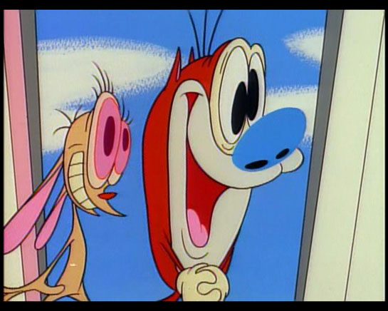
I transferred these characters in the comic books was by first recording all the episodes and then playing them back on my VCR (yes, I said VCR) and pausing it at the moment Ren or Stimpy made a unique, hilarious expression so that I could draw the image in my sketchbook. If you’ve ever watched the show, you know these moments happened every other second.
(My father would yell at me when he caught me doing this because he said it ruined the tape heads on the VCR. He’s and an engineer and that’s a story for another time.)

Moving Beyond Copying

Back to John K’s quote. Copying is crucial to learning. Whether you’re copying someone’s cartoon characters, CSS files, poster design, acting or music you eventually reach a point of departure. I believe it was Picasso who said that that point of departure, that screw-up in what you copied – that is your voice.
Since my goal was never to become a cartoonist, i never moved beyond copying Ren & Stimpy off of the television, but copying has played a big part in my work as a designer. Whether it’s been code, or style or methodology the first step for any artist or designer is copying.
Once you’ve full absorbed and become one with the subject it’s a natural progression to alter it and make it your own.

Tags:

Innovating from the Old(s)

During Apple’s WWDC 2010, Steve Jobs unveiled the iPhone 4. As is customary at these events, he walked through all the details on phone – both hardware and software, inside and out.
At one point in the presentation (about 33:15), Jobs pointed out breaks in the outer shell of the phone, something that seemed very un-Apple.
WWDC_keynote_2010_iPhone-frame.jpg
He went on to explain that while these pieces did serve as “the primary structural element of the phone” they also were the antennas for Bluetooth, Wi-Fi, GPS as well as for UMTS and GSM mobile bands.
This reminded me of my friend Bryan’s 1980 Delta 88 in high school. I was riding in the car with him one day, and I noticed these two wires embedded inside the windshield.
I couldn’t find any decent shots online, but Bryan (former owner of said Olds) did:
Oldsmobile_windshield_with_embedded_antenna.jpg
I asked him what they were. He told me it was antenna for the radio. Sure enough, he was right, and unlike most cars at the time, his Delta 88 didn’t have an external antenna sticking straight out of hood or trunk.
While these two examples don’t match up perfectly (the windshield isn’t part of the car frame), they illustrate my point that when you’re innovating, it’s not always necessary to solve your problem completely fresh. In many cases someone has solved your problem. Maybe in a different context and industry, but translatable to your product.

Categories:

Technology

Tags:

Jaded

John Paczkowski from All Things Digital:

The first analysts’ notes on Apple’s new iPhone 4 have begun rolling in and they sound a common theme: While not the revelation it might have been (for obvious reasons), the device may well be, as Steve Jobs claimed Monday, “the biggest leap since the original iPhone.”

There’s two things that keep popping in my head when I read posted like this.
First – fuck analysts. They produce nothing real and nothing of real value. They shit out guesses on what they think will do well in the market and what won’t. If all the analysts in the world disappeared tomorrow, things would be much better. I could give a shit if it’s not the “revelation” they wanted.
And second, to quote Louis CK, everything’s amazing and nobody’s happy. Whether you’re talking about the new iPhone 4, or hybrid cars or new vaccines and treatments for medical conditions, I constantly come across people who are underwhelmed. It’s unfortunate, because we really are living in amazing times.

Tags:

Android, iPhone OS & their differences

True designers understand the design isn’t about how something looks, but how it works.
Every product that is designed is usually intended to be built and when it’s built, the look and style usually follow from the design. Of course this doesn’t always happen, as some companies merely apply a style to a product without thinking about the design.
The screenshots below are a great example of being able to tell how much design – not engineering – went into the software on each mobile operating system.
Android’s default media player:
mediaplaybackactivity1.png
iPhone OS’s media player:
iPhone_OS_media_player.jpg

Categories:

Music, Technology

Tags:

No Bees, No Us

From the Telegraph:

They set up a controlled experiment in Punjab earlier this year comparing the behavior and productivity of bees in two hives – one fitted with two mobile telephones which were powered on for two fifteen minute sessions per day for three months. The other had dummy models installed.

And:

After three months the researchers recorded a dramatic decline in the size of the hive fitted with the mobile phone, a significant reduction in the number of eggs laid by the queen bee. The bees also stopped producing honey.

Via Analogue

Tags:

It’s what’s outside the office that counts

Words of wisdom for anyone in a position of hiring from Heidi Hackemer at BBH.
The article pertains to the hiring methodology for the advertising world that BBH lives in, but I would go so far as to say this should be the methodology for every industry:

The second column is where things got interesting: we also looked for candidates that had a bit of “mess” in their resume, i.e. a curiosity, a drive to think about and do things beyond pursuing the perfect advertising career. As a result we have filmmakers, activists, dancers and a guy that has worked in third world development.

And:

We believe the mess is just as important as the “proper” education and inputs: advertising is one of those fields that should collaborate not only internally, but with culture at large – to be relevant and human we should inhale the world around us, circulate it in our lungs a bit and then exhale our response. The minute that we get too obsessed or spend too much time focusing on what happens within our walls or the minute the great love in our life becomes a widget or :30 second idea is the minute we lose the oxygen that we need to make great work.

This mindset is especially important in the design industry. Our greatest ideas come from being interested in everything, then combining disparate ideas into new combinations for products and services.

Categories:

Technology

Tags:

Flash is Open and It Runs Fast

Flash_plug-in_versions.gif
Flash Co-Creator Jonathan Gay Responds to Steve Jobs
I’m hoping to get the iPhone vs Flash stuff out of my system so I can post thoughts on other topics, but I’m still too interested in the arguments. Call me a chick, but I like drama and gossip.
In the interview, Gay rehashes all the ‘open’ talk I’m already way to familiar with. I’m going to skip over commenting on that as well as all the “Apple-is-hurting-users-by-not-providing-Flash-on-the-iPhone” talk. Enough already.
I did find this nugget funny, where the interviewer asks Gay “how much would the Flash player need to evolve before it would meet Steve Job’s strict efficiency standards”:

It’s worth noting that Flash was developed on a 66 Mhz 486 which is probably one tenth the speed of an iPhone. So I don’t think there is a fundamental architectural issue. I think the Flash architecture with the binary file format is inherently higher performance than HTML for multimedia.

Gay is absolutely right. Flash was developed for those very limited specifications way back in the day. But if I recall the days when I used to design and develop in Flash 4, cerca 1999, the Flash plug-in was around 200K (Adobe has all the versions archived on their site). Granted, it also couldn’t dynamically load JPGs or any video. It also couldn’t load XML files. Or do PaperVision3D.
Looking into my Internet Plug-ins folder today, the Flash 10 plug-in is 13MB.
Times have changed. I’m not saying Flash can’t be refactored to run on a mobile device, but Adobe still has a lot of work ahead of them.

Categories:

Innovation, Technology

Tags:

iPad apps – expectations for content producers

MacNN: GQ records extremely low iPad magazine downloads
VP and publisher Pete Hunsinger doesn’t seem to get digital:

Hunsinger defends the iPad edition, claiming that it costs “nothing extra,” given that there are no printing or shipping costs. The iPad app is $2 less than the print edition, and GQ is also charging just $2 for back issues. The VP says he expects the iPad to eventually become a “major component” of circulation; one boost is anticipated with the June issue, which will feature Australian supermodel Miranda Kerr.

First off, I would argue that the iPad version should cost as much, if not more than the print version. From my experience, most people don’t understand the costs that go into building products/experiences/tools for the web. There’s an incorrect assumption that because this product isn’t physical and ‘real’, it must be cheaper to make.
The truth is that it should cost a lot of money to create an iPad version of GQ magazine if they truly exploit everything that makes experiences on the iPad great. This doesn’t mean you have to go overboard when using a new medium, but it does mean creating an appropriate experience.
And that’s what we’re talking about when talk about building for iPads and iPhones – experiences. I’ve read a number of stories in the press about the iPad being a device for passive consumption, but that’s a premature dismissal. If GQ is simply digitizing text and making image galleries that you can flick through, they’ve missed the point. That’s easy.
My second point is that the iPad is not and should never be ‘the savior’ of the print industry.
Every company is responsible for their own fate. Whether you’re Conde Nast trying to convert your print publications into digital experiences, or Adobe trying to make Flash relevant to mobile computing, blaming or praising Apple for your failure or success is to sell your company short.
Conde Nast is moving their properties onto an amazing platform. They’re responsible for creating an amazing experience.
Evolve or die.

Tags:

Windows Phone Wireframes 7

wp7_3_screenshots.jpg
So last week, Paul Thurrott posted ‘near-final’ screenshots of Windows Phone 7.
I have the same opinion now, as I did last month when I posted and reacted to Edward Tufte’s thoughts on the mobile interface design.
They’re still just wireframes.
Jack Moffett astutely observed, “There isn’t enough variation between what is tappable and what isn’t.”
Just to be clear, this isn’t me wanting or expecting the WP7 interface to be shiny and polished like iPhone interface. There’s many ways to design a GUI, and these just don’t look designed. At all.
It’s impossible to ignore what you’ve seen from your competition, but I’m hoping that the Windows Phone 7 team didn’t deliberately rage against the machine and decide to reject all implied dimensionality within the WP7 interface. If you want things to look clickable, you need to make them look, um, clickable. This doesn’t mean you need to use bevels, gradients, reflections and gloss. A lot can be achieved using just one of those effects.
A minimalist interface would be amazing, but WP7 isn’t minimalist, it’s empty.
Which brings me to my next point about WP7. In an interview with Steve Jobs back in the 80’s, he comments that “… they [Microsoft] don’t think of original ideas and they don’t bring much culture to their products …”
When first watched the interview, I understood what he said in theory, but it wasn’t until I saw the WP7 screens that I truly ‘got’ what Jobs was saying. The WP7 interface is completely uninspired and has a complete lack of culture.
Given WP7’s lack of real design, I was shocked at tweets from Khoi Vinh and AisleOne:
khoi_tweet_wp7.jpg
aisleone_tweet_wp7.jpg
I’m waiting for another company to give Apple some real competition to the iPhone. I love Apple products, but Apple needs competition and there’s so much more room to innovate with the mobile space.
Let’s not get excited over wireframes posing as finished designs.

Tags:

Garbage Kin

Gizmodo reviews Microsoft’s new mobile phones for hipsters:

It’s smart for a company to control its focus in designing a device, and that’s what Microsoft has done here. Messaging and social media are the Kin. But that doesn’t mean it shouldn’t come with a mapping application (there isn’t a native one, despite the presence of a GPS receiver.) It doesn’t mean that the browser shouldn’t have tabs, or a rendering engine that isn’t excruciatingly slow. It doesn’t mean that there should be no way to watch any web video of any kind, or that the phone should be arbitrarily tied to Microsoft’s Bing search service. It’s no excuse for excluding any kind of calendar.

Kids don’t do maps and browsers and shit like that, yo! They’re all up in all those social networks, hundreds of them! (read: Twitter and Facebook)
And regarding no calendar, I like this one from the comments:
“I can understand the lack of a calendar. Have you ever seen a hipster in a hurry? They don’t have appointments.”

Categories:

Image, Technology

Tags: