macOS design resources
Apple has officially released design resources for macOS.
via Designer News
Apple has officially released design resources for macOS.
via Designer News
Frederico Viticci gives a great breakdown of Shortcuts, Siri, and iOS automation in iOS 12 (via DF):
Available in Settings ⇾ Siri & Search, iOS 12 features an option for users to define their own phrases for launching specific shortcuts via voice. This is done by speaking a custom phrase into a Siri recording UI that transcribes the command and creates a shortcut that can be invoked at any time. The Settings app automatically suggests recently used app shortcuts as well as other shortcuts that were previously “donated” by apps. Both recording a custom shortcut phrase and launching the phrase via Siri require an active Internet connection. Once given a custom phrase, user-configured shortcuts appear under the My Shortcuts section in Settings.
The shortcut phrases functionality is the feature I’m most excited about in iOS 12. I use Siri more and more in each subsequent year since it was introduced. My iPhone X is the snappiest iPhone I’ve had yet. What I mean by this is there is very little latency between pressing-and-holding the side button to launch Siri, speaking your command, and Siri executing that command.
Over at The Verge, Tom Warren confesses he misses Windows Phone not just for the product it was but how it pushed Apple and Google to design better mobile features in their own products:
Windows Phone has arguably changed Android and iOS, though. Microsoft aggressively pursued modern design principles at the time to launch Windows Phone with its Metro design, and Apple responded with iOS 7 and a flatter user interface. Google went one step further, with its Material Design that included bright colors, playful transitions, and a much flatter and simplified interface.
Most of Warren’s points I agree with, except this one.
I think the move from super-shiny buttons and strong drop shadows in iOS 1 through 6 to the flat aesthetic of iOS 7 has more to do with Jony Ives’ own design sensibility rising to prominence after the death of Steve Jobs and the ouster of Scott Forstall than it does with reacting to anything Microsoft was doing.
Given the number of times Microsoft has rebooted Windows Phone, we might see them blaze a trail back to skeuomorphism in the future.
C’mon Microsoft, we’re all waiting for you to dazzle us once again with your legendary design skills.
Slack is the latest app to ditch the Apple Watch:
Like Twitter, Amazon, and Google Maps before it, Slack is ditching its Apple Watch app. The team chat and collaboration platform for businesses quietly announced the news via an update to its iOS app. But, that doesn’t mean Slack will disappear entirely from your wrist.
You’ll still be able to respond to incoming messages on your Apple Watch courtesy of rich notifications — all that’s absent is the ability to view unread mentions. So, you may not be missing much after all, which sums up the essential problem with dedicated Apple Watch apps.
This move makes sense. The Apple Watch isn’t the iPhone.
For me Apple Watch is a glanceable, health-tracking, message notifier that unlocks my MacBook when I wake it up (my favorite feature).
I have no need for the apps on my Apple Watch to mirror the ones on my iPhone.
Over at The Verge Ashley Carman asks, Should you force close your apps?
No. No. No.
It drives me crazy when I see people do what Carman describes (and I see a lot of people do it):
I force close my apps all the time. I double click the home button on my iPhone 6S and close out of every app I’ve used, even in the past 20 minutes. It’s a terrible habit, but it makes me feel good.
I wrote about this over 4 years ago and what I wrote remains true: swiping up to kill background apps kills your battery life because it forces iOS to relaunch apps, versus merely ‘waking them up’ from their suspended background state.
What I discovered on my new iPhone X running iOS 11.2 is that Apple has made it a bit harder to close apps.
Now when you bring up the app switcher swiping up on an app card simply brings you back to your Home screen. In order to close apps, you have to bring up the app switcher and then long-press on any app card. This causes red close icons to appear in the corners of all the app cards. Now you can swipe up on app cards to close them.
But you don’t need to, so leave them the fuck alone.
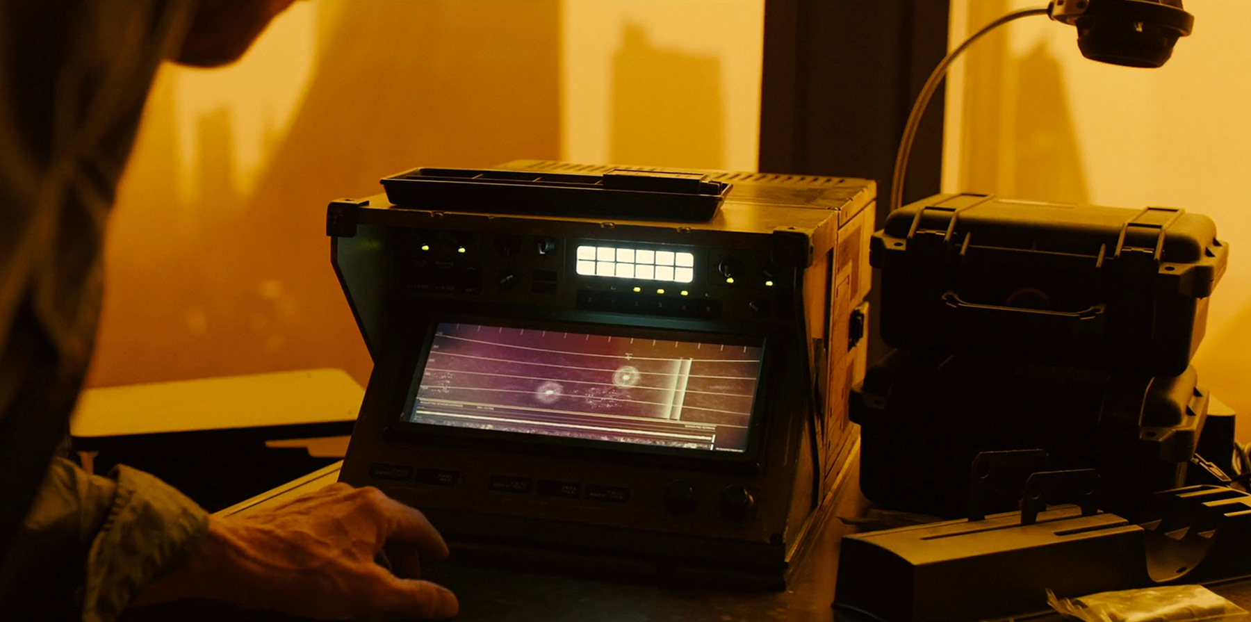
Throughout the movie, K visits a laboratory where artificial memories are made; an LAPD facility where replicant code, or DNA, is stored on vast pieces of ticker tape; and a vault, deep inside the headquarters of a private company, that stores the results of replicant detection ‘Voight-Kampff’ tests. In each scene, technology or machinery is used as a plot device to push the larger narrative forward. Almost all of these screens were crafted, at least in part, by a company called Territory Studios.
The London-based outfit is known for developing on-set graphics. These are screens, or visuals, that the actor can see and, depending on the scene, physically interact with during a shoot. They have the potential to raise an actor’s performance while creating interesting shadows and reflections on camera. Each one also gives the director more freedom in the editing room. If you have a screen on set, you can shoot a scene from multiple angles and freely compare them during the edit. The alternative — tailoring bespoke graphics for specific shots — is a time-consuming process if the director suddenly decides to change perspective in a scene.
—Designing the technology of ‘Blade Runner 2049’
This is amazing. I’ve always assumed the computer interfaces I see in movies are are put in during post-production. Territory are making usable interfaces.
John Gruber responds to Marco Arment’s view that it took Apple courage to embrace the “notch” on the iPhone X:
Marco Arment:
Apple just completely changed the fundamental shape of the most important, most successful, and most recognizable tech product that the world has ever seen.
That’s courage.
It is. But as I wrote when Phil Schiller used the word to explain why they removed the headphone jack last year, that took courage too. It takes courage to rob a bank too. The objection people had to calling the removal of the headphone jack “courage” is based on the notion that courage is always noble. You can despise the notch and/or think it’s the stupidest thing Apple has ever done, but still acknowledge that it took courage to embrace it.
My objection (again, after admittedly only spending 10-15 minutes with an iPhone X in hand) remains that Apple could embrace the notch on the lock and home screens, allowing for this new iconic silhouette, without embracing it all the time.
Gruber is on point with regard to things that take courage to do, but he’s off on wanting Apple to embrace the notch sometimes.
Apple isn’t embracing the notch sometimes. That’s not Apple’s modus operandi. When they make a decision on something, they go all in. Gruber wants iPhone X to wear concealer and fake eyelashes when it goes out in public and iPhone X is all, “Oh no, child! This is how I look! Love me the way I am!”
I’ll say it again. I’ll keep saying it until I’m dead: look long-term. No one has an iPhone X yet. Everyone who has an opinion has either never used an iPhone X (like me) or only used it for a brief period of time (as Gruber himself openly admits).
Humans are reactionary animals and reacting to the short-term is the default for us in life, investing, planning, everything.
It’s possible I’m wrong, but let’s regroup in a year.
We’ll really know for certain if Apple made the right move if Samsung apes the notch on their next Galaxy phone.
Sammobile has a headline that caught my eye: ‘Samsung has a legitimate reason to block Bixby button remapping, whether we like it or not’
This headline is interesting because it highlights a big difference between iOS and Android users: Android users expect to be able to make hacks around crappy features like Samsung’s Bixby and the dedicated Bixby button.
I wrote about how half-baked Bixby was when it debuted a few months ago.
Over at The Verge, Vlad Savov examines the ‘notch’ at the top of the new iPhone X:
Draw me an iPhone.
The lines may be squiggly, the rounded corners imperfect, but almost everyone you pose this challenge to will present you with the shape of a rectangle containing another rectangle sat atop a circle. The iPhone’s silhouette is the most iconic outline in all of modern technology, recognized by even diehard Android fanboys and featured on the side of “Made for iPhone” accessory boxes around the world. It’s a brand and a logo in its own right.
Now, after 10 years of the home button and big bezels, Apple is giving us something new. The notch. The monobrow. The annoying black protrusion getting in the way of your photos and videos. However you choose to see the black cutout housing sensors at the top of the new iPhone X, you will most definitely see it. And Apple wants it that way.
Like most humans on planet Earth, I had a knee-jerk, negative reaction to the notch/unibrow at the top of the iPhone X the other day.
But as I’ve sat with my thoughts and let them marinate, I’ve gathered a more holistic view on the unibrow. I agree with what former Windows Division President, Steven Sinofsky, said on Twitter:
Prediction: <3 months after first availability reviews of iPhone X everyone will have forgotten about the “notch” and “missing” home button.
— 🍪Steven Sinofsky ॐ (@stevesi)
We’re all going to be ok, people. The reason why I think we’ll be ok is because it dawned on me that the majority of apps I use daily on my iPhone, I use in portrait mode. I check email in portrait mode. I browse the web in portrait mode. I read books in portrait mode. I play music in portrait mode. I use Maps and Waze in my car with my iPhone mounted in portrait mode. Instagram is portrait-only.
Youtube is the only app I use in landscape mode.
I’m willing to bet this is the case for most iPhone users (I have no data on this, just a guess). Video is the most obvious and most nasty exception, but I noticed in a demo yesterday that as is the case now, you double-tap a video you’re watch to toggle between a letter-boxed, scaled down video, and one that fills the entire screen. When a video is viewed uncropped in letterbox mode, the notch goes away.
Games are the other case where the notch would be most annoying. I wonder if game creators will factor this into updates of their games and work around it.
I respect that Apple doesn’t shy away from the unibrow. They don’t try to downplay it. Even in the iconography for iPhone X they depict the unibrow. They could have easily advised designers and developers to hide it by blacking out the whole horizontal space at the top of the screen but they didn’t.
Yesterday was Apple’s Keynote where they unveiled the ‘all screen’ iPhone X.
They also posted an instructional video on how to design for the iPhone X, and it’s unibrow.
I would love to know what level of rage Jony Ive is feeling about this:
I understand the unibrow is there because it houses all the of the fancy facial recognition sensors and phone speaker. I also understand having an edge-to-edge screen has become table stakes, but that indent is like a huge itch I can’t scratch.
I’m sure there are dozens of physical prototypes Apple designers created where there isn’t a unibrow and I’m curious how and why this version of the iPhone X beat out the others.
Apple has posted Human Interface Guidelines for Augemented Reality.
Skype’s Snapchat-inspired makeover puts the camera a swipe away, adds stories:
“If social networks have given you the stage on which to perform your life, the new Skype gives you the additional equivalent of the local coffeehouse or corner pub, where you meet people on a daily basis to deepen your relationships,” explains Amritansh Raghav, Corporate Vice President of Skype, about the new design’s focus on enhancing users’ real social connections. “We call that set of interactions your personal network,” he says.
Barf.
The tech world is out of ideas, just aping what the other guys are doing.
Samsung says Bixby voice assistant won’t ship with Galaxy S8:
One of the key signature features of Samsung’s Galaxy S8, its Bixby voice assistant, won’t work out of the box, when the device goes on sale later this month. Other parts of Bixby, including its visual search and reminder abilities, will ship at launch, a Samsung representative told Axios in a statement.
Samsung really doesn’t like being reliant on Android to power all their mobile devices. Tizen is the most obvious example of this. TouchWiz is another. Bixby is the latest example.
What I want to know is if Samsung is truly invested in Bixby for the long-term?
Siri was very beta and had many problems when it first launched. Today it has much fewer, although it has a ways to go. Apple’s great at having the balls to ship 1.0 versions of products and then iterate year after year. Remember when everyone was bitching about the shitty colors, icons, and hard-to-read Helvetica Light in iOS 7? If you compare iOS 7 to iOS 10 you can see a lot has changed in four years.
Even if Samsung does decide to stick with Bixby, they have yet to prove they can ship top-quality software experiences on par with iOS and Android.
If Samsung is dreaming of overcoming Apple, they have some work ahead of them.
Headline from The Verge:
The 2017 BMW 5 Series emphasizes design over intuitive software
First off, shame on whoever the editor is for creating that headline. They’re conflating design with the superfluous. Design isn’t how it looks, it’s how it works.
How many times do we have to go over this?
If you do eventually get your phone connected over Bluetooth, you have a few options for controlling iDrive. The most novel way is with those gesture controls. I was excited to try them because, as I’ve learned after playing around with many gadgets, it’s often a gimmicky and faulty feature. I hoped that BMW had figured out the magic solution to making it an essential form of interaction. Spoiler: the company hasn’t. The gesture controls didn’t always function, and beyond that, I never wanted to rotate my finger in a circle to adjust the volume level or stick two fingers out to end a call. I tried to make the controls part of my driving experience and ended up never using them, although they were still a fun party trick that entertained my passengers. Buttons and knobs have a 100 percent success rate — why would I want to struggle to change the volume with a twirl of my finger when I could just turn the volume knob?
BMW’s voice commands also weren’t foolproof. The system registered people who have a full name in my phone book, like The Verge’s photographer Amelia Krales, but not addresses like 550 West 25th Street, or simple words like “mom.” Why is it always so hard to call my mom?
Incumbents always laugh at the idea of a newbie coming into their industry and stealing away market share, but the car industry is a great example of an industry ripe for disruption. This happened to the fixed-keyboard smartphones with the iPhone, it’s happening now to the watch world with the Apple Watch, but I’m not sure we can say it’s happening to the auto industry yet (Ford sold 2.5 million cars in 2016, Tesla moved 80K).
It frustrates me when I read about BMW creating it’s own (currently inferior) voice command system, when a lot of us already use Siri or ‘Ok, Google’. It’s bad enough we have redundant AI efforts happening at Microsoft, Google, Amazon, and Apple, but now auto makers are joining in. I understand not wanting to let the tech companies eat your lunch, but something has to give. Let us plug our phones into our cars, our lives are on those devices.
Mercedes-Benz is another company continuing to make cumbersome user interfaces. I recently drove a fully-loaded 2016 E Class sedan and for such a classy, well-engineered, and fun-to-drive car, the on-screen graphics and menus lack the visual sophistication you expect from a Mercedes (fonts are clunky, drop shadows are heavy-handed, background swooshes and texture are dated, animations are stiff), and are also confusing to navigate.