Spark

Blanchard Joins Readdle to Work on Popular Email Client ‘Spark’:

Readdle has hired former Apple Mail engineering manager Terry Blanchard in a position that will focus on creating the “future of email” for Readdle’s popular email client “Spark,” working with an entirely new team of his choosing in Silicon Valley. Blanchard’s new role, per his LinkedIn page, is vice president of engineering for Readdle.

I decided to start testing Spark as my main email client on iPhone and desktop a few months ago and so far I love it.

Categories:

Interface, Product

Google’s Slackalike

Google Hangouts is getting a major overhaul to take on Slack:

If you know anything about Google’s messaging strategy in the last few years, you know that it’s been a bit of a mess. Allo, the consumer app, launched without the cross-platform features users expect. Text messaging on mobile is mired in inter-carrier warfare. And Hangouts has become a punchline.

On two of those fronts, Google has been making progress. And today, in a bit of a surprise, Google has signaled that it finally decided Hangouts is supposed to be: a business communication tool to complement its consumer apps. We’re now getting a glimpse of what that means — and if the early demo I saw is any indication, it might be time to stop making fun of Hangouts.

That’s because Hangouts is turning into a group chat system that looks a hell of a lot like Slack. Like Microsoft, Google is launching a Slackalike — and like Microsoft, it’s betting that deep integration with the rest of its office suite is going to be catnip for IT managers and cost-conscious CFOs.

I’ve used Slack at different companies and projects over the last three years and I’ve never understood what all the hype was about. To me it was just the newest kid on the messaging block. Then about two weeks ago I started a new job and the company I work for uses Hipchat. I immediately became aware of how inferior Hipchat is to Slack. There is zero delight, personality, and thoughtfulness to it. Sometimes you don’t miss something until it’s gone.

For all the great thinking that went into the design and usability of Slack, I’ve always found it to be where people waste a lot of time sharing links, videos, animated GIFs, and chatting about things unrelated to their work.

If I ran a company, I’d be willing to try offsetting time wasted on Slack by eliminating email.

Categories:

Interface, Product

Dammit, Apple. You’re Supposed to Be the Ones With Good UI Design.

The grand appeal of using an e-reader is the ability to own a large library of books without adding to the colossal weight of one’s possessions. Ever since I moved away from print books I’ve been able to remove hundreds of pounds of clutter from my apartment and from my life. Storing books digitally has improved my quality of life. That being said, the various e-readers that are out there have an obligation to provide a good user experience, and they do that through design.

In the past I’ve taken Amazon to task for user interface design that I felt was subpar. Since it’s introduction, Kindle for the iPad has gone through numerous updates to its UI, and while still not perfect, it provides a fine balance of text and whitespace. The only reason I don’t use the app regularly is because Kindle doesn’t have continuous scrolling. Enter iBooks, the e-reader app from Apple.

Apple prides itself on the quality of its design. One can see it from the look and feel of Apple’s signature hardware, to the way fonts render in OSX, and everything in between. Which makes this so inexplicable:

ios10ibooks

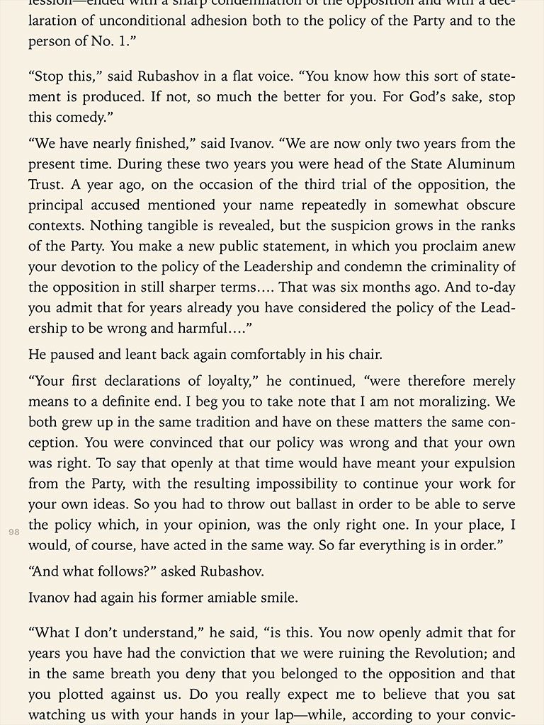
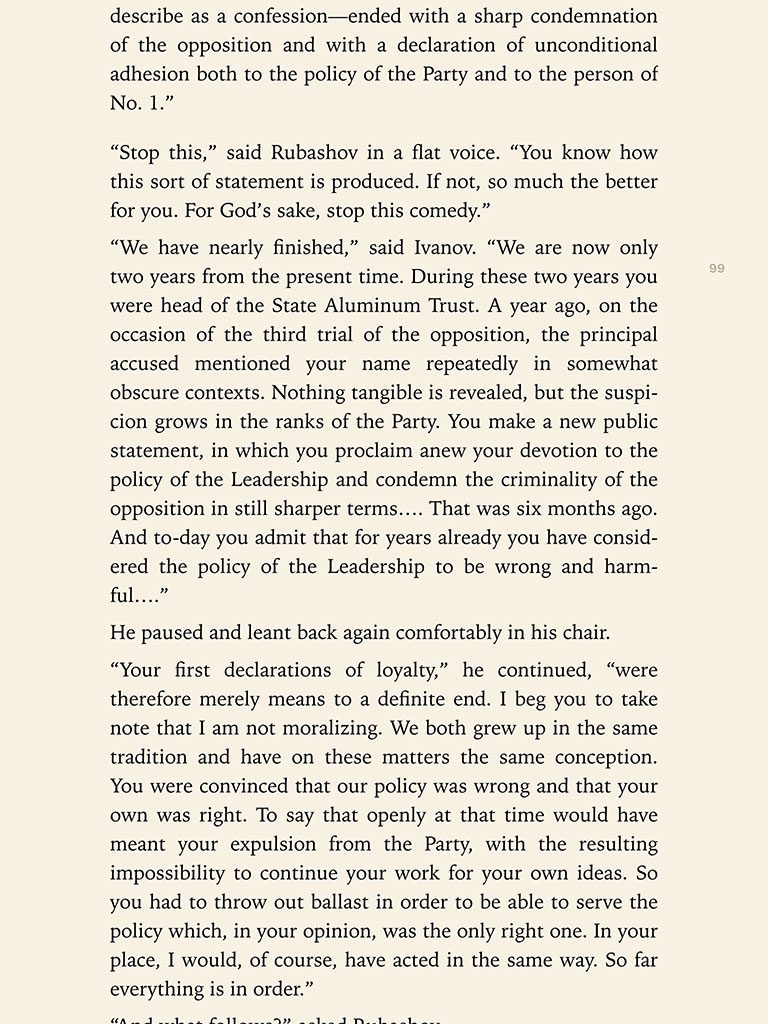
That is a screenshot of a page in iBooks, with continuous scroll turned on, after an update to iOS 10. The margins to the right and left are too small, leaving the text crowded to the edge of the screen. When using one of the new model iPad Pros, the text is less than an inch from the edge of the device. The width of the text also interferes with the eye’s ability to flow from one line to the next. What happened to all that whitespace that designers value so much? It used to be there. This is a screenshot of the same text taken in iBooks from an iPad running iOS 9:

ios9ibooks

The second screenshot shows a much better use of margins. I know there are charlatans out there who prefer text to be much closer to the edge, but they’re wrong. Luckily, a solution that satisfies most users should not be that difficult for Apple to implement. The Kindle app already has a margin selector in the same menu where a user adjusts fonts and background colors. The settings in iBooks does not. As of right now, the experience in iBooks on the iPad has been degraded by the decision to close the margins. Were Apple to add a margin selector, it would be a vast improvement to the app.

Tags:

 /  /  /  /  /  /  /  /  /  / 

Interface Details

In 2015, Moleskine released a calendar app for iOS (yes, the company that makes notebooks and journals).

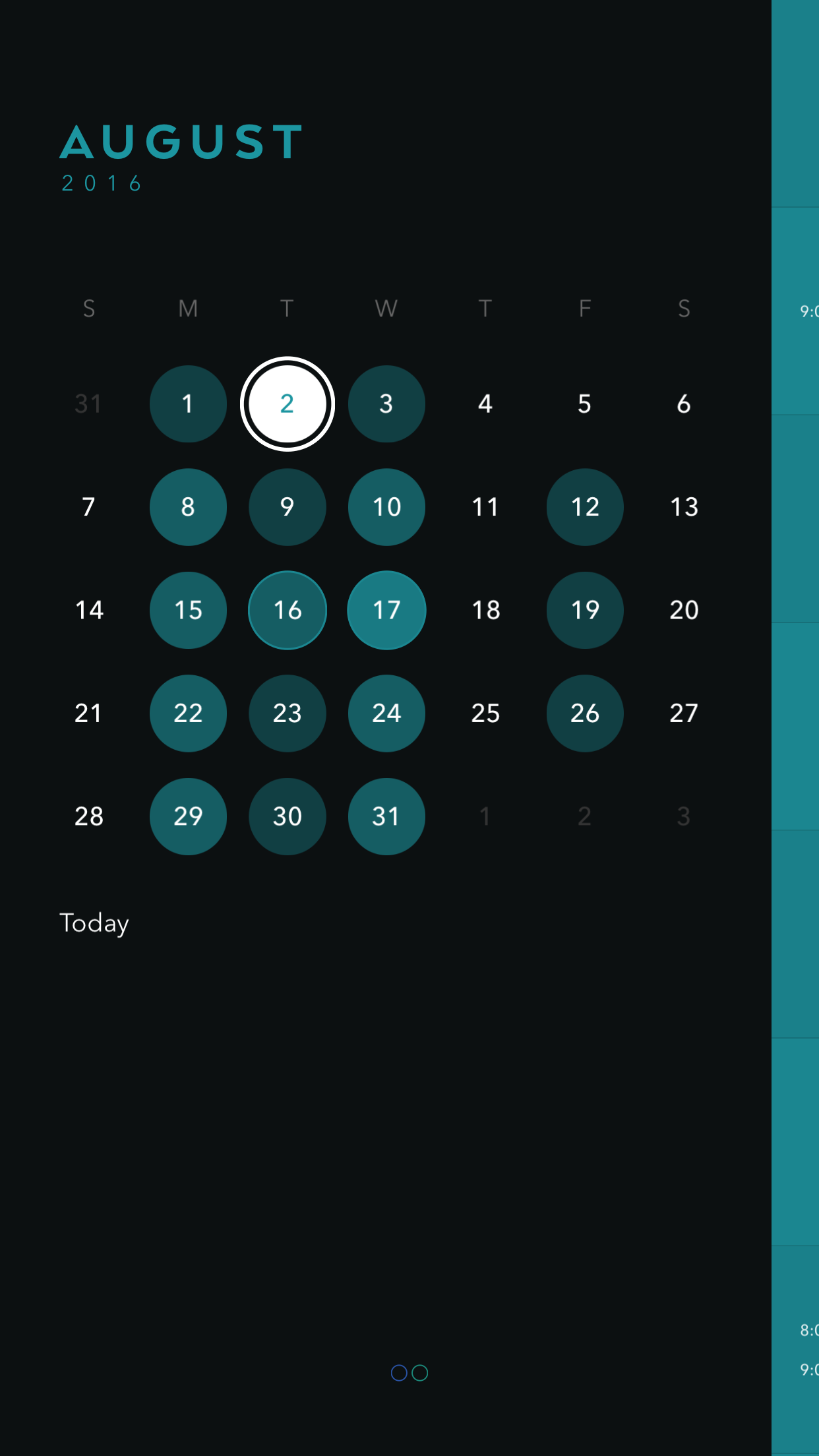
The app is called Timepage. I’ve been using it since it came out and it’s really good. As with all great design, it’s beautiful, but design is about how it works, not how it looks, and it works great. It much easier to use than Apple’s native Calendar app for iOS.

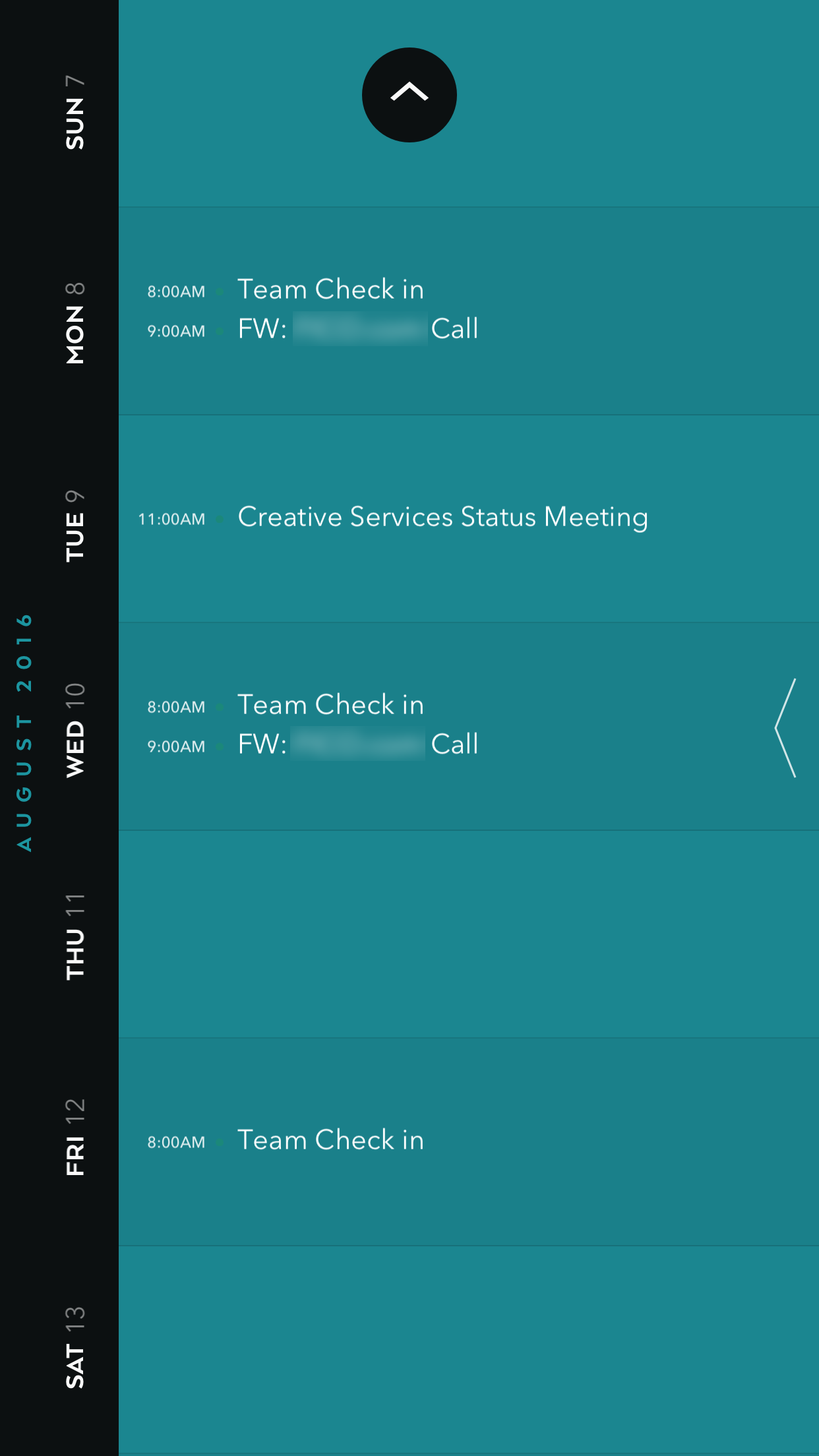
I’m not going to give a full breakdown of the app, I just want to highlight one detail I love. When you have no appointments on a day, instead of showing you nothing, it displays a historic event:

If you’re the kind of person searching for great calendar apps try it out, it’s $2.99 and if that’s too expensive for you, how about you skip your over-sugared and over-priced Starbucks latte.

Categories:

Interface

Tags:

 /  / 

The Gear Shifter Was Working Perfectly, Thanks for Messing it Up

The Verge: The recalled Jeep shifter is just bad user interface design:

First things first: if you have a 2014 or 2015 Jeep Grand Cherokee or a 2012-2014 Dodge Charger or Chrysler 300, you should call your dealer right now and set up an appointment for the recall. According to my local dealer, the update takes 3.5 hours, and it patches the car’s software to engage the emergency brake if the driver’s door is opened when the car is in neutral. That’s it. It’s a software update that was finally accelerated in the past few weeks after a death, even though problems with this shifter were so widespread that it made local TV news stories last year, the National Highway Transportation Administration issued a harsh report in February, and FCA recalled the shifter in April. The timeline is damning, but at least the update is here now. Go get it.

It’s frustrating to watch the video of Nilay Patel using the shifter. Car companies have essentially taken something that worked perfectly and replaced it with something that is confusing as shit. On the Jeep shifter, when you pull or push it into a gear, it returns to the center position, so there’s no way to tell by looking at it what gear you’re in.

If car companies want to experiment with new shifter configurations, they should remove the shifter entirely. Come up with something better, maybe something that saves space. If they’re offloading everything from an analog stick to software, then just use buttons. We’re already seeing this happen with cars where you don’t need to insert a key to them.

On a related note, car makers are already working on evolving the steering wheel:

Volvo’s Concept 26 vehicle, which debuted in November at the Los Angeles Auto Show, features a retractable steering wheel. Robin Page, Volvo chief of interior design, says Volvo chose to keep the familiar shape of the steering wheel.

“We wanted to keep that recognition of a round steering wheel,” he said. “People need to get used to autonomous drive, so being able to get back to that steering wheel and grab hold of it, that’s comforting. We decided to have it there as a recognizable icon.”

Kottke guest editor Tim Carmody makes a great point about this:

The steering wheel becomes a skeuomorph. It becomes a surveillance device, registering pressure to tell whether you have both hands firmly on the wheel, or if you’ve fallen asleep or are in distress. It becomes an entertainment console. It transforms and retracts into the dash to signal when you’ve shifted between user-controlled and autonomous modes. Its familiar presence soothes you through the transition. Eventually, you forget it was ever there at all.

A retactable steering wheel.

This reminds me of the retractable steering wheels in Demolition Man (video at 53 sec):

What else will evolve and go away. Rubber tires? Glass windshields?

Just think about just the word ‘car’. It originally was shorthand for ‘horseless carriage’ and the ‘glove compartment’ was the place you put your actual gloves.

The interfaces are changing. Will the labels?
Dropbox Looking Instagram-y

I updated Dropbox earlier today and I noticed the UI is a little bit more Instagram-y:

Instagram UI for reference (current and previous):

More info on the new “productivity” features here.

I’m not sure I’ll ever use any of the features they listed, but as long file syncing remains rock solid, I’ll continue to be a paying Dropbox customer.

Categories:

Interface, Product