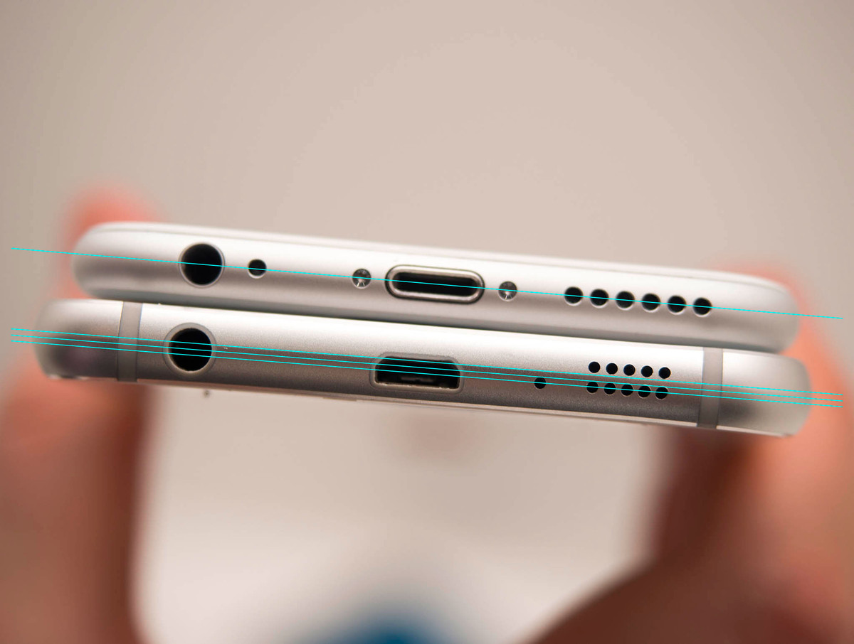
This Should Go Fine
At BGR.com, Brad Reed on Microsoft’s plans to let you port iOS and Android apps to Windows:
Microsoft is raising the white flag when it comes to developing its own mobile app ecosystem — instead, it’s going to let developers easily bring their iOS and Android apps over to Windows 10 without having to completely rebuild them from the ground up as they’ve had to do in the past. Essentially, Microsoft is letting developers reuse most of the same code that they used to write their apps for rival platforms and is giving them tools to help them optimize these apps for Windows.
Wow! Sounds tremendous. I’m sure there won’t be any redesigning needed. I mean, it’s not like Apple or Google have their own design guidelines, like this and this.
I’m also sure performance will be lickity-split. No lag or recoding needed.
Microsoft: Still In a Red Ocean
At Re/code, Ina Fried on Microsoft’s Build Conference this week:
When Microsoft CEO Satya Nadella takes the stage on Wednesday at Microsoft Build, the most important event of the year for the once mighty software maker, it represents something of a last best chance to win over mobile developers.
For all its power in the PC era, Microsoft has struggled to convince developers to create apps for its Windows Phone system, which has badly lagged rivals Google and Apple. Failing to win support at its annual developers conference this week could be fatal to its phone business.
I don’t see this week’s Build Conference shifting the tide for Microsoft.
They’re hovering at under 4% marketshare in the mobile OS space.
As I wrote back in 2011, a big part of Microsoft’s problem is that they’re in a red ocean, from Wikipedia:
Red Oceans are all the industries in existence today–the known market space. In the red oceans, industry boundaries are defined and accepted, and the competitive rules of the game are known. Here companies try to outperform their rivals to grab a greater share of product or service demand. As the market space gets crowded, prospects for profits and growth are reduced.
My wife just picked up a cheap Windows Phone as her secondary phone for her jewelry business (it was only $29!) and I have to say, Windows Phone is a great feeling operating system, but it’s just not enough.
Details Matter
Tripping a Debt Convenant
Wait, I’m not done with financial euphamisms, this one is regarding Ouya:
Gaming company OUYA is on the auction block after tripping a debt covenant, according to a confidential email sent out earlier this month from CEO Julie Uhrman to company investors and advisors.
Investment bank Mesa Global — which recently managed the sale of music service Songza to Google — has been hired to manage the process. No word yet on asking price.
“Tripped a debt convanent”? What the fuck?
So Ouya raised money, pissed it away and now the company that originally raised $8 million on Kickstarter and was heralded by some as an open source savior of the gaming world is done-zo.
Nice work, guys.
Financial Euphamisms
At TechCrunch, Alex Wilhelm on Microsoft’s quarterly 10-Q document:
Microsoft made waves recently by disclosing in its quarterly 10-Q document that its Phone business, which generates billions in yearly revenue, isn’t performing as well as it expected. As Microsoft is carrying billions of dollars of goodwill related to the Nokia purchase on its books, the warning landed like a brick in a puddle of lukewarm slop.
What the hell is goodwill?
Good question. According to Investopedia, goodwill is “[a]n intangible asset that arises as a result of the acquisition of one company by another for a premium value.” Or, put more simply, it’s the value you doodle onto your balance sheet after you buy something and can’t count every dollar you paid for as resulting in material assets.
I guess when you reach the point when you’re working with billions of dollars (be it real or made up) you view as Monopoly money.
There are some real cocksuckers in the financial world.
Things Connect Things
We don’t have to pour molten hot lead into copper matrices to make letters. We don’t have to typeset one page at a time, and we don’t have to make paper to print it all on. When an idea is ready to be published, we don’t even have to ship physical copies of that idea.
Once our brains put an idea into a computer, that idea can be on another computer in an instant. The bottleneck in this network of brains, then, is between the brain and the computer.
This is where design comes in. The clear presentation of the subtext of information (this is more important than that; that is related to this) through shapes, lines, colors, and spaces between pieces of information, strengthens the connection between brain and computer where language isn’t enough.
—David Kadavy, Design Connects Brains
What Then
Exploded
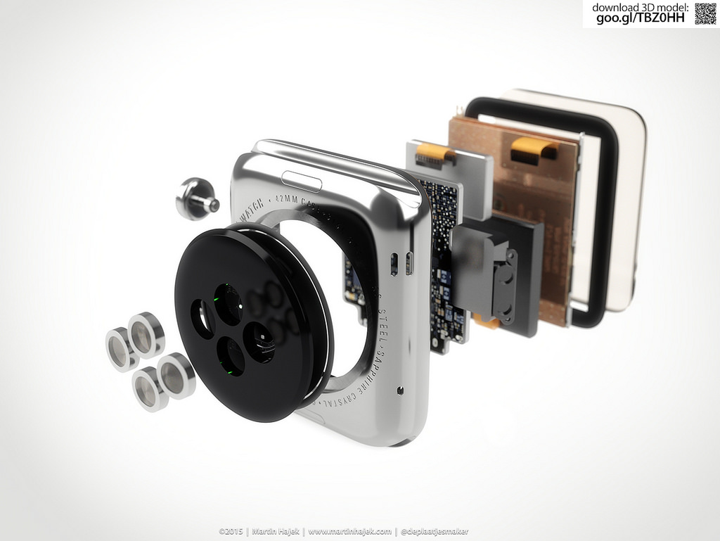
via martinhajek.com
Apple Watch Notifications
Dan Frommer on Apple Watch notifications:
I was expecting to be more annoyed by notifications.
It turns out that I’ve already done a good job turning off most in-app notifications—I haven’t been bothered at all by them.
Exactly as I said a few weeks ago, we are in charge of our gadgets, not the other way around.
Problem. Solved.
—Me
“That ergonomy is not a new discovery.”
I always enjoy listening to Jony Ive talk.
Eli Schiff has an interesting multi-part series on the “Fall of the Designer”.
Here’s a bit from Part 3, Conformist Responsive Design and the shift away from shiny, roundy, textural UI elements and towards ‘flat’ design:
Similar to web design, application design is becoming homogenized. Where before, apps like Tapbots’ Tweetbot were worlds unto themselves, with robotic sounds and futuristic cartoon aesthetics, today the only remnant of that past is robotic sound effects, devoid of any rationale as to why they sound the way they do.
Paul Haddad of Tapbots seemed to laud the shift, explaining in 2013 that he and his team “talked about making the Mac version a little bit more…plain” too. This hesitation might have invited our skepticism about their approval of flat design. But in the following years, Tapbots announced proudly their newly flattened Tweetbot 2.0 for OS X.
Tapbots is not alone in castrating Calcbot and their Twitter client Tweetbot. The Iconfactory’s Twitteriffic and Twitter’s proprietary iOS app in earlier days all attracted dedicated followings based on expressive designs which each exposed unique feature sets. But with their new flat interfaces, they struggle to differentiate their brands. Even with custom glyphs, animation and functionality, at a 10 foot view, it is difficult to tell one of these flat UIs from the next.
Did these developers suddenly have an epiphany and conclude that their former designs were ugly and overwrought? Or was it instead an imposed, though convenient, ideological shift by operating system designers?
I respect the time and thought Schiff has put into this series on design, and I think the answer to this last question is simple: fashion. UI design, like clothing, goes through different different phases and trends. Thats’ really it.
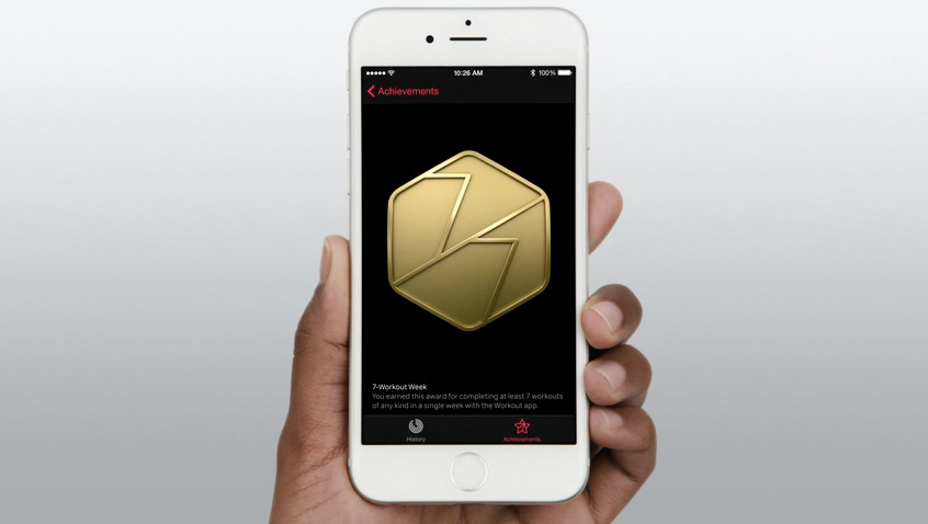
If you’re afraid skeuomorphism is gone forever, fret not. All you need to do is look at the achievement badges in the new Apple Watch exercise app:
There are gaudy ways of using depth and shading in UI design and there are tasteful ways of using depth and shading just like there tasteful and gaudy ways of using chrome and paint on a car.
I think what we’re seeing, as Schiff has pointed out is not so much flat design as lazy, flat design.
Da Vinci Was a Loser
Adam Westbrook explores our distorted view of success and our obsession with youth in his two part video series.
The Long Game Part 1: Why Leonardo DaVinci was no genius (4:25 minutes)
The Long Game Part 2: the missing chapter (5:48 minutes)
via Open Culture