This is ridiculous, ok I’ll go, I’ll go, I’ll go, I’ll go, I’ll go. I’LL GO. Shit.

via Dribbble
via Dribbble
My sister reminded me this morning today is Jimmy Page’s 70th birthday.
Next time you think about bitching about being too old to do shit, remember this video:
via YIMMY’S YAYO
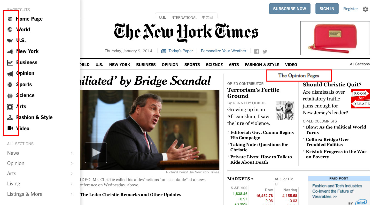
I like the New York Times redesign. The text looks great and I’m a big fan of white space. But, they went to all that trouble to redesign their site and left a whole bunch of icons and logos scattered throughout that are still 72dpi, i.e., too low-res for retina and other higher resolution screens. Come on, fellas, there’s no excuse for that. Here’s an image I captured on an iPad with some problem areas highlighted. Maybe you’ll be able to see the issue on your screen, maybe not.
Sorry, Jim, I couldn’t resist.
New Old Stock, “vintage photos from the public archives
Free of known copyright restrictions.”
Hell yeah.
I’ve been bruising up Android real nice lately, pointing out the things Google still isn’t getting right with the operating system, but today I have to turn my attention to Apple.
Yesterday, iClarified posted pictures of the iOS 7 beta release, which Apple just seeded to developers.
Here’s a before-and-after:
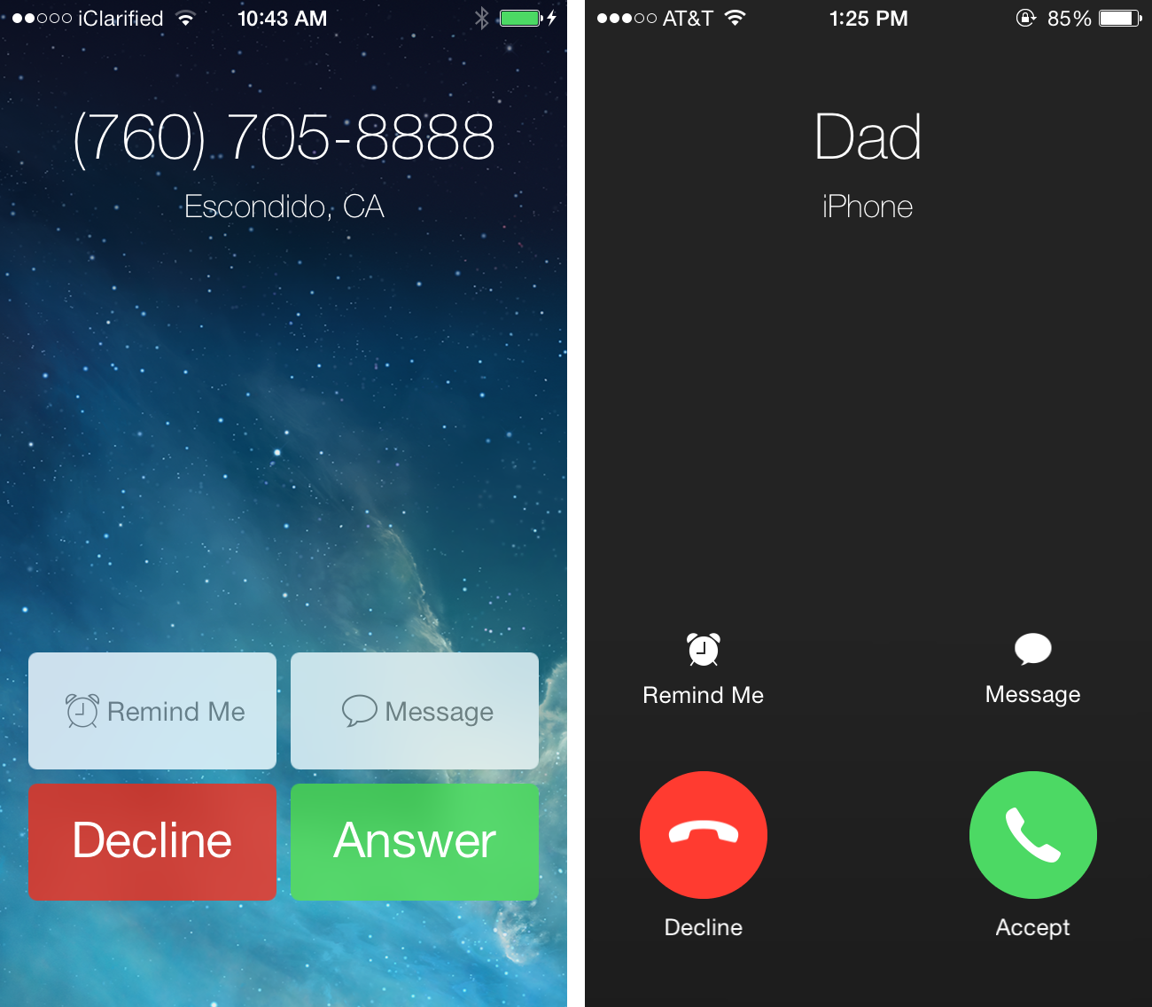
Why have Apple’s UI designers gotten into the bad habit of making the sizes of hit areas on buttons smaller?
This is the same problem we have with the iOS 7 music app I wrote about in November.
I’ll repeat myself for the millionth time: when you make hit areas on user interfaces smaller, they’re harder to click/tap on. I didn’t conceive of this. Paul Fitts did. This is excusable if you’re cramped for space, but the places where Apple is choosing to be stingy with screen real estate just doesn’t make sense.
There’s plenty of room for nice, big beautiful buttons. Use it.
This is a beta release, so let’s hope Apple reverts to the current button style.
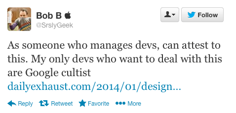
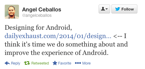
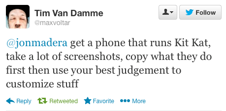
Based on some of the feedback I’ve received on my mini-rant about the poor state and Android UI & UX design, there is definitely a contingency of people out there who feel everything is great in Android land.
Luckily, there’s also people who acknowledge the work that needs to be done to improve Android’s design.
These headlines caught my eye today:
BGR: Leaked photos may reveal Samsung’s gorgeous new Android interface
To be clear, the screenshots in the link above are interesting looking, but the font choice is far from great. It resembles Gill Sans, a typeface known for it’s problems, not the least of which is how bad it looks in title case (it should only be used in all caps).
And this one, also from BGR:
BGR: Is Android’s iPhone finally here?
As well as these tweets:
If you’re wondering, yes, I do have thoughts on problems with iOS 7 I plan on publishing as well.
There’s no interface on the planet that’s above criticism.
I wonder how common this method is?
via Designer News
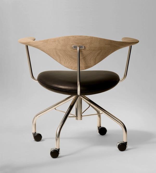
Swivel Chair by Hans J. Wegner
via 2Modern
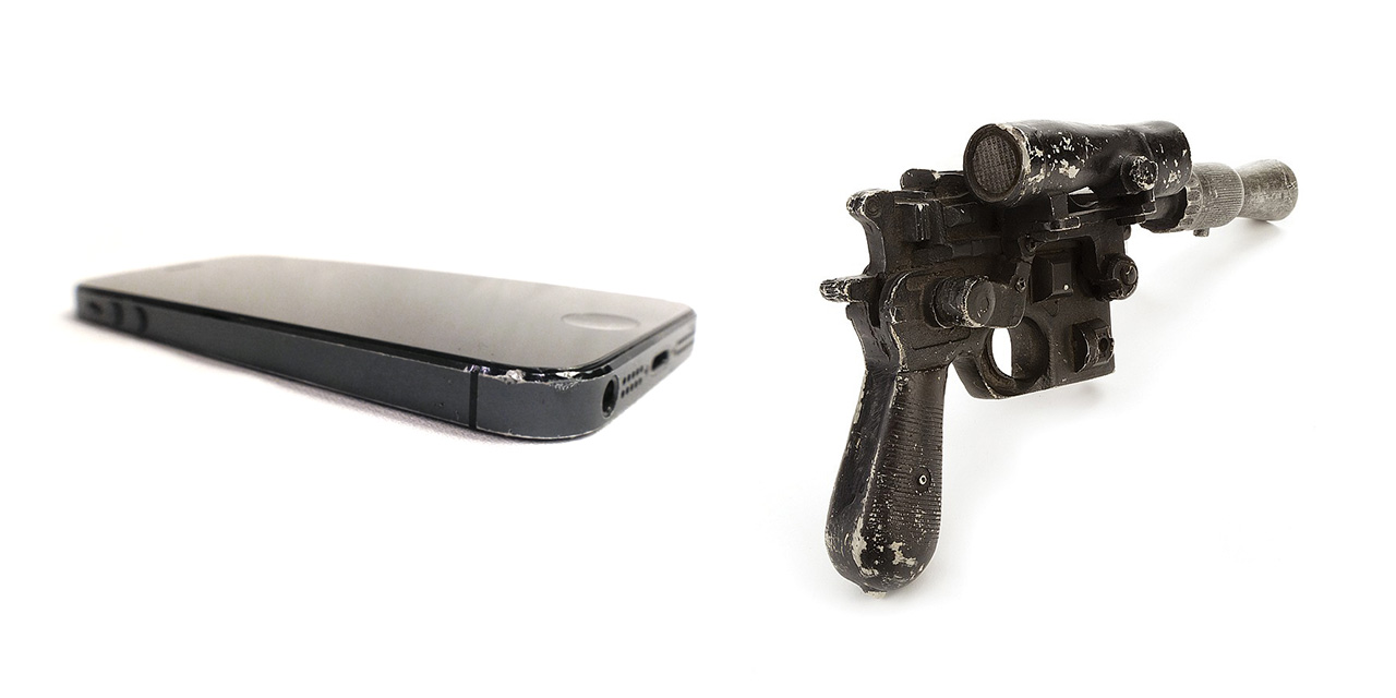
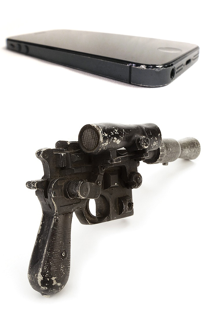
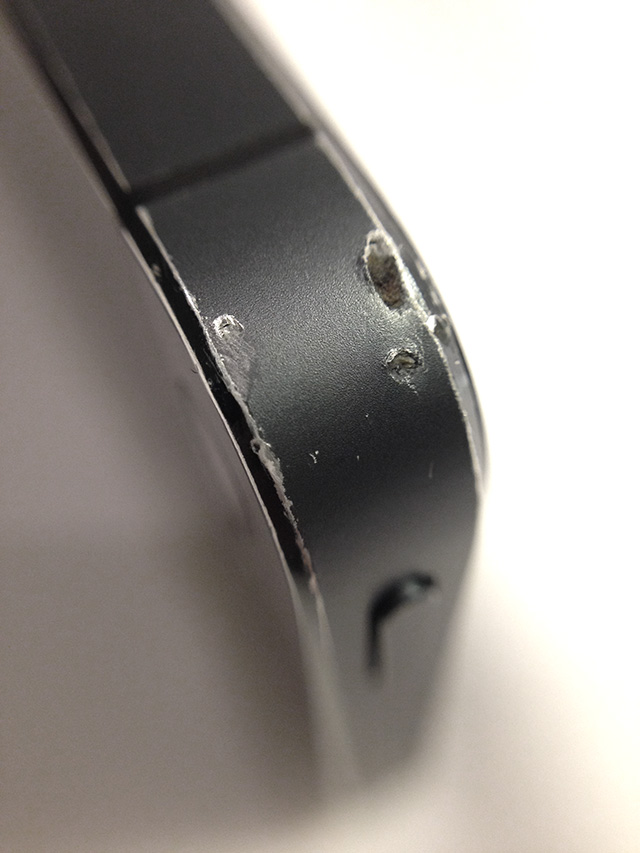
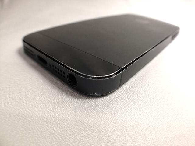
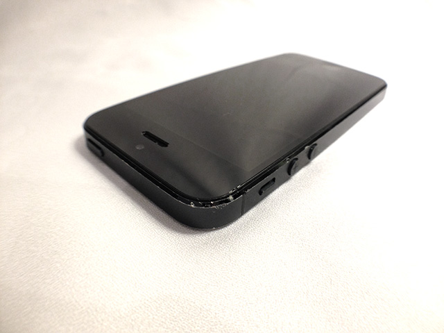
Since my original iPhone, I’ve been against cases and protectors. Yes, screens can crack and make lovely spiderweb patterns you have to read through, but generally speaking, iPhones (and many other gadgets) can deal with everyday wear-and-tear.
I’ll go so far as to say I like the look of a worn, scratched up iPhone.
I comped mine up next to Han Solo’s blaster. You be the judge.
And yes, my phone still works perfectly, with no cracks on the screen.
(all iPhone photos shot with an iPhone 5 with the awesome olloclip attached, Blaster photo taken from Invaluable)
Pebble announced a new watch, the Pebble Steel.
I’m with Gruber, the design is horrible.
We shouldn’t be surprised. I mean, look at their website:
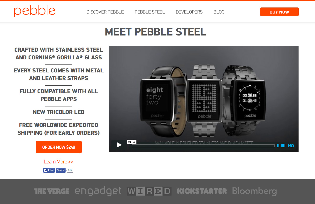
Oof.
At BGR, Zach Epstein says Android is about to get a whole lot sexier because Google acquired Bitspin:
Bitspin consists of a small team of application developers based in Zurich, Switzerland that is fresh out of college. Timely is the only Android app the group has released at this point. While Google hasn’t shared any plans for its Bitspin acquisition, it’s possible that the team will help design user interfaces and user experiences for the companies various Android apps, or even help tweak various areas of the core Android interface itself.
For the sake of all the Android users in the world, I can only hope Bitspin takes a crack at reworking the UI of Android. Sexier would be a big improvement for Android, even though ‘sexier’ does not mean ‘better designed’ (design is how it works).
I’m not holding my breath though, because it’s not like Bitspin is going to solve the fragmentation problem and fragmentation is one of the main monkey wrenches in the Android design problem.