Papanek

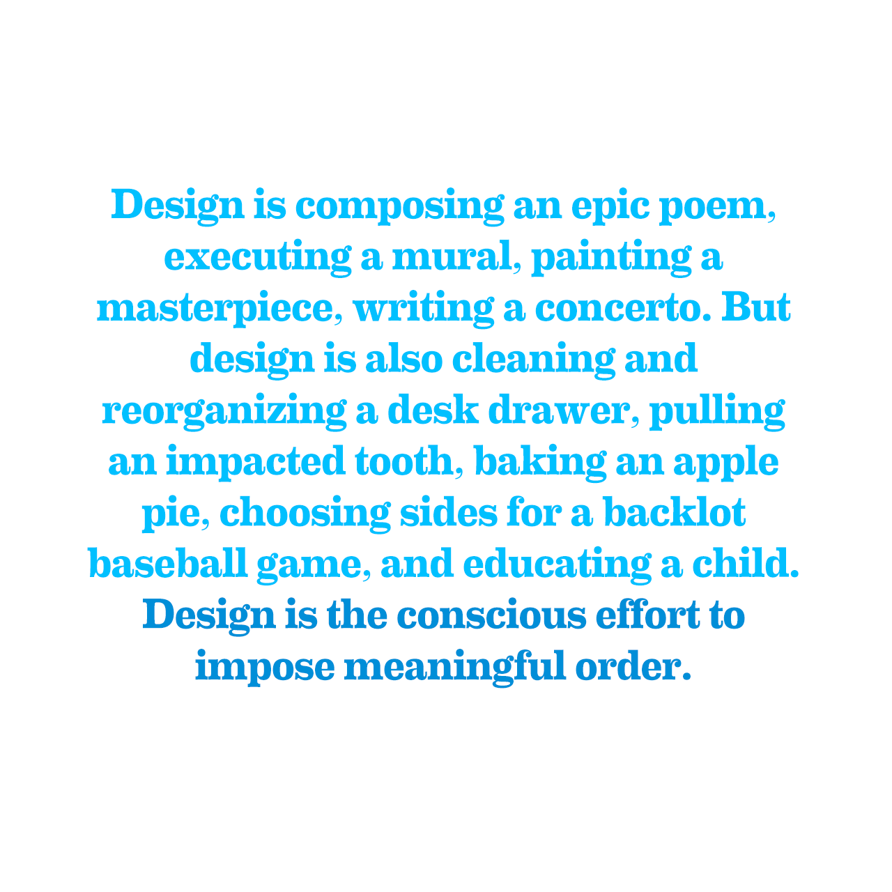
—from Design for the Real World by Victor Papanek

—from Design for the Real World by Victor Papanek
David Byrne: If the 1% stifles New York’s creative talent, I’m out of here
What, then, is the future of New York, or really of any number of big urban centers, in this new Gilded Age? Does culture have a role to play? If we look at the city as it is now, then we would have to say that it looks a lot like the divided city that presumptive mayor Bill de Blasio has been harping about: most of Manhattan and many parts of Brooklyn are virtual walled communities, pleasure domes for the rich (which, full disclosure, includes me), and aside from those of us who managed years ago to find our niche and some means of income, there is no room for fresh creative types. Middle-class people can barely afford to live here anymore, so forget about emerging artists, musicians, actors, dancers, writers, journalists and small business people. Bit by bit, the resources that keep the city vibrant are being eliminated.
I lived in New York for 12 years and started to see the signs Bryne talks about in 2012 when my wife and I moved out. Now we’re in San Francisco and seeing the same signs, perhaps even more.
(Note: I began a draft of my review of Steve Jobs by Walter Isaacson back in 2011. This week I dug it up, rewrote a lot of it, but the core of my review is the same.)
Summary: Steve Jobs by Walter Isaacson is nothing but a huge, missed opportunity.
Steve Jobs was written by a man who not only didn’t know Steve Jobs, but has no understanding or insight into the world of computers Jobs helped create.
Isaacson had a lot of sources to pull from when he began this book. There was a handful of times where I knew exactly where he had pulled a story or quote, whether it be from Jobs’ commencement address at Stanford in 2005 or story from Andy Herzfeld’s (one of Apple’s first employees) Folklore.org. Or the introduction of the first Macintosh. Or his ‘Values’ talk in 1997 after his return to Apple. Or the awesome interview with him at Wired in 2002.
Isaacson managed to badly summarize the key moments in Apple’s history and Steve’s life because he didn’t have a thorough grasp of the computer industry. I also noticed inconsistencies in how he referred to different computer acronyms and functions within computers and operating systems.
Despite the persistent sense of unease I felt, paragraph after paragraph, I continued reading through the book. Occasionally I was rewarded with anecdotes and details I had never heard before—like the fact that Jobs wanted to rename the Macintosh to be ‘The Bicycle’ (inspired by my favorite Jobs quote).
It wasn’t until I finished the book and listened to John Siricusa’s reaction did I realize how badly Isaacson botched it. Siricusa gave his review in episode #42 of his podcast, Hypercritical, with Dan Benjamin. It’s the best and most (hyper)critical review you’ll ever read on Steve Jobs. As I listened to Siricusa list out all the problems and errors in the book, I kept thinking to myself, “Damn, that’s what I was thinking too!”.
Before getting into all his nit-picky problems, Siricusa first summarizes his take on the biography by referencing an interview with Steve Jobs in the documentary, Triumph of the Nerds (1996). In the interview, Jobs is asked about his fallout with the guy he hired to run Apple, John Sculley. The board of directors at Apple eventually voted to keep Sculley and fire Jobs. Jobs replies, “What can I say, I hired the wrong guy.” (Here’s an excerpt, around the 3:41 mark)
In reference to Isaacson, Siricusa says (my emphasis):
Reading the Walter Isaacson Steve Jobs bio, if I had to summarize my take on the book, I would say, what can I say, he picked the wrong guy to write his bio because Walter Isaacson, for whatever his strengths might be, was absolutely the wrong guy to write the official biography of Steve Jobs.
He continues:
I can’t emphasize this enough—the thing that’s special about this book, because many, many books have been written about Steve Jobs and Apple, is that this is the one book, with the one guy, who had official, authorized access to Steve Jobs. […] It was notoriously difficult to pin down Steve Jobs. He doesn’t like doing interviews. He doesn’t like talking about his personal life at all. So this is the one time that he says, “c’mon, I want you to do a book about me, you can ask me anything.”
And (my emphasis):
The reason I say he’s the wrong guy is Walter Isaacson does not know this industry. The industry Steve Jobs grew up in and defined. That’s strike one. But strikes two and three is that he doesn’t know and he didn’t bother to learn about it. That’s the most egregious sin. It’s like he didn’t feel the responsibility of, “I’m the one guy with the authorized Steve Jobs biography, I know nothing about this industry at all, but I better buckle down and learn.”[…]
If you don’t know the industry, how can you know what’s important in the life of this person? What Walter Isaacson came in with is sort of a generalist, lazy-person’s knowledge of computers and what he ends of focusing on in the bio are sort of human interest, general interest stuff. Family, friends, relationships, money, gossip. Things that are sort of common to the human experience and he should write about those, but it’s impossible to have any real insight in a life like Steve Jobs if you just look at the parts that are common to all lives. […]
You’re missing out on what’s special.
First, I recommend every read the Steve Jobs bio if you haven’t already. It might suck, but there is knowledge in the book you won’t find elsewhere.
Once you’ve done that, check out episodes 42 & 43 of Hypercritical to hear Siricusa’s full review. It’s awesome.
Steven Sinofsky responds to the fall of Blackberry on his blog:
Disruption happens when a new product comes along and changes the underlying assumptions of the incumbent, as we all know.
Incumbent products and businesses respond by often downplaying the impact of a particular feature or offering. And more often than folks might notice, disruption doesn’t happen so easily. In practice, established businesses and products can withstand a few perturbations to their offering. Products can be rearchitected. Prices can be changed. Features can be added.
What happens though when nearly every assumption is challenged? What you see is a complete redefinition of your entire company. And seeing this happen in real time is both hard to see and even harder to acknowledge. Even in the case of Blackberry there was a time window of perhaps 2 years to respond-is that really enough time to re-engineer everything about your product, company, and business?
…says the man who left Microsoft.
His post is decent, but hindsight is 20/20. It’s like an alcoholic with a revoked driver’s license telling you not to drink and drive.
Sinofsky mentions “Christensen” once, but it would have been good to mention the actual book that obviates his blog post—The Innovator’s Dilemma by Clayton Christensen.
Mobile is ubiquitous. As such, every website needs a mobile version. It just makes sense (except over at my site; we’re keeping things REAL). But, mobile websites don’t just fall from the sky. They need to be designed and developed with the same amount of care as a site made for desktop browsers. So, for all you small business people who are planning on hiring some people to design and build a site: If you want a mobile version, mention it in advance. Bringing up the subject at the end of a project, and expecting it to have been part of the package, is not going to do much to foster good relationships with your contractors.
If there has been no mobile design that you saw or approved of, there will be no mobile site. If there is no quote for a mobile version in the estimate, there will be no mobile site. And most importantly, if you do not ask for a mobile version of the site, you will not get one. Someday soon, it will not need to be said that a mobile version is required (it will still have to be paid for), but that day is not here yet.
First, Microsoft shows up a few years late to the tablet party with a half-baked product, Surface.
Then they sell about 9 Surfaces total in the year it’s been on the market.
…wait, I mixed that up, that should be $900,000,000 that Microsoft had to write off for all the unsold Surfaces.
Then they announce the Surface 2, who’s updates include a new docking station, a new kickstand and better battery. People are going to be all over that shit for sure. Are you kidding me? My parents love kickstands and docking stations. Doesn’t everybody?
Now Dell announces their own Windows 8.1 tablet priced to undercut Microsoft’s Surface 2. Yeah, that’s right. A licensed, Microsoft partner is trying to undercut Microsoft because, well, Microsoft wants to have it’s cake and eat it.
Doesn’t this whole thing seem like a bad dream?
via The Loop
(Title attributed to sci-fi author William Gibson)
Over at Campaign Monitor they’ve published an article on how to design iOS 7 style icons.
Bad idea.
Apple has introduced some great, new features in iOS 7—iconography and typography are not on the list (more on this in a forthcoming post).
Aubrey Johnson has an insightful post on the cognitive issue with hollow icons.
Take a look at the example above. The red lines indicate areas where cognitive load is occurring. Your brain traces the shapes on the first row an average of twice as much. Your eye scans the outside shape and then scans the inner line to determine if there is value in the “hollow” section.
Icons without this empty core are processed as definite and only the outer lines are processed. Depending on the outline of the shape, this happens pretty fast. No matter the shape, though, the hollow icons take more time to process.
I completely agree. Since I installed iOS 7 on my iPhone 5 a few weeks ago I’ve been thinking the icons aren’t icons so much as they’re wireframes of icons. This makes them hard to distinguish from each other (particularly in Mobile Safari).
In short, the iconography in iOS 7 is a perfect example of form over function.
 –from Sherlock Holmes: A Game of Shadows
On September 4th, Samsung announced their smartwatch, Gear (It looks and sounds weird without “the Samsung” in front of it, right?).
What’s ironic about Samsung’s efforts to beat Apple to market with their own smartwatch is that in cobbling together a half-baked product with no clear purpose and problem to solve, they’ve set up Apple to look even better when Apple announces whatever it is they’re cooking up with the M7 chip.
Samsung is much more successful when they follow Apple’s lead, as they’ve done up until now.
Just check out these reviews below. Pretty harsh.
Gizmodo:
Ultimately, though, this feels like a beta product. Apps feel unfinished, gestures are finicky, and very little about the whole experience is fluid or easy. It often takes a lot of scrolling around to finally find the app you want, and even then it’s easy to accidentally back out of it because it mistook your tap for a swipe. It seems like Samsung just wanted to put some feelers out there and try to get some feedback from consumers, while charging them $300 for the honor.
The Verge:
A smartwatch the Galaxy Gear is not. Frankly, I’m not sure exactly what it’s supposed to be. Samsung describes it as a companion device, and the Gear is indeed chronically dependent on an umbilical link to another Samsung device, but it never left me feeling like it was a helpful companion. The notifications are Orwellian, the media controls are exiguous, and the app selection has no substance to underpin the hype. Samsung’s attempt to turn the Gear into a style icon is also unlikely to succeed, owing to the company’s indecision about its target demographic. Trying to please all tastes has resulted in a predictably charmless and soulless product.
BGR:
Wearables may or may not be the future of computing, but the Galaxy Gear makes envisioning that future very difficult.Samsung is pitching the Gear as a smartphone companion device that is designed to make your life easier. It does not. In some cases the Gear adds conveniences to the mobile experience but they are minor at best and they come at too great a price: Another device to charge each day, an awful experience where voice controls are concerned, and a constant uncomfortable feeling shared by the user and those around him or her.
Engadget:
The Gear isn’t bad for a first-generation Samsung product, and it’ll get better as the ecosystem grows. Of course, that’s if the watch catches on and developers decide it’s worth their time to produce a special app for it. Of any Android manufacturer, Samsung stands the best chance of gaining support. If it doesn’t succeed, however, the $300 retail price will be even harder to swallow than it currently is, and no assortment of hot colors will change the fact that it’s little more than a glorified time-telling device.
Uh-oh. DE contributor Bryan Larrick is back with the October Horrorshow:
October is here. Rejoice! For this is the best month in which to watch horror films. Summer has just died and the month ends with Halloween. The chill that has suddenly arisen in the air portends the coming cold slumber of winter…or the passing whisper of a phantom. To celebrate, Missile Test once again dedicates the month to reviewing horror films. The good, the bad, or the putrid. It doesn’t matter. If there’s blood, it gets a watch. Welcome to the fifth annual October Horrorshow. First up is a real winner.
He’s going to be posting a new horror film review each day this month.
The first is a real winner, Resident Evil: Retribution:
As for the casting choices, it’s rare to see an ensemble this uniformly bad in a movie that doesn’t have the words “fast” and/or “furious” in its title. Or, to put it another way, how does a cast get worse AFTER it loses Ali Larter from one film to the next? The answer: it adds Sienna Guillory.The single worst acting I have ever seen in a film was turned in by Robbi Morgan in the original Friday the 13th. With her performance in Retribution, Guillory has seized the crown. It was a stunningly inept performance, on par with a class of kindergarteners putting on a Christmas pageant, or the awkward openings of porn scenes. Although, I’m pretty sure Sasha Grey or Traci Lords would have been better in this movie. I will never forget how maliciously Guillory butchered the art of acting for as long as I live, unless some other brave soul surpasses her level of futility in some future project.
Grab the popcorn.