Last week, Amazon updated it’s Kindle app for iOS. For the iPad, the new update is a case study in poor design. From the update blurb in the app store:
Improved reading experience on iPad: Smaller margins and a cleaner look help you focus on the author’s words.
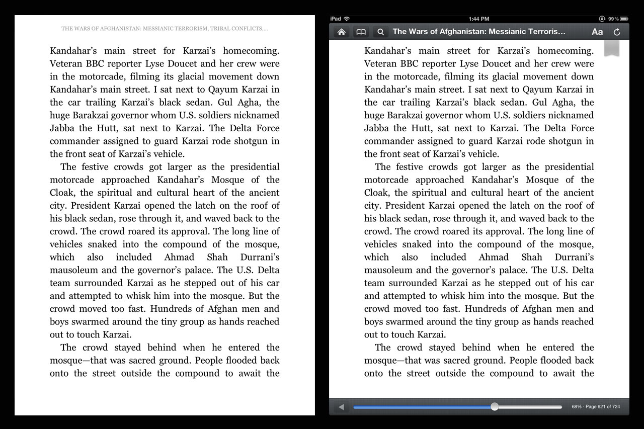
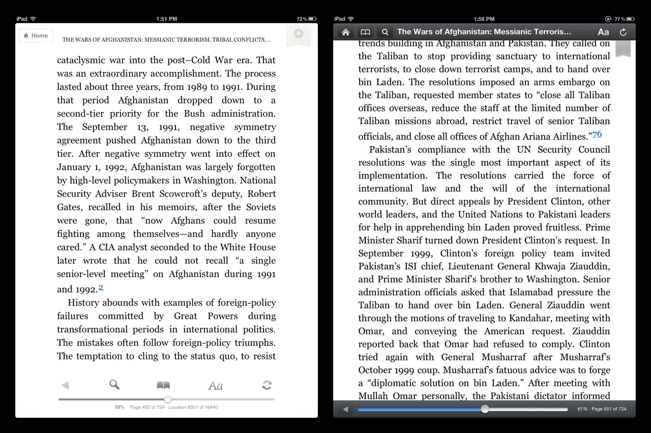
When I first saw this in the blurb, I was immediately suspicious. It’s hard to overstate the importance of healthy margins and whitespace in good design. Generally, it’s also one of the earlier casualties when good design meets project managers and clients who aren’t designers. But I updated the app anyway. Upon opening, I saw what had been a decent treatment of margins had been destroyed by the redesign:
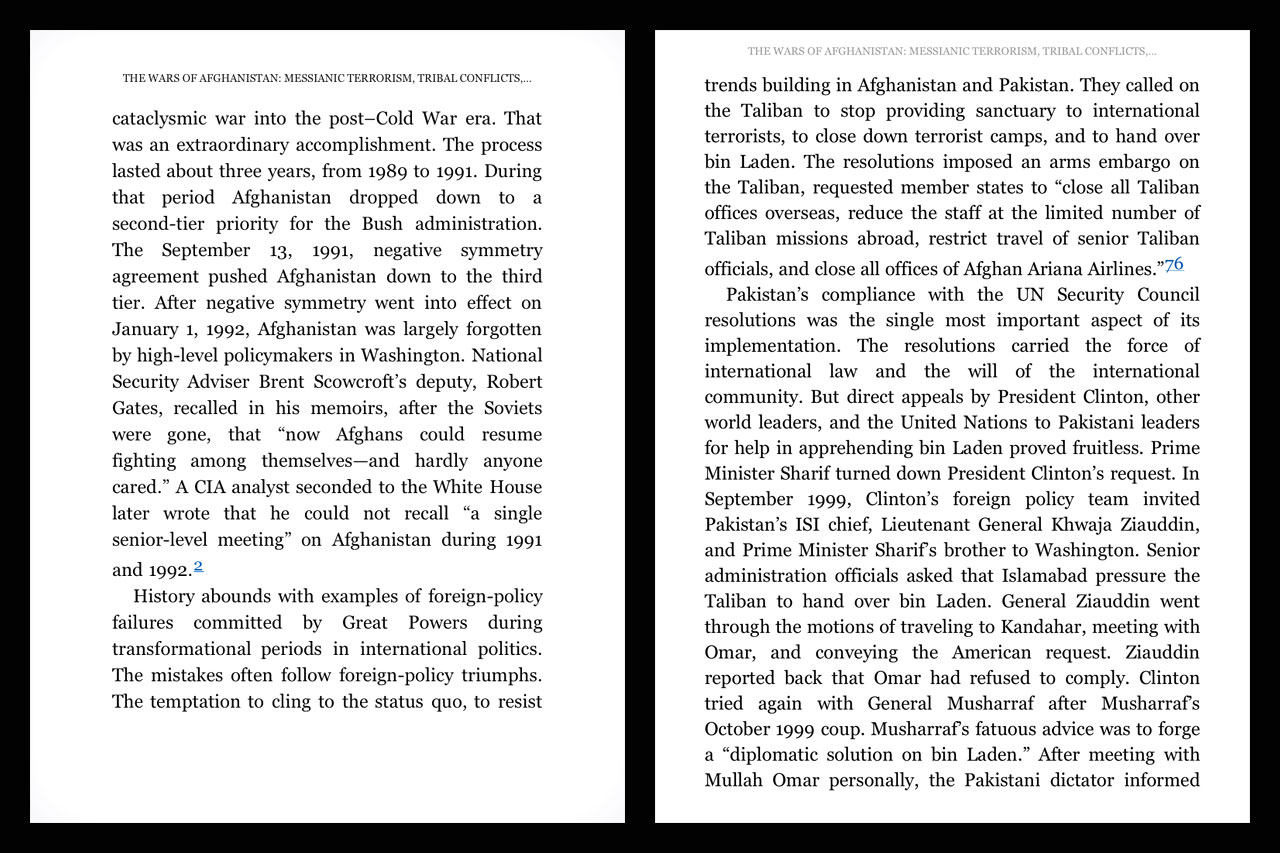
The image on the left is a screen capture from an iPad without the update installed (I’m a developer, I have more than one iPad. How first world of me.). The image on the right is with the update installed.
The smaller margins do indeed help a user focus on the words. In fact, that’s all a user can focus on. What Amazon has done is create a solid mass of text that has no breathing room. It’s claustrophobic. It’s stressed.
It’s like standing three feet in front of a brick wall and pretending you’re appreciating the architecture of a building.
The words are the most important aspect of a book. That’s intuitive. But, presentation is very important. Having ample margins helps the eye flow over the text and makes it easier to move from one line to the next while reading. Making the margins smaller in the app hinders the ease with which the eye can move over the page, making the book harder to read, not easier. Also, it’s just ugly.
There is also a usability gap that was created with the update. Previously, the app’s toolbar overlays would not interfere with the text on the page. Some people like to read with the toolbar visible. I’m not among them, but I respect that. After the update, keeping the toolbar visible is no longer a workable option:
Also, the new toolbar design has none of the nuance of the previous version. It’s black, bold, and in a user’s face. Even if it didn’t cover up text, the look and feel of the new toolbar is a downgrade.
The Kindle app in the iPad has been a conundrum ever since I began to use the device, simply because the presentation has always been suspect. The options for reading have been limited in ways I could never understand.
Continue…