
Tripping a Debt Convenant
Wait, I’m not done with financial euphamisms, this one is regarding Ouya:
Gaming company OUYA is on the auction block after tripping a debt covenant, according to a confidential email sent out earlier this month from CEO Julie Uhrman to company investors and advisors.
Investment bank Mesa Global — which recently managed the sale of music service Songza to Google — has been hired to manage the process. No word yet on asking price.
“Tripped a debt convanent”? What the fuck?
So Ouya raised money, pissed it away and now the company that originally raised $8 million on Kickstarter and was heralded by some as an open source savior of the gaming world is done-zo.
Nice work, guys.
Financial Euphamisms
At TechCrunch, Alex Wilhelm on Microsoft’s quarterly 10-Q document:
Microsoft made waves recently by disclosing in its quarterly 10-Q document that its Phone business, which generates billions in yearly revenue, isn’t performing as well as it expected. As Microsoft is carrying billions of dollars of goodwill related to the Nokia purchase on its books, the warning landed like a brick in a puddle of lukewarm slop.
What the hell is goodwill?
Good question. According to Investopedia, goodwill is “[a]n intangible asset that arises as a result of the acquisition of one company by another for a premium value.” Or, put more simply, it’s the value you doodle onto your balance sheet after you buy something and can’t count every dollar you paid for as resulting in material assets.
I guess when you reach the point when you’re working with billions of dollars (be it real or made up) you view as Monopoly money.
There are some real cocksuckers in the financial world.
Things Connect Things
We don’t have to pour molten hot lead into copper matrices to make letters. We don’t have to typeset one page at a time, and we don’t have to make paper to print it all on. When an idea is ready to be published, we don’t even have to ship physical copies of that idea.
Once our brains put an idea into a computer, that idea can be on another computer in an instant. The bottleneck in this network of brains, then, is between the brain and the computer.
This is where design comes in. The clear presentation of the subtext of information (this is more important than that; that is related to this) through shapes, lines, colors, and spaces between pieces of information, strengthens the connection between brain and computer where language isn’t enough.
—David Kadavy, Design Connects Brains
What Then
Exploded

via martinhajek.com
Apple Watch Notifications
Dan Frommer on Apple Watch notifications:
I was expecting to be more annoyed by notifications.
It turns out that I’ve already done a good job turning off most in-app notifications—I haven’t been bothered at all by them.
Exactly as I said a few weeks ago, we are in charge of our gadgets, not the other way around.
Problem. Solved.
—Me
“That ergonomy is not a new discovery.”
I always enjoy listening to Jony Ive talk.
Eli Schiff has an interesting multi-part series on the “Fall of the Designer”.
Here’s a bit from Part 3, Conformist Responsive Design and the shift away from shiny, roundy, textural UI elements and towards ‘flat’ design:
Similar to web design, application design is becoming homogenized. Where before, apps like Tapbots’ Tweetbot were worlds unto themselves, with robotic sounds and futuristic cartoon aesthetics, today the only remnant of that past is robotic sound effects, devoid of any rationale as to why they sound the way they do.
Paul Haddad of Tapbots seemed to laud the shift, explaining in 2013 that he and his team “talked about making the Mac version a little bit more…plain” too. This hesitation might have invited our skepticism about their approval of flat design. But in the following years, Tapbots announced proudly their newly flattened Tweetbot 2.0 for OS X.
Tapbots is not alone in castrating Calcbot and their Twitter client Tweetbot. The Iconfactory’s Twitteriffic and Twitter’s proprietary iOS app in earlier days all attracted dedicated followings based on expressive designs which each exposed unique feature sets. But with their new flat interfaces, they struggle to differentiate their brands. Even with custom glyphs, animation and functionality, at a 10 foot view, it is difficult to tell one of these flat UIs from the next.
Did these developers suddenly have an epiphany and conclude that their former designs were ugly and overwrought? Or was it instead an imposed, though convenient, ideological shift by operating system designers?
I respect the time and thought Schiff has put into this series on design, and I think the answer to this last question is simple: fashion. UI design, like clothing, goes through different different phases and trends. Thats’ really it.
If you’re afraid skeuomorphism is gone forever, fret not. All you need to do is look at the achievement badges in the new Apple Watch exercise app:

There are gaudy ways of using depth and shading in UI design and there are tasteful ways of using depth and shading just like there tasteful and gaudy ways of using chrome and paint on a car.
I think what we’re seeing, as Schiff has pointed out is not so much flat design as lazy, flat design.
Da Vinci Was a Loser
Adam Westbrook explores our distorted view of success and our obsession with youth in his two part video series.
The Long Game Part 1: Why Leonardo DaVinci was no genius (4:25 minutes)
The Long Game Part 2: the missing chapter (5:48 minutes)
via Open Culture
Superheroes Don’t Kill (anymore)
Over at Slate, Jacob Brogan writes about the origin of superheroes not killing:
The industry as a whole didn’t adopt a collective set of standards until 1954, when prominent publishers banded together to form the Comics Code Authority in response to Wertham’s attacks and the congressional hearings they inspired. Long before, however, DC’s prominent characters provided a tacit model for every superhero that would follow. Accordingly numerous other costumed adventurers who refused to kill would appear in the years after Ellsworth laid down the law: Spider-Man wraps thieves up in webbing, the Fantastic Four banish their enemies to the Negative Zone, and Netflix’s Daredevil tosses would-be assassins into dumpsters. By editorial fiat, Ellsworth had effectively imposed a principle that comics storytellers still follow today, three-quarters of a century after the moral panic that inspired it.
If you follow Bryan and I on the Weekly Exhaust podcast, you’ll know Bryan talked about this on episode 34.
Aperture, Shutter Speed & ISO
This is a great example of how data visualization and illustration can simplify the understanding of complex ideas:
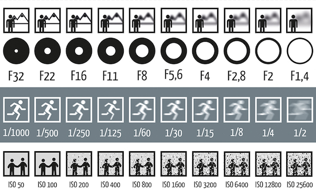
via Lifehacker
Lester Beall
Here are a few of those posters Armin Vit was talking about:


Seemingly simple compositions, but powerful.