Sealed Up

Rafe Colburn asks, why are Apple laptops becoming harder to take apart? (via Daring Fireball)
… and gives an answer:

I know a lot of people think that computers (and many other products) are becoming less maker-friendly because greedy companies want to get more money for parts and labor, or even better, shorten the upgrade cycle and sell more computers, or cars, or appliances, or whatever.

I doubt that is ever really the case. There are a lot of tradeoffs that go into product design. When it comes to laptops, there are capabilities (display resolution, processor speed, storage space, battery life, and so on), size and weight, cost, and upgradeability. Apple seems to have gotten the impression that upgradeability is the factor that people care about the least, and I suspect that they’re right.

I’m sure there’s people in the automotive world asking themselves the same thing. If you open the hood to a lot of cars these days all you see is a big cover over everything. Car makers don’t want you monkeying with shit the same way Apple doesn’t want you monkeying with shit. Even Mercedes uses a special vacuum to suck the oil out of your engine when you get an oil change. There’s not even a lug nut underneath the car if you wanted to do it yourself.
The same goes for car stereos. When I was a teenager, my friends and I used to swap out and install new stereo equipment all the time. This was long before dashboards were filled with GPS units and satellite radios. Things are much more complex now and the majority of people buying cars and computers don’t want to customize their things.
Categories:

Materials

Tags:

Improved Reading Experience? No.

Last week, Amazon updated it’s Kindle app for iOS. For the iPad, the new update is a case study in poor design. From the update blurb in the app store:

Improved reading experience on iPad: Smaller margins and a cleaner look help you focus on the author’s words.

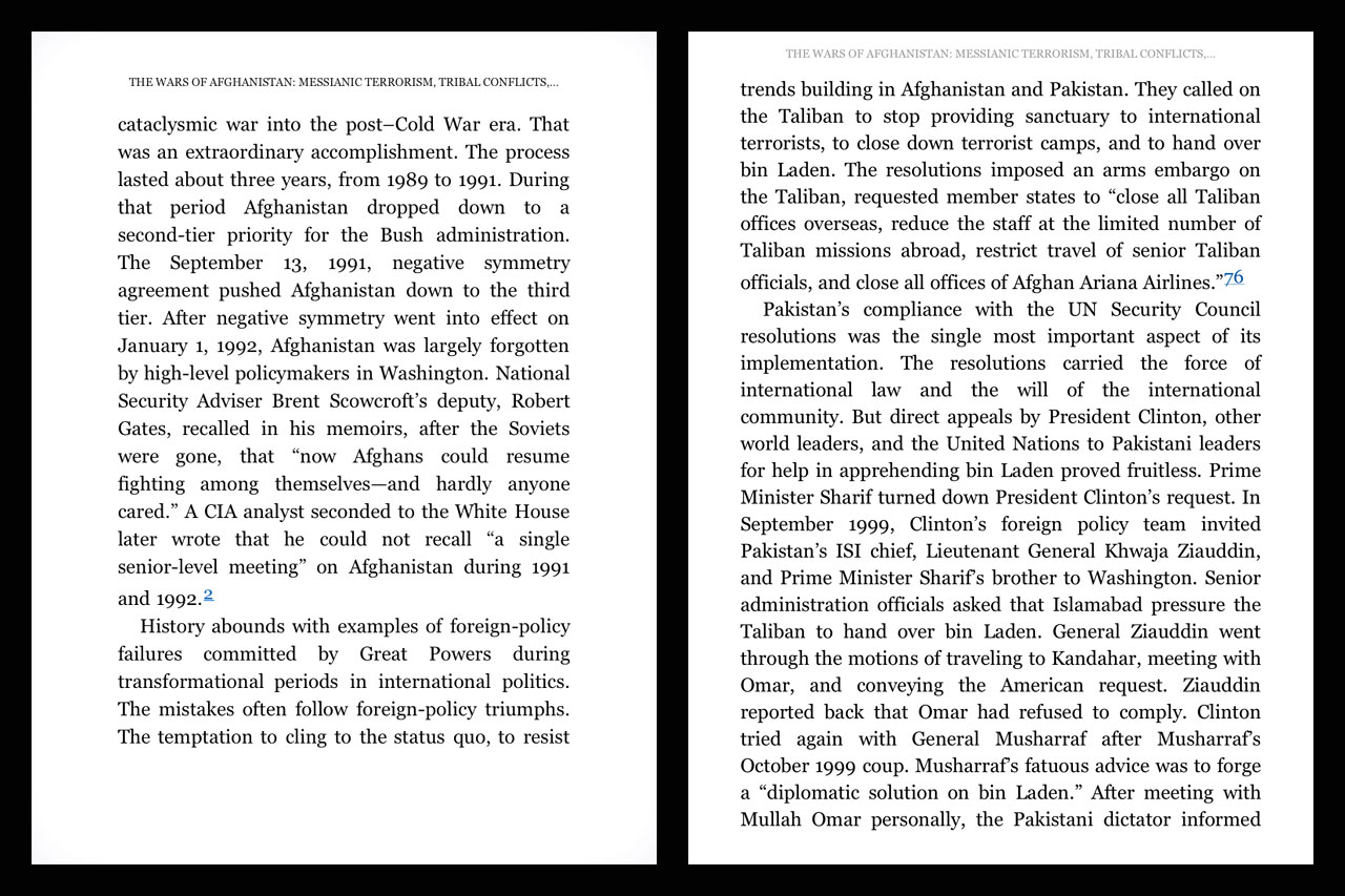
When I first saw this in the blurb, I was immediately suspicious. It’s hard to overstate the importance of healthy margins and whitespace in good design. Generally, it’s also one of the earlier casualties when good design meets project managers and clients who aren’t designers. But I updated the app anyway. Upon opening, I saw what had been a decent treatment of margins had been destroyed by the redesign:

kindle1_bl.jpg

The image on the left is a screen capture from an iPad without the update installed (I’m a developer, I have more than one iPad. How first world of me.). The image on the right is with the update installed.

The smaller margins do indeed help a user focus on the words. In fact, that’s all a user can focus on. What Amazon has done is create a solid mass of text that has no breathing room. It’s claustrophobic. It’s stressed.

It’s like standing three feet in front of a brick wall and pretending you’re appreciating the architecture of a building.

The words are the most important aspect of a book. That’s intuitive. But, presentation is very important. Having ample margins helps the eye flow over the text and makes it easier to move from one line to the next while reading. Making the margins smaller in the app hinders the ease with which the eye can move over the page, making the book harder to read, not easier. Also, it’s just ugly.

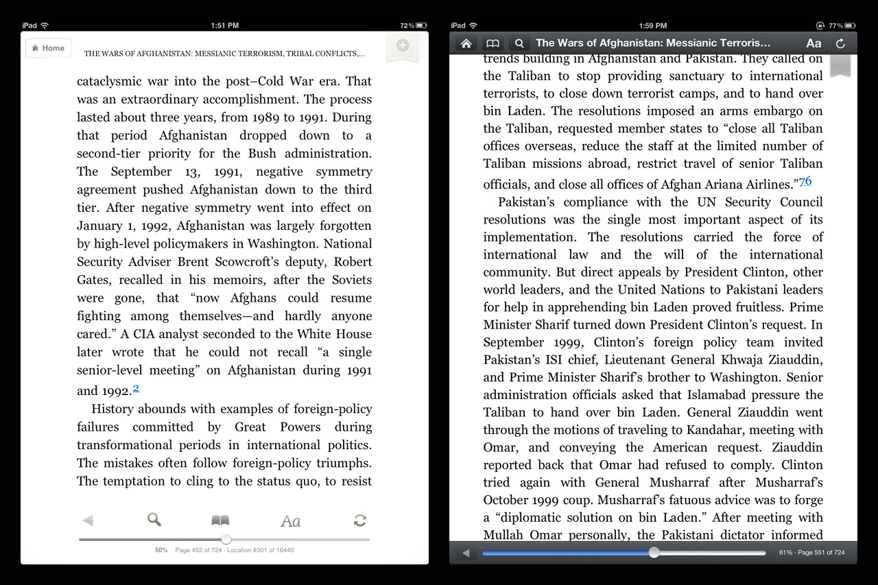
There is also a usability gap that was created with the update. Previously, the app’s toolbar overlays would not interfere with the text on the page. Some people like to read with the toolbar visible. I’m not among them, but I respect that. After the update, keeping the toolbar visible is no longer a workable option:

kindle2_bl.jpg

Also, the new toolbar design has none of the nuance of the previous version. It’s black, bold, and in a user’s face. Even if it didn’t cover up text, the look and feel of the new toolbar is a downgrade.

The Kindle app in the iPad has been a conundrum ever since I began to use the device, simply because the presentation has always been suspect. The options for reading have been limited in ways I could never understand.

Continue…

Categories:

Human Experience

Tags:

 /  / 

Jersey Wine

The New Yorker : Does Wine from New Jersey Taste the Same as Wine from France?

On May 24, 1976, the British wine merchant Steven Spurrier organized a blind tasting of French and Californian wines. Spurrier was a Francophile and, like most wine experts, didn’t expect the New World upstarts to compete with the premiers crus from Bordeaux. He assembled a panel of eleven wine experts and had them taste a variety of Cabernets blind, rating each bottle on a twenty-point scale.

The results shocked the wine world. According to the judges, the best Cabernet at the tasting was a 1973 bottle from Stag’s Leap Wine Cellars in Napa Valley. When the tasting was repeated a few years later–some judges insisted that the French wines had been drunk too young–Stag’s Leap was once again declared the winner, followed by three other California Cabernets. These blind tastings (now widely known as the Judgment of Paris) helped to legitimate Napa vineyards.

But now, in an even more surprising turn of events, another American wine region has performed far better than expected in a blind tasting against the finest French ch√¢teaus. Ready for the punch line? The wines were from New Jersey.

I’ve known wine snobbery to be bullshit for a while now and this fact was further confirmed this past winter when a friend of mine had a wine tasting party. Everyone was to bring one bottle of red wine and $20 for the blind tasting. The person/couple who’s bottle scored the highest got the pot – $240. The bottle my wife and I brought won. I paid $13 for the bottle.

Categories:

Pyschology

Tags:

Bleak

Over at Grantland, Andy Greenwald gives his review of Mad Men’s “bleak” fifth season:

All told, it was a dreamy, dispiriting season of Mad Men, one that muddied everything that crossed its path, from lecherous Jaguar executives to the previously squeaky fan fiction of Ken “Dave Algonquin” Cosgrove. Unlike years past, there were no fleeting splashes of California sunshine. The dominant sensation was one of menace: murderers on the loose, bodies under the bed, a car crash — or a driver as bad as Pete Campbell — lurking around every corner. Even sex got sticky, with chewing gum on the pubis evidence of the high price of bad business.

I agree with Greenwald. While this season had some moments, overall I was disappointed.
Everyone has their favorite characters and settings of the show. For me all they need to to is have more scenes with Roger and Don and focus less on the home life drama no one cares about. Pete’s affair? Megan’s auditions? No thanks. More agency life, more pitches. More creative struggle and creative success. There was a lot of angst and frustration and not much got accomplished.

Categories:

Entertainment

Tags:

More trouble than it’s worth

J. Eddie Smith on creativity:

So you think everyone wants to be more creative? I don’t.

I don’t think it’s creativity most people seek. No, people want to be more like post-creative people. People are nothing if not jealous of the success of others, especially over here in the arbitrarily westernmost side of the planet.

Creatives just have this highly coveted form of social capital. Creative success echoes envy in six words: “Why didn’t I think of that?”

So spot on.
Another thing people who think they want to be creative fail to understand is the extremes involved in getting paid to be creative. What I mean by this is, as someone who gets paid to be creative (as an interface/web/app designer), it’s awesome when I create something I’m happy with. And the client likes. And they praise me for. And I get paid well for doing.
The problem is, sometimes the great ideas and great designs don’t always come out on command. Sometimes the designs I create suck. And the client hates. So I go back and I iterate. And iterate. And iterate. If you had good creative training, you understand this and accept it, but it’s still hard work.

Categories:

Process

Tags:

Punching Steel

Great NYTimes piece on Johnny DeVincenzo, a 77-year-old ex-convict:

The logo on the back of his warm-up jacket — “Johnny Knuckles, the Italian Steel Puncher” — suggested that this was not his first time doing this. So did the two discolored spots on the pole where the man’s fists were pounding, as well as the man’s taut physique and his toughened fists, enlarged with calluses.

His punches started out as firm rhythmic thuds, each blow causing a dull clang that resonated up the steel column. But they got quicker and harder until this featherweight was grimacing as his roundhouse rights slammed into the steel. Passers-by shook their heads, the skies darkened, but the man only shed his jacket and kept slamming the steel in the rain.

*Be sure to watch the video of DeVincenzo doing his punching as well as his declining push-ups on his knuckles. Remember, he’s 77.
Johnny Knuckles. Right out of a Scorsese movie.

Categories:

Entertainment

Tags:

More Cowbell

Last week while I was looking through my site referrals I came across an interesting writer. Her name is Elmo Keep.
How could I not dig deeper with a name like that?
Like most good writers both her words and the words she recommends you to read are solid.
Here’s a bit from a piece she wrote on technology and culture called Don’t Fear the Reaper:

A lack of knowledge of the technology being critiqued is evidently not a reason to not espouse your thoughts on it. Aaron Sorkin deigned to use Facebook for a two-week research period in preparing to write the almost hysterically overwrought Social Network. He compared it unfavourably to reality TV, as only two weeks of cursory use will allow. Jonathan Franzen will call Twitter the antithesis of in-depth thought without so much as being connected to the Internet. Roger Ebert is happy to declare video games exempt from the “real art” canon without ever having played one. All these failures of imagination seem to spring from an age old knee-jerk reaction to the New: it is far easier, and takes less time, to dismiss something foreign outright than to properly interrogate and investigate it.

So far, the few pieces I’ve read by Keep resonate a lot with me.
I also dug her piece in The Age on the new HBO series ‘Girls’ which I’ve been watching because, well, my wife’s been watching it.
Keep also has a well-designed website. In the same way I think it’s important for designers to write well, I also think it’s as important for writers to know how to present their work on the web. I don’t expect either to master the other’s craft, but shit, at least try. She seems to be trying.

Categories:

Words

Tags:

Cutting Out the Middle Man

There’s been a lot of discussion on how Apple is getting aggressive at getting Google off of iOS, ever since the Steve Jobs “thermonuclear” comment.
Many have been focusing on this snubbing of Google in an almost soap opera kind of way. John Gruber got a keen “fuck you, Google” feeling about the whole keynote and I agree there’s absolutely some strong, healthy rivalry going on. No doubt.
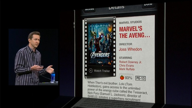
But after watching Scott Forstall walk through the new features of Siri, I realized it really doesn’t require a lot of justification on why they’re not using Google, it just makes good business sense.
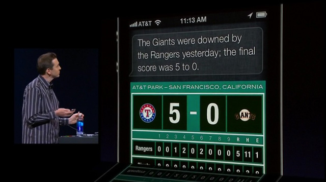
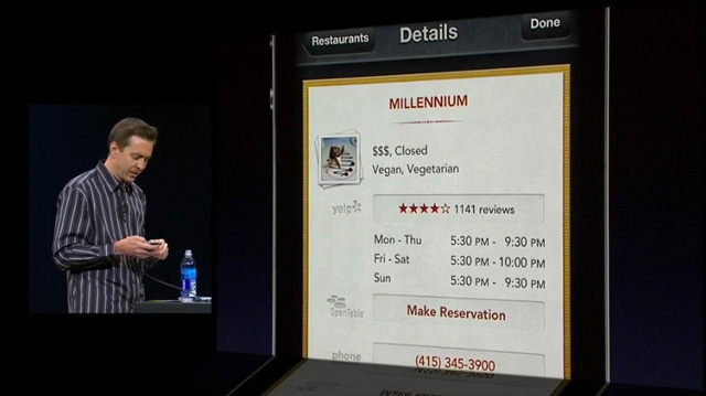
Have a look at these screen grabs from the keynote:
wwdc_siri_01.jpg
wwdc_siri_02.jpg
wwdc_siri_03.jpg
You catch some of the logos in those images?
Yelp. OpenTable. Rotten Tomatoes (we also know they’re getting a good chunk of horsepower from Wolfram Alpha).
Apple hasn’t snubbed Google like a teenage girl, they’re merely cut out the middle man.
In much the same way as Apple rethought what a smartphone is with the iPhone, they’re now rethinking search.
A smartphone no longer means having a dedicated (hardware) keyboard on your device and search no longer means having a dedicated search box on your screen.
I can envision a time in the not-too-distant future where many people start replacing the term, “Just Google it.” with “Just ask Siri.” You watch.

Categories:

Business

Tags:

OS X Mountain Lion

After watching the WWDC Keynote, a few great things stood out to me:

  • Unified Alerts and Notifications (like on iOS) which automatically disable when you plug into an external projector – for anyone who does presentations regularly, this resolves the distracting email and IM/Growl alerts that pop up
  • Unified Search Field in Safari – Address Bar and Search Box have been combined
  • iCloud Tabs – any web pages you have open on any of your other iCloud-connected devices are accessible from your desktop computer
  • AirPlay Screen Sharing – so much better than connecting to crappy projectors with dongles

The greatest thing to see in OS X is the bleeding over of iOS features to the desktop environment in ways that make sense. This is the opposite of Microsoft, who’s abruptly moving their users to a completely new environment in Windows 8 (they even killed the Start Menu, even in their ‘classic mode’), Apple is taking little steps, year-by-year to merge the mobile and desktop operating systems.
Slow, careful iterations.
John Gruber pointed this out in a Macworld article he wrote in 2010:

This is how the designers and engineers at Apple roll: They roll.

They take something small, simple, and painstakingly well considered. They ruthlessly cut features to derive the absolute minimum core product they can start with. They polish those features to a shiny intensity. At an anticipated media event, Apple reveals this core product as its Next Big Thing, and explains–no, wait, it simply shows–how painstakingly thoughtful and well designed this core product is. The company releases the product for sale.

Then everyone goes back to Cupertino and rolls. As in, they start with a few tightly packed snowballs and then roll them in more snow to pick up mass until they’ve got a snowman. That’s how Apple builds its platforms. It’s a slow and steady process of continuous iterative improvement–so slow, in fact, that the process is easy to overlook if you’re observing it in real time. Only in hindsight is it obvious just how remarkable Apple’s platform development process is.

Design isn’t just how it looks. It’s also not just a solution to a problem. Design is having a plan.

Categories:

Human Experience

Tags:

It’s Just Stuff

Great post by Kyle Baxter on how crucial iCloud and Siri are to Apple’s future and why you don’t need all the new shiny products:

It sounds like I’m complaining that today’s event was a let-down, iOS 6 isn’t introducing much worth upgrading for, and the new MacBook Pro is a boring update. That’s not what I’m saying. Actually, each thing Apple announced is impressive and took a massive amount of work. The new MacBook Pro really is the best notebook Apple’s ever shipped, but here’s the thing: their line-up as of 9:59 AM this morning was really, really good too. Apple’s hardware is getting to the point where it’s so good that it’s good enough for nearly everyone, so dramatic improvements like a retina display for Macs is a relatively minor improvement for users. The same goes for iOS.

Remember, Apple makes computers. Every year. That’s how they make money. This does not mean you have to buy them every year. The same way you don’t have to buy a new car every year. Or a new house. Or new boxers.

Sometimes you can go years without buying new versions of those things.

Categories:

Consumer

Tags:

Limited and Cramped

Michael Mace gives the good, the bad and the ugly on Windows 8 Preview in a very short 8,300+ word review.
Here’s one of many insightful conclusions Mace comes to:

Because of its problems, Windows 8 isn’t fun to use, at least for me. Whatever sense of joy I get from the cool new graphics is outweighed by a feeling that my productivity is being reduced. Think of the best new app or website you’ve ever discovered; the feeling you got the first time you understood the power of Twitter or you created a presentation and it came out looking great. That feeling of empowerment and excitement is critical to getting people started with a new technology. But Windows 8 makes makes me feel limited and cramped. It isn’t a launch pad, it’s a cage.

If Windows 8 is a problem for me, what’s it going to do to a typical Windows user who just wants to get work done and doesn’t have time to learn something new? And what sort of support burden is it going to put on the IT managers of the world?

It’s going to be very interesting to see how Windows 8 does when it hits virtual shelves.

Categories:

Human Experience

Tags: