Exploded

via martinhajek.com
Apple Watch Notifications
Dan Frommer on Apple Watch notifications:
I was expecting to be more annoyed by notifications.
It turns out that I’ve already done a good job turning off most in-app notifications—I haven’t been bothered at all by them.
Exactly as I said a few weeks ago, we are in charge of our gadgets, not the other way around.
Problem. Solved.
—Me
“That ergonomy is not a new discovery.”
I always enjoy listening to Jony Ive talk.
Eli Schiff has an interesting multi-part series on the “Fall of the Designer”.
Here’s a bit from Part 3, Conformist Responsive Design and the shift away from shiny, roundy, textural UI elements and towards ‘flat’ design:
Similar to web design, application design is becoming homogenized. Where before, apps like Tapbots’ Tweetbot were worlds unto themselves, with robotic sounds and futuristic cartoon aesthetics, today the only remnant of that past is robotic sound effects, devoid of any rationale as to why they sound the way they do.
Paul Haddad of Tapbots seemed to laud the shift, explaining in 2013 that he and his team “talked about making the Mac version a little bit more…plain” too. This hesitation might have invited our skepticism about their approval of flat design. But in the following years, Tapbots announced proudly their newly flattened Tweetbot 2.0 for OS X.
Tapbots is not alone in castrating Calcbot and their Twitter client Tweetbot. The Iconfactory’s Twitteriffic and Twitter’s proprietary iOS app in earlier days all attracted dedicated followings based on expressive designs which each exposed unique feature sets. But with their new flat interfaces, they struggle to differentiate their brands. Even with custom glyphs, animation and functionality, at a 10 foot view, it is difficult to tell one of these flat UIs from the next.
Did these developers suddenly have an epiphany and conclude that their former designs were ugly and overwrought? Or was it instead an imposed, though convenient, ideological shift by operating system designers?
I respect the time and thought Schiff has put into this series on design, and I think the answer to this last question is simple: fashion. UI design, like clothing, goes through different different phases and trends. Thats’ really it.
If you’re afraid skeuomorphism is gone forever, fret not. All you need to do is look at the achievement badges in the new Apple Watch exercise app:

There are gaudy ways of using depth and shading in UI design and there are tasteful ways of using depth and shading just like there tasteful and gaudy ways of using chrome and paint on a car.
I think what we’re seeing, as Schiff has pointed out is not so much flat design as lazy, flat design.
Da Vinci Was a Loser
Adam Westbrook explores our distorted view of success and our obsession with youth in his two part video series.
The Long Game Part 1: Why Leonardo DaVinci was no genius (4:25 minutes)
The Long Game Part 2: the missing chapter (5:48 minutes)
via Open Culture
Superheroes Don’t Kill (anymore)
Over at Slate, Jacob Brogan writes about the origin of superheroes not killing:
The industry as a whole didn’t adopt a collective set of standards until 1954, when prominent publishers banded together to form the Comics Code Authority in response to Wertham’s attacks and the congressional hearings they inspired. Long before, however, DC’s prominent characters provided a tacit model for every superhero that would follow. Accordingly numerous other costumed adventurers who refused to kill would appear in the years after Ellsworth laid down the law: Spider-Man wraps thieves up in webbing, the Fantastic Four banish their enemies to the Negative Zone, and Netflix’s Daredevil tosses would-be assassins into dumpsters. By editorial fiat, Ellsworth had effectively imposed a principle that comics storytellers still follow today, three-quarters of a century after the moral panic that inspired it.
If you follow Bryan and I on the Weekly Exhaust podcast, you’ll know Bryan talked about this on episode 34.
Aperture, Shutter Speed & ISO
This is a great example of how data visualization and illustration can simplify the understanding of complex ideas:
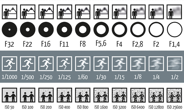
via Lifehacker
Lester Beall
Here are a few of those posters Armin Vit was talking about:
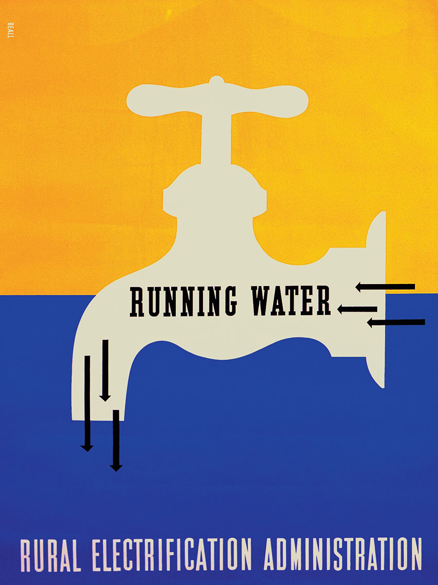
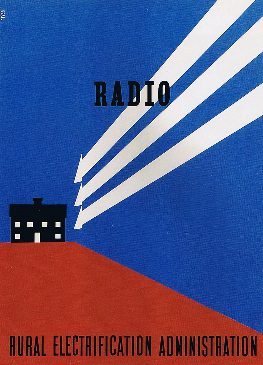
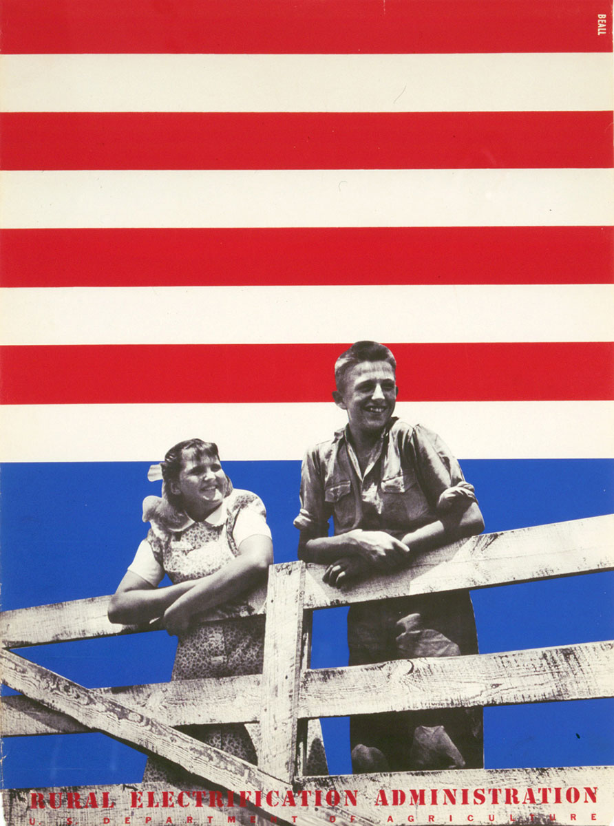
Seemingly simple compositions, but powerful.
Hillary
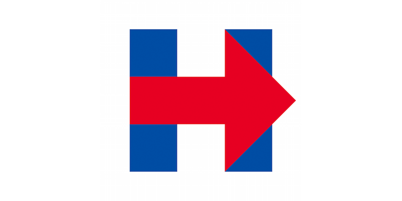
Armin Vit on Hillary Clinton’s new campaign identity:
When considering the range of work for the Obama campaign — from Andy Keene’s logo (done as part of Sol Sender’s team), to Scott Thomas’ applications, to Shepard Fairey’s plagiarized poster — we see room for creativity within a managed system. But so far, for Hillary, all I’ve seen are missed opportunities. All the arrow applications are flat and simplistic. A pointing finger rather than a metaphor for progress. A visual tic rather than a passionate call for action.
Vit sees a missed opportunity to take cues from legendary graphic designer Lester Beall:
Which is a shame. Because within those two blue bars and red arrow lies a connection to a powerful and authentic visual language that comes from a pivotal moment in history: Depression America and the WPA.
In 1935, during the depths of the Great Depression, President Franklin Delano Roosevelt used the Emergency Relief Appropriation Act to create the Works Progress Administration, an ambitious agency which employed thousands of unemployed people for numerous infrastructure projects. One of these projects was the Rural Electrification Administration, whose charter was to bring electricity to rural areas that had yet to be wired.
At the time, only 10 percent of rural households had electricity. And while to us electricity is a basic need, in 1935 that concept needed some convincing. Enter Lester Beall, a well-respected New York graphic designer who received the commission to help promote the project.
Image is everything.
Stromboli Pizza
The Post-PC Era
Walken
Little man, I give the watch to you.